BLACKHOLE
A niche social network for the night side of the internet. Dark, cozy, a little cyberpunk, and built from day one to stay kind. Designed, written and coded solo, live on the web.
A PLACE, NOT A FEED
Blackhole started with a question I kept coming back to: what would a social network feel like if it were designed as a place instead of a feed? Something between a late night radio station and a small club where the regulars know each other.
So I designed and built one. Blackhole is made for night people: illustrators, musicians, small venues, urban explorers, anyone who creates after dark. You do not post, you drop a Signal. You do not like, you send a Pulse. You do not follow, you join someone's Orbit. DMs are Transmissions on an encrypted channel. The vocabulary sounds like fiction, but it does real work: it sets the tone before any rule has to.
The founding decision is invisible at first glance: there are no vanity numbers anywhere. No like counts, no follower totals, no view counters. The sidebar even says it: what you see here stays here. If a number exists only to be compared with someone else's, it does not ship.
FROM ONE NOTE TO A LIVE NETWORK
One note, written at night: what if a social network was a place, not a feed? The vocabulary arrived the same week (Signal, Pulse, Orbit) and so did the two founding rules: no vanity numbers, no dark patterns.
Fourteen screens designed in Figma, mobile and desktop: feed, radar map, profile, terminal-style messages. That design system froze the identity before a single line of code. The full set lives in the Creative Lab.
Next.js 16, Supabase, Tailwind v4. The mockups became a working app in one intense week: auth, feed, realtime messaging, notifications, search, then a faithful re-skin of every screen against the Figma exports.
Then the layers that turn an app into a world: the radar Map, the Live monitor, hard moderation with visible warnings, a full avatar builder, French and English everywhere, age bands, hidden safe spaces, anti-bot defenses, UI sounds.
Loops, Stations, live rooms and the Market landed next, then real payments through Stripe: two small optional subscriptions, tips, and the 92/8 split on every sale.
Deployed, indexed, open, with a demo mode that lets anyone walk the whole network as one of three fictional members. And the work did not stop there: the latest pass brought the mobile home back to the original mockup and spread the neon treatment across every screen.
NEON ON NEAR-BLACK
Everything sits on a near-black canvas, #0A0A0F, lit by one cyan accent that behaves like neon: it glows, it scans, it sweeps. Categories work like districts of a city at night, each with its own color, so you can read the mood of a card before you read its text.
One typeface everywhere: Aldrich, a squarish techno face that reads like a machine trying to be polite. Labels carry terminal prefixes, corners get bracket marks, hover states flash a short glitch. That is a lot of atmosphere, so I balanced it with strict alignment, generous spacing and a calm three column grid. Moody, not messy. The latest pass pushed the neon further: outlined chat bubbles, glowing inputs, notification cards with a real halo.
AGAINST THE FEED MACHINES
Every decision in Blackhole answers a habit of the big platforms that I did not want to inherit. Same category of product, opposite priorities.
Likes, followers and view counts on everything.
Zero vanity metrics. Presence dots and unread badges, nothing to compare.
An algorithm decides what you see.
You pick your frequencies, your zone and your age band. The feed obeys you.
Report, wait, nothing happens.
Hate speech is an immediate, permanent ban. Everything else: three warnings, visible on the profile.
AI-generated content floods the feed, unlabeled.
AI work must carry a dedicated tag, and the main feeds filter it out by default. A real person made this.
The platform keeps 30 to 50 percent of creator income.
Creators keep 92 percent. As the Market page puts it: 92% for you, 8% for the servers. That's it.
Ads, tracking and data resale pay the bills.
No ads, no data resale, ever. Two small optional subscriptions and tips instead.
Bots and engagement farms inflate everything.
An anti-bot check at the door, honeypots at signup, and a network that stays human-scale by design.
Doomscroll until 4 a.m., by design.
Gentle rituals instead: one daily pulse to answer, a signal check, two tiny daily games, one weekly digest. Then it lets you go.
A TOUR OF THE APP
Every screen below is a real screenshot of the app running in demo mode, captured in July 2026 on the latest build. Nothing staged in a design tool.
A MARKET OF SIGNALS
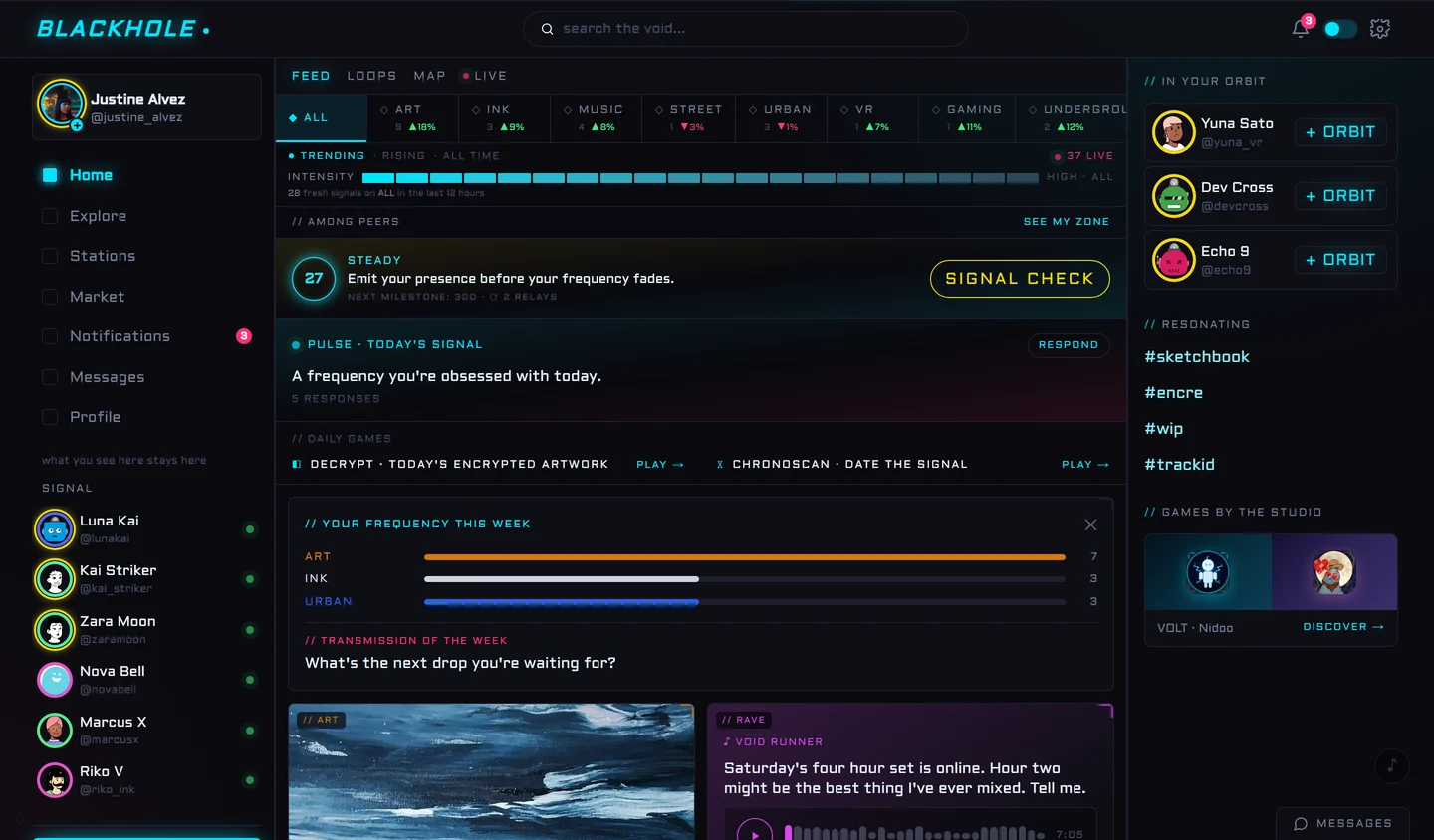
The feed reads like a night market ticker: sixteen frequencies with their own trend, an intensity meter, and your peers' zone. Below it, the daily rituals: a pulse to answer, a signal check, two tiny games. Community data everywhere, personal scores nowhere.
A RADAR, NOT A MAP
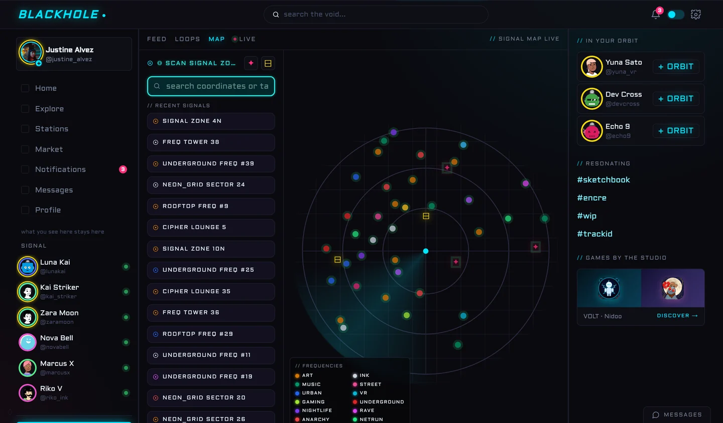
My favorite screen. Instead of a literal city map, signals appear as colored blips inside sweep rings, decoded by a frequencies legend. It says what the whole product wants to say: you are not scrolling a feed, you are scanning a territory.
VERTICAL VIDEO, LEGAL MUSIC
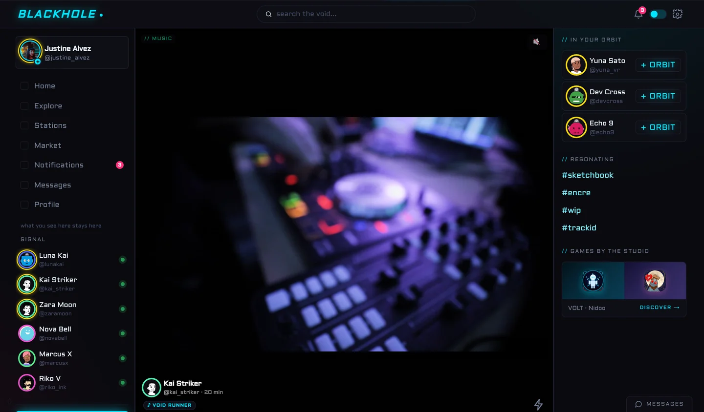
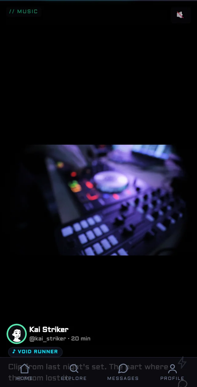
Short looping videos, one at a time, with sound you opt into. Creators can lay a music extract over a loop, picked from a library of free-license tracks with a start point and a duration, because licensing major-label music is a lie I refused to fake.
A MONITOR, NOT A STAGE
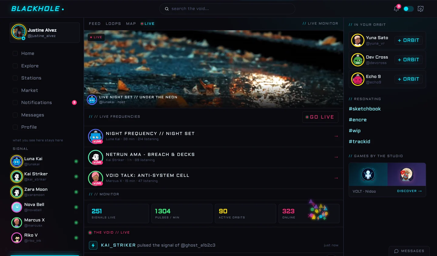
Live frequencies to join, a featured direct, and an activity monitor that pulses with the whole network: signals live, pulses per minute, active orbits. The numbers here describe the place, never a person.
SMALL ROOMS, STRONG WALLS
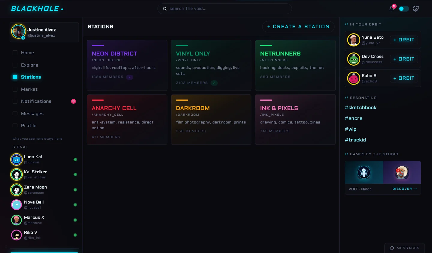
Themed communities with their own color and charter: vinyl heads, netrunners, darkroom photographers, ink artists. Joining a station feels like pushing the door of a club, not subscribing to a hashtag.
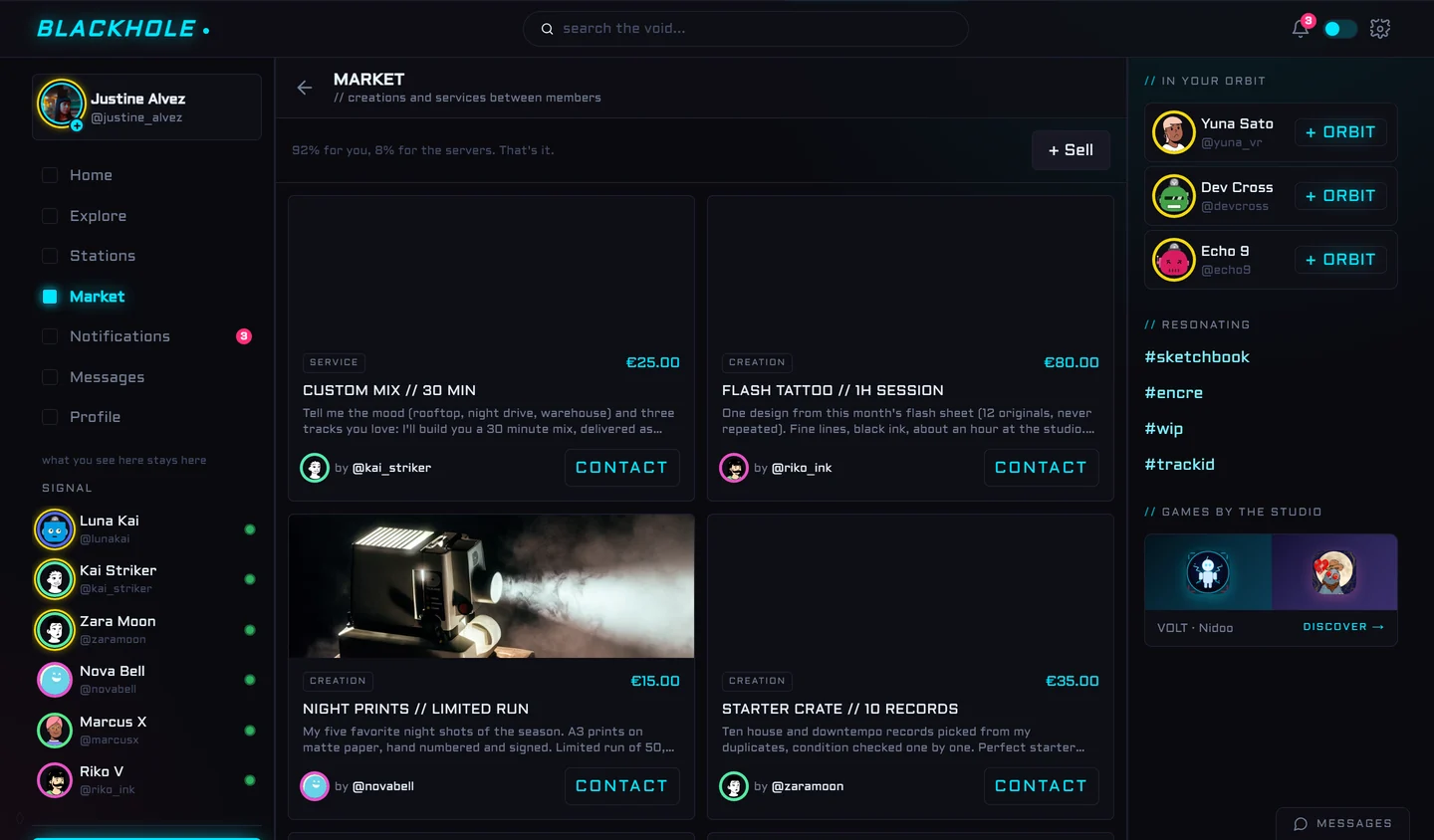
92% FOR YOU, 8% FOR THE SERVERS
A small marketplace of creations and services between members: mixes, prints, flash tattoos, record crates. The commission line is printed right on the page because a fair split should not hide in a FAQ. Payments run on Stripe, for real.
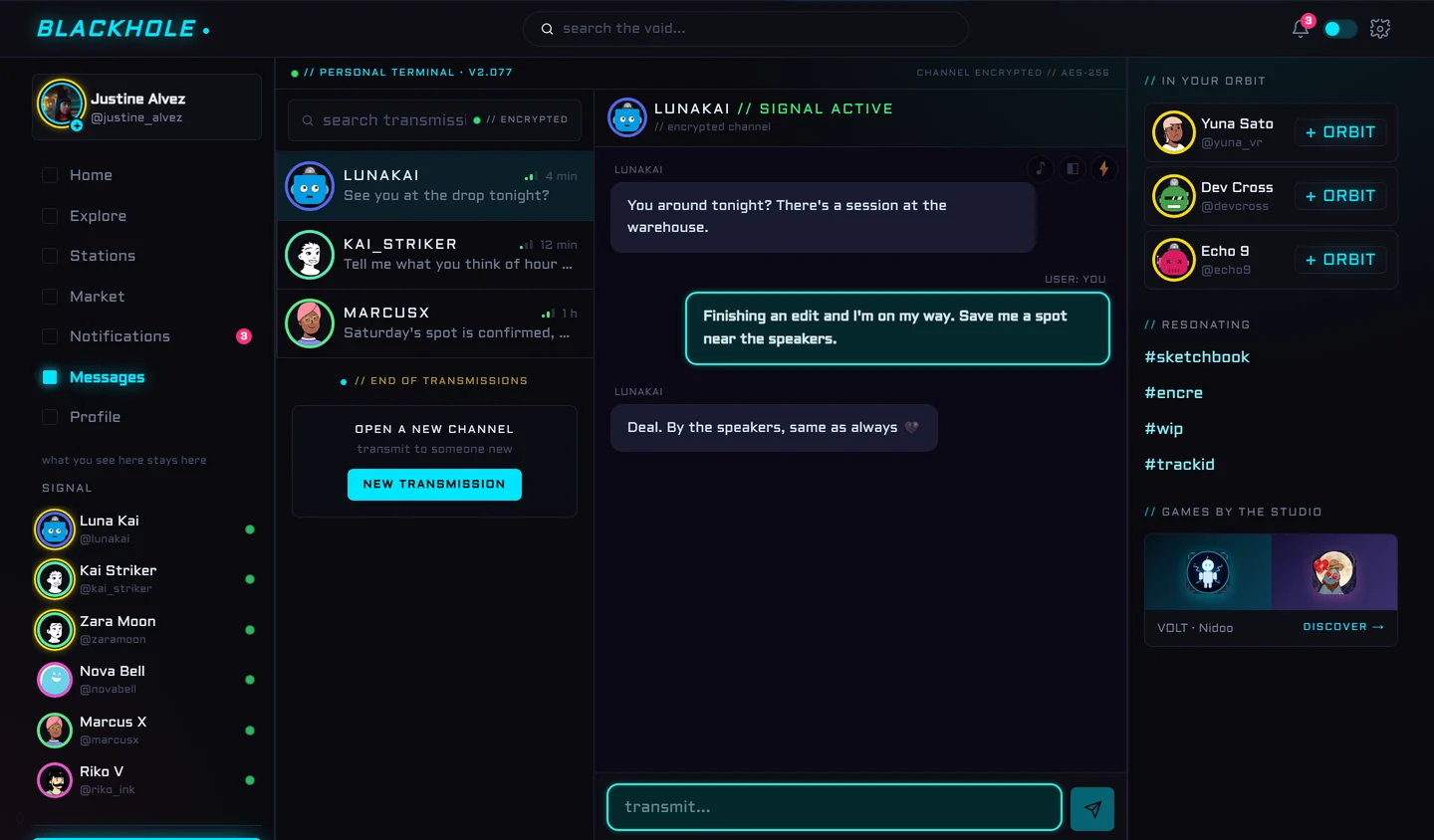
A PERSONAL TERMINAL
Messages live in an encrypted terminal. Your own bubbles are outlined in neon, the transmit field glows, and each conversation has its quiet settings in the corner: a sound ambience, a background, and JOLT, a consent-based nudge you both have to enable before anyone can use it.
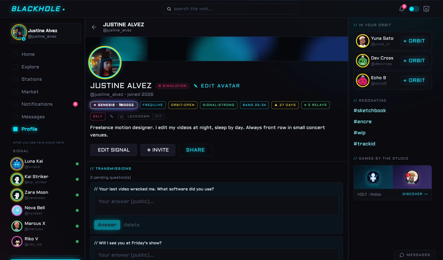
AN ID CARD, NOT A SCOREBOARD
Profiles wear chips instead of stats: frequency live, orbit open, signal strong, your age band, your streak of presence. Visitors can leave public questions to answer. And a lockdown switch closes the door when you need the night off.
NO DARK PATTERNS, SAYS THE DOOR
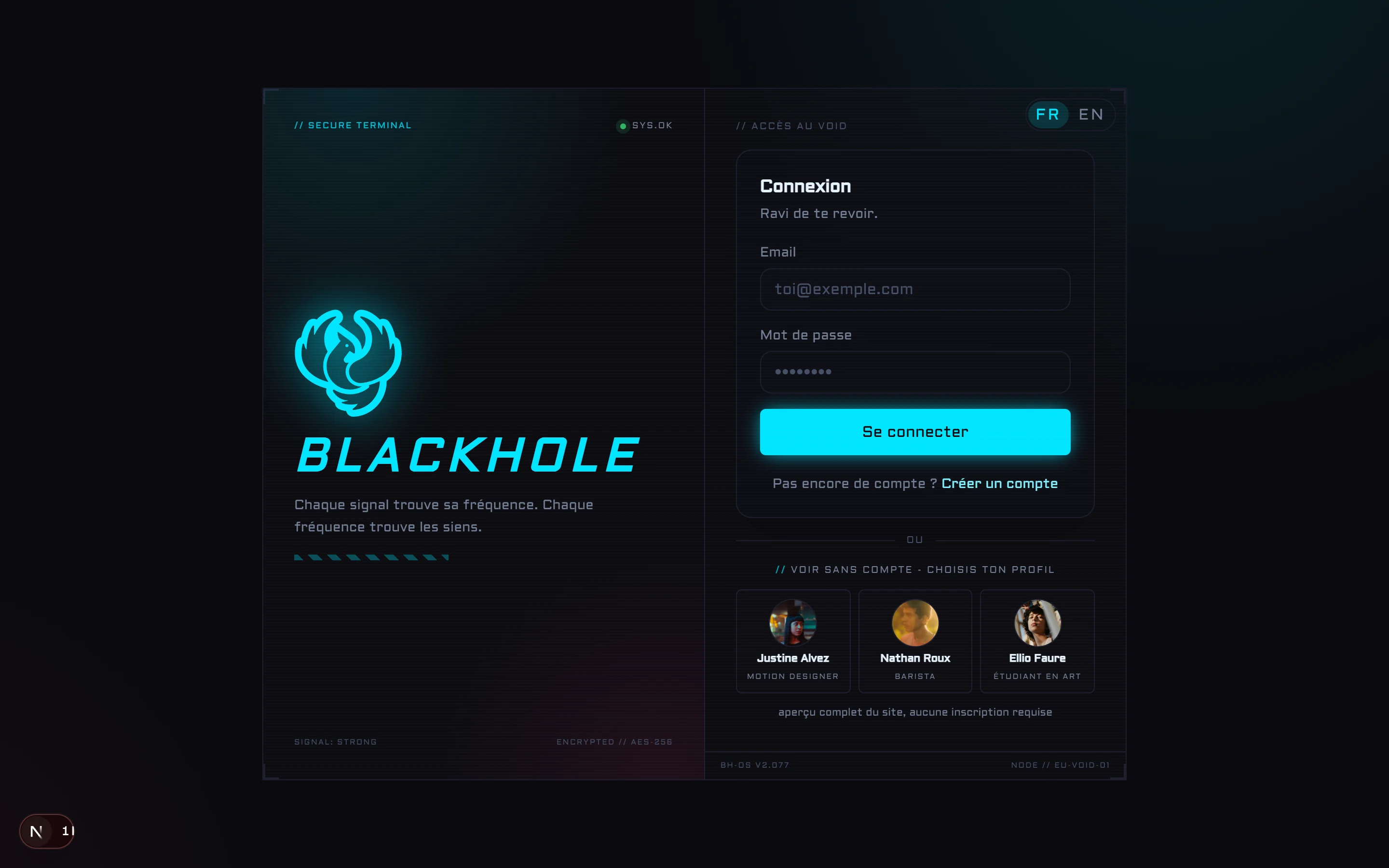
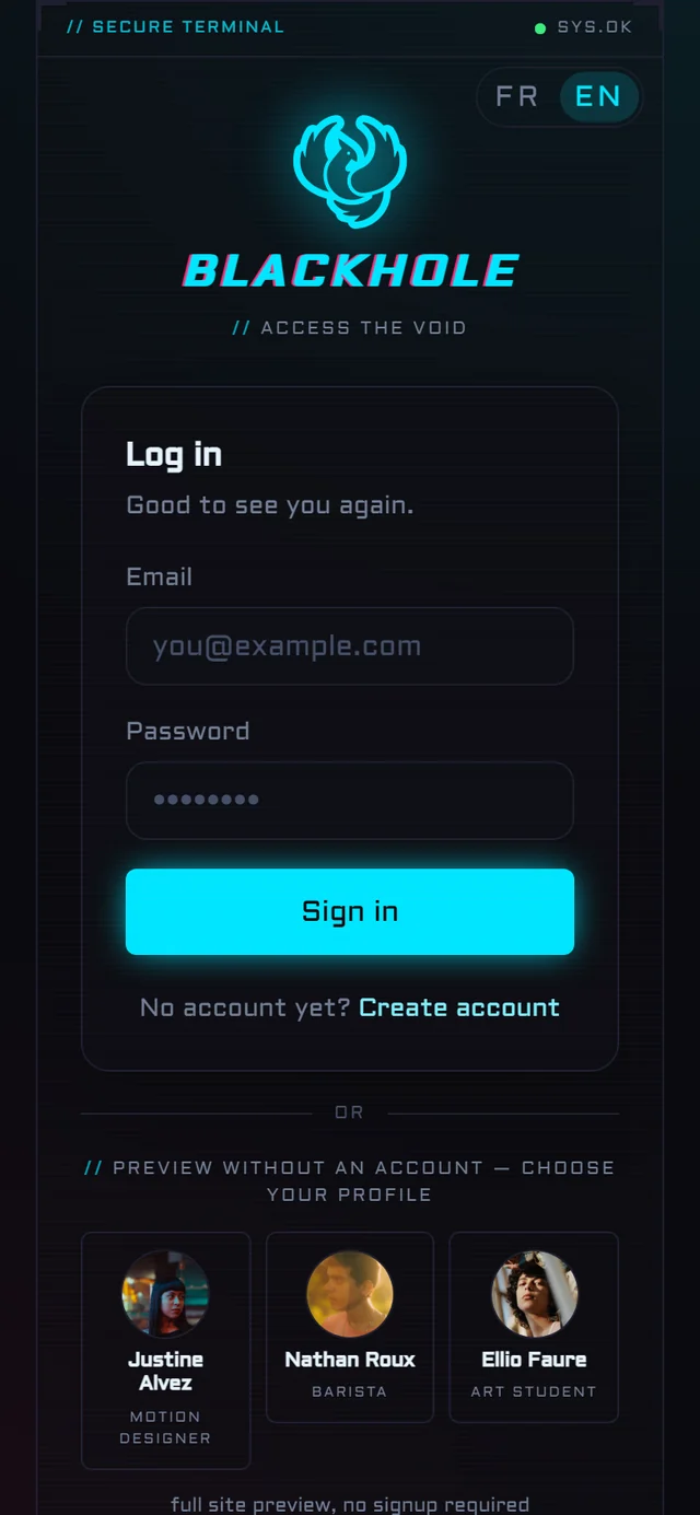
The login terminal announces the contract before you enter: a network of signals, no dark patterns. And instead of a wall, a real demo: pick one of three fictional members and walk the whole site, no signup required.
AND THE THINGS I WILL NOT SHOW
Some rooms only open for the people who need them: keyword-unlocked safe spaces with their own charters, including one for the LGBT community. There are also a few secrets for the curious. Screenshots would spoil both, so you will have to find them.
THE MOCKUPS KEPT LIVING
The June mockups are still in the Creative Lab, and I like them too much to delete them. So here they are instead, each one next to what its screen looks like in the latest build, after weeks of building, testing on my own phone at night, and changing my mind. Sometimes the app drifted away from the mockup and I brought it back. A dedicated mobile app is in the works: its link will land on this page the day it ships.
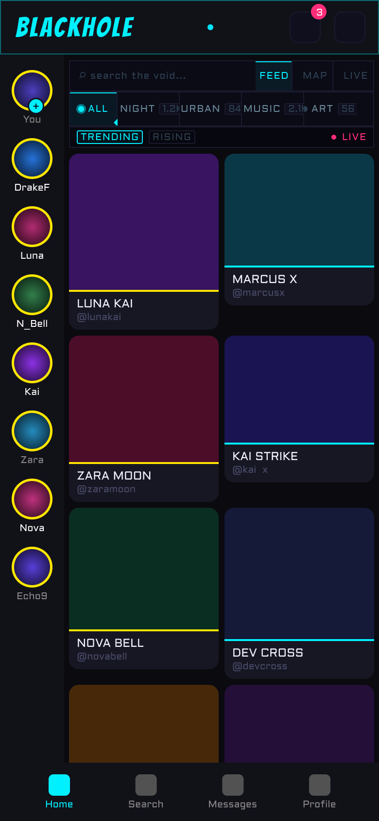
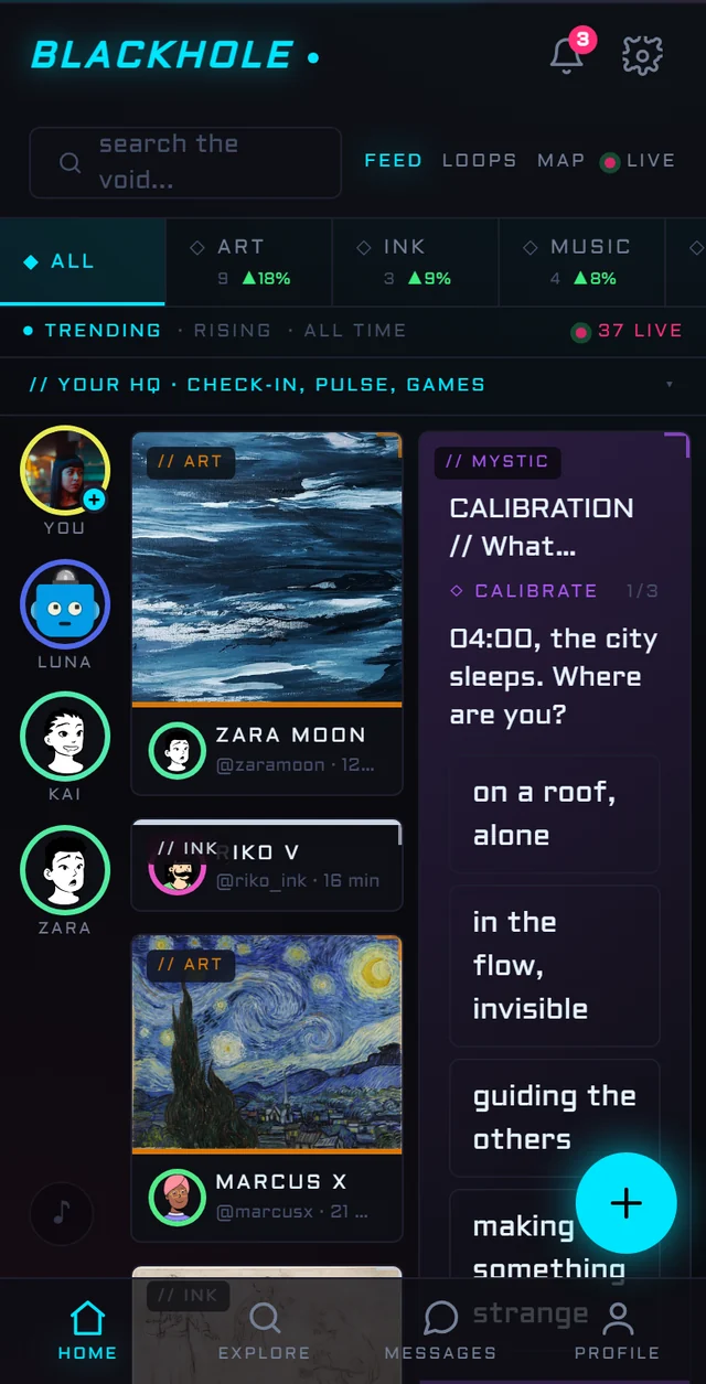
The mockup always had that vertical rail of stories on the left. For a while the app lost it under a pile of widgets that pushed the feed down. The latest pass put things back in order: the rail is back, the feed shows up immediately in a two column grid, and the check-in, the daily pulse and the games now fold behind a thin // YOUR HQ bar. One tap opens them.
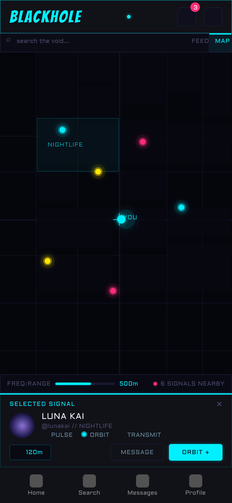
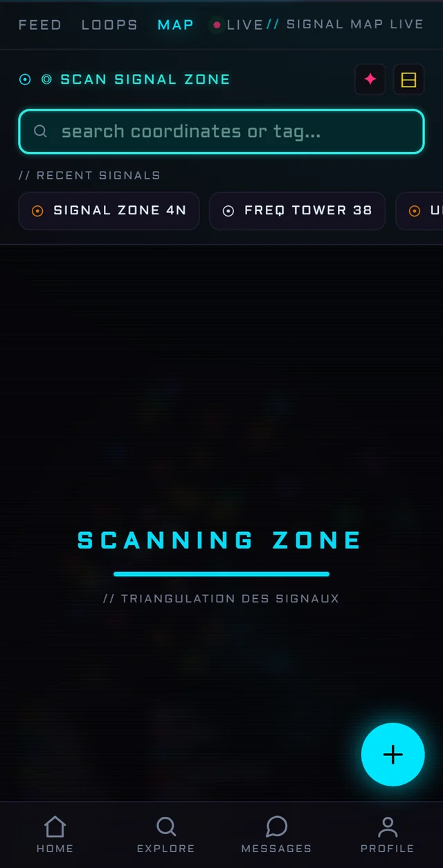
In June the radar was an idea: dots on rings. Now it breathes: a sweep, a legend that decodes the colors, and the SCAN SIGNAL ZONE panel wears the same neon as the rest of the app.
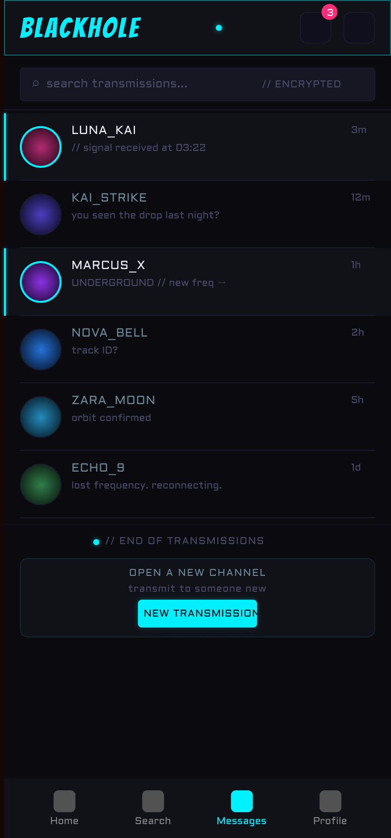
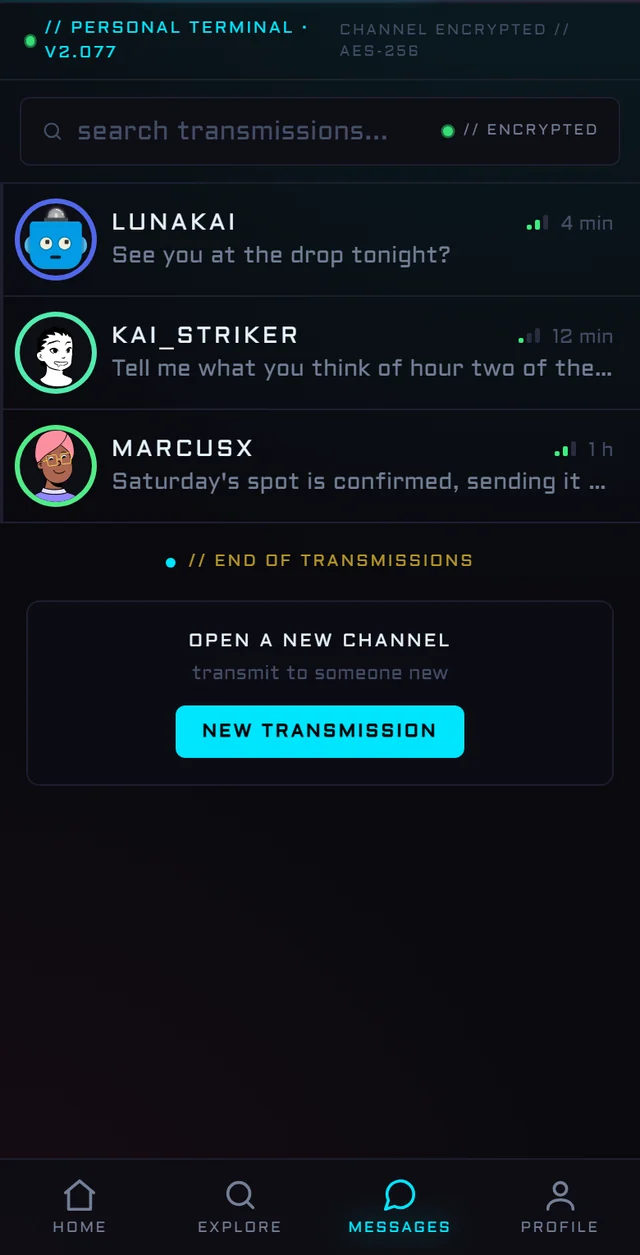
The mockup drew the channel list; the app now follows it point by point: an encrypted search that filters as you type, accents on unread channels, an // END OF TRANSMISSIONS divider, and a card to open a new channel. The signal strength bars next to each contact were born in code.
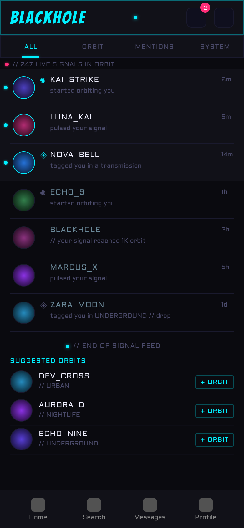
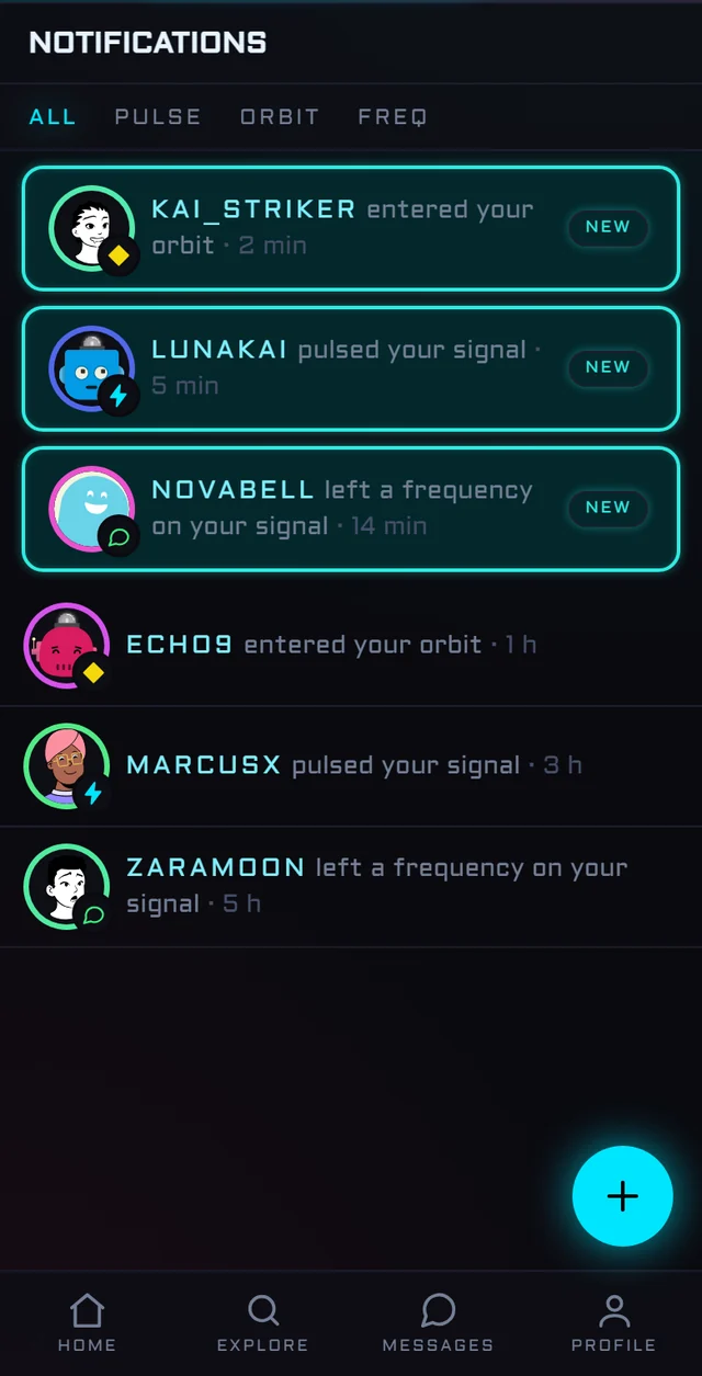
For weeks this screen was a plain grey list. The neon pass aligned it with the rest of the app: one outlined card per unread notification, a NEW chip, and a small pulse, orbit or frequency icon on each avatar so you know why someone is knocking before reading a word.
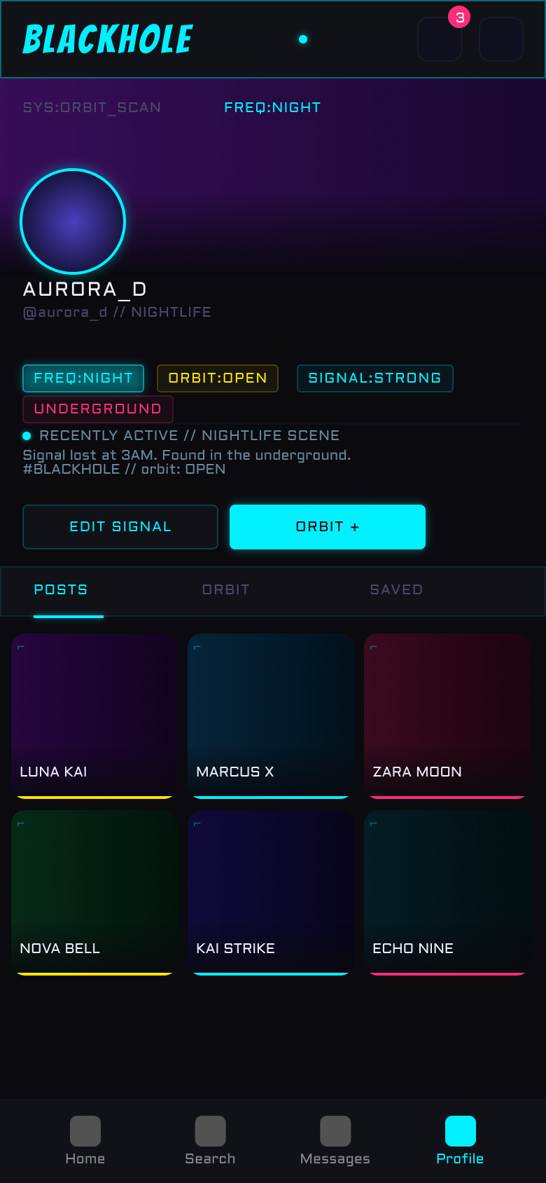
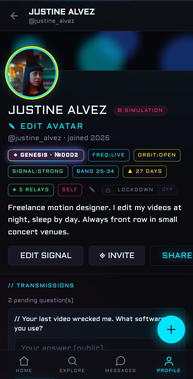
The chips-instead-of-stats idea held. What the mockup could not predict: a genesis number, a streak of presence, public questions from visitors, and a lockdown switch for nights off.
BORN IN PRODUCTION
And some screens never had a mockup at all. Loops arrived when I understood the network needed motion. The door came last, once there were three demo members to welcome people in.
BORING STACK, SHARP EDGES
The stack is deliberately unexciting: Next.js 16 with the App Router, TypeScript, Tailwind CSS v4, and Supabase for auth, Postgres, realtime messaging and storage, with row level security keeping every table locked down by default. Brevo plugs in as the emailing platform for everything the app needs to send. Next 16 shipped some sharp edges of its own (middleware became proxy, cookies went async) and this project lost a few evenings to those alone.
Media was the first real cost problem. A social network eats images, so every upload is compressed and converted to WebP or AVIF before it is stored, and each screen requests the size it actually renders. Videos stream from a CDN in HD, never 4K, because nobody needs 4K at 2 a.m. The pages stay fast on a phone and the storage bill stays a side project bill.
Money runs through Stripe in live mode: two optional tiers at 1.99 and 4.99 a month, tips, and the marketplace with its 8 percent flat commission. Moderation is homemade: a normalizer that defeats leetspeak and spacing tricks, category word lists, device fingerprint bans, and warning messages I rewrote more times than any component.
WHAT BLACKHOLE TAUGHT ME
ENTER THE VOID
The network is live. Demo mode lets you explore everything without creating an account.
The mobile version is on its way. Its link will land right here as soon as it ships.
Browse the full UI mockups and interactive screens in the Creative Lab.