End-to-end mixed-methods research for a luxury all-inclusive resort brand: interviews in 4 markets, a survey in 10 markets, a co-design workshop and usability tests on redesigned prototypes. All client-identifying details are protected under NDA.
NDA_ACTIVEClient identity, raw verbatims and business metrics are confidential
Interviews
20
Respondents
5,982
Markets
10
Journeys tested (FR)
10
My contribution in 30 secondsFrom observer to lead moderator of the French market.
1Followed the interview and survey phases, then rebuilt a pre-diagnosis from their deliverables.
2Co-prepared the four Design Studio workshops and acted as their structured scribe.
3Recruited 5 French participants and moderated 10 journeys on two prototypes.
4Analysed the sessions, wrote the French synthesis and the prioritised proposals, in English.
00The programme at a glance
Six months of research, and how my role grew at each phase.
A booking-journey redesign for a luxury all-inclusive resort brand, run by the agency in four phases. I joined in January, while the research was already under way, and my involvement grew from observing to running the user tests of the French market on my own.
Dec 2025Jan 2026FebMarAprMay 2026
Kick-off and hypotheses
Before I joined
Qualitative interviews
I observe how interviews are run
Quantitative study
I observe the analysis and deliverables
Design Studio workshops
I co-prepare, then act as scribe
User tests, French market
I run the tests on my own
Restitution
Deliverables handed over in May
ObservationCo-preparationLed on my own
01Brief and hypotheses
A premium promise, a booking journey that feels like a price comparison site.
The brand sells human warmth and travelling light. Its online booking engine, however, felt transactional: a sequence of forms where the resort, the room and the price became hard to read. The client wanted to understand why too few visitors completed their booking online, to validate its own Jobs-to-be-Done hypotheses, and to explore where AI could help in the journey.
The request as received
Business and operational: run a qualitative and quantitative study, identify frictions, validate internal hypotheses, explore AI, raise conversion, deliver actionable insights and wireframes.
My ergonomic reformulation
"To what extent do the information architecture and navigation logic of the booking engine fit users' real activity, families in particular, when planning and booking an all-inclusive stay, and what changes would reduce the gaps observed?" The question shifts from listing frictions to understanding why real behaviour departs from the designed journey.
Hypothesis · Price
Without a total price visible at all times, users carry a budget worry that slows them down and sends some of them to the phone.
Hypothesis · Childcare
Information on childcare is not visible enough at each step, which pushes families to abandon.
Hypothesis · Accommodation
Room categories are hard to tell apart, so the value of upgrading stays invisible.
Hypothesis · Journey
A strictly linear funnel does not match the way people actually compare and decide.
Scope: 4 markets in the qualitative phase, mixed methods (interviews, survey, co-design, usability tests), about six months, January to May.
02Discovery · qualitative and quantitative
The research confirmed the hypotheses, and showed people do not book in the order the funnel imposes.
This phase was led by the agency's lead UX researcher. I joined while it was under way, so my role was observational: I attended the follow-up meetings, studied every deliverable and analysed the results to carry them into the next phases. It is where I learnt how a multi-market study is run: recruiting clients and prospects in several countries, adapting incentives to each market, scheduling across time zones.
Study 1 · qualitativeTwenty semi-structured interviews
GoalExplore how people really book, confirm or enrich the client's internal Jobs To Be Done, and find the friction points of the funnel.Sample12 prospects recruited on external criteria, 8 clients from the brand's baseMarketsFrance, United Kingdom, United States, SingaporeFormatVideo calls in French and English, with an incentive per participant
■ Clients 8Prospects 12 ■
The questioning went beyond what people say they do: close to the explicitation interview (Vermersch, 1994), each booking was rebuilt step by step, because a declared preference is a starting point to analyse, not an insight.
Study 2 · quantitativeOne survey, ten markets
GoalTest the interview findings at scale, rank them and compare markets.Sample5,982 respondents, clients from the brand's base and prospects from a panelFormat3 languages (French, English, Portuguese), 12 to 15 minutes8 sectionsProfile, booking habits, accommodation, transport, childcare, activities, reassurance and payment, AI
■ Clients 2,503Prospects 3,479 ■
I used the French answers most, because they matched my market for the tests: they gave me a context to read each session against.
What the survey answered · six questions out of sixty
The real questions, with the overall answers (clients and prospects, all markets). Under each one, what it changed in how I prepared or read the tests.
Q28« When you start searching, is your destination already decided? »
General idea only64 %
Exact destination known27 %
Fully open9 %
→ Most people arrive with a vague idea: the tests started from the resort page, not from a blank search.
Q31« How important is the accommodation in your booking decision? »
Influences the choice57 %
Main criterion24 %
→ Decisive but rarely the trigger: I watched whether people found the room details without being sent there.
Q34« Comparing a standard and a premium room, what do you look at first? »
Price70 %
The view65 %
Photos55 %
Size47 %
→ The premium has to be visible: room comparison became a test task in its own right.
Q41« On a family holiday, how important is childcare? »
Important or essential57 %
Decisive criterion28 %
Not important22 %
→ A comfort factor for most, decisive for some: the childcare layer was tested with parents of young children.
Q52« What type of assistance would you prefer? »
A human advisor51 %
A personalised chat28 %
→ Reassurance comes from people first: I noted every moment a participant looked for someone to ask.
Q56« Have you ever used AI to plan or book a trip? »
Already used it44 %
Never56 %
→ Under half had tried it: the AI entry point was tested for discoverability, not taken for granted.
What the interviews structured · five Jobs To Be Done
JTBD 1Compare and anticipate the budgetWeigh options without losing track of the total.
JTBD 2Explore and get inspiredProject oneself into the stay before committing.
JTBD 3Check it fits, no hidden costsKnow what is included before choosing.
JTBD 4Organise without paperworkFill in the travellers without breaking the momentum.
JTBD 5Feel reassured at paymentSee the full cost before confirming.
My part · a pre-diagnosis rebuilt from the deliverables
Crossing the interviews, the survey and the site analytics, I rebuilt a pre-diagnosis in three points: cognitive overload at the accommodation step (no side-by-side comparison, room categories hard to tell apart, price shown per person), a rigid sequence that does not match how people actually search, and childcare information that families need before anything else but find scattered. Read through Bastien and Scapin's criteria and Norman's mental models, it led to more precise hypotheses that shaped the workshops and my test guide.
The survey showed that many people choose their accommodation after fixing the destination, and that the moment families check childcare is spread across the whole search. Both point the same way: the journey has to be open, not a single fixed sequence.
Unreadable accommodation
Participants could not say what a higher room category really added. The premium stayed invisible.
Exhausting comparison
With no comparison tool, many left the journey: screenshots, quotes by email, several tabs. The booking momentum broke.
Opaque transport
What was included (flight, transfer) stayed unclear, and that doubt led to abandonment.
Childcare, a hidden condition
For families, childcare is a condition before even choosing a resort, yet it appeared late in the journey.
A form felt as paperwork
The participants step felt cold and administrative, and the confusion between logged-in and guest profiles added to it.
AI, on the user's terms
Many travellers already use AI to find ideas and compare offers, but want suggestions only when they ask for them.
03Design Studio · 2 days of co-design
Turning insights into four design directions, with the client's teams in the room.
Two days of workshops on site with the client's product, design, marketing, data and AI teams, in two cross-functional groups of seven, each with an agency designer. Each workshop tackled one of the four main friction areas found in the research.
20'Insights
20'Sketching
5'Pitch
10'Critique (Six Hats)
25'Convergent synthesis
5'Closing
85 minutes per use case, 4 use cases over two days, two cross-functional groups of 7 people.
My role
Before: with my tutor, I selected and formatted the key insights for each use case, framed the problem given to the groups and defined how each session would run.During: I was the structured scribe. I captured the arguments in pitches and critiques, where the two groups converged or diverged, and the ideas that emerged in the synthesis. My notes were the basis of the formal synthesis the team delivered.
A central "stay hub" page to move freely between room, childcare, activities and transport, with the total price always visible and an AI agent suggesting options by profile.
UC2 · Accommodation
A room suggested from the traveller's profile, the differences between categories spelled out, a transparent total price.
UC3 · Childcare
Family and kids information shown from the start of the journey, adapted to the children's ages and the group.
UC4 · Comparison
Compare on practical criteria first (transport, price, dates), then on the emotional side (photos, atmosphere, activities).
04User tests · preparing
The French market was mine: five participants, two prototypes, ten journeys tested.
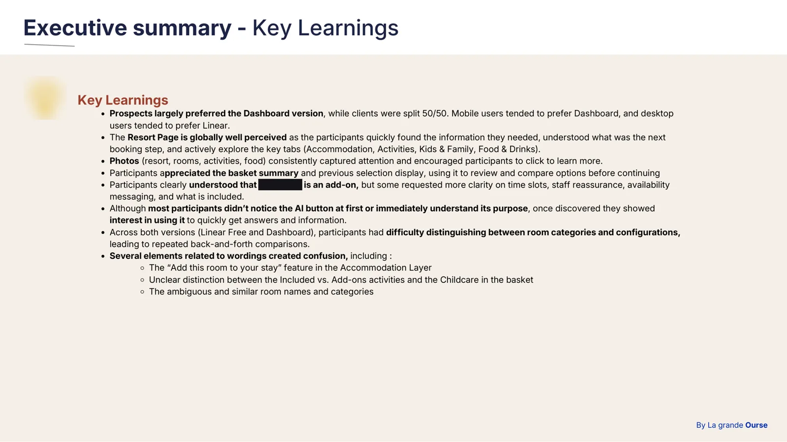
After the workshops, the client's designers built two interactive prototypes of the same journey: one spread over several pages with a side menu to go back without losing choices (version A), and one gathering the whole stay on a single "dashboard" page with no imposed order (version B). Tests ran remotely in several markets. I took on the whole French contribution, from April to May: recruiting the participants, running every session, analysing them and writing the French restitution, in English.
Recruitment
Five participants: three prospects and two clients (one new, one loyal), all living in France, used to digital tools, with a family or a leisure trip planned. Recruited through the client's opt-in base and an external panel, with an incentive.
Two versions, counterbalanced
Each of the five participants tested both versions, then compared them: ten journeys in all. Three started with version A, two with version B, so that the order would not favour either architecture.
Ethics
Each session opened with a consent and recording agreement: aims of the study, right to withdraw at any time, recordings used only for internal analysis. Participants are referred to by session number only.
Code
Status
Age
Family
First version tested
P1
Prospect
60-70
Grown-up children
A
P2
Prospect
40-50
3 children
A
P3
Prospect
30-40
2 very young children
A
P4
New client
30-40
1 child
B
P5
Loyal client
70+
Grown-up children
B
Anonymised profiles: codes instead of first names, age ranges instead of exact ages.
Research ops · recruitment trackingTwenty sessions, four markets, one French clock.
Recreated from the project's tracking sheet, without dates or names. Each block is a session placed at French time, with the participant's local time inside: early mornings for Singapore, late afternoons for the Americas.
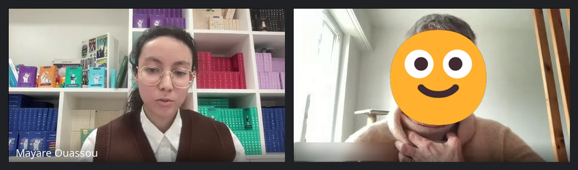
Opening interview, before the tasksAnonymised: participant's face and name hidden
The test guide, written with my tutor
10 min · Opening. Profile, booking habits, how the person usually plans a family trip.45-50 min · Tasks on the prototype. Four successive tasks, thinking aloud: choosing the stay, choosing the room, checking childcare, finalising and exploring the price. Phrased as open scenarios rather than instructions, so as not to steer navigation: "You want to book a week for your family. Show me how you would do it."10 min · Closing. Looking back on the experience as a whole.Five dimensions observed: where the person thinks they are, whether elements are found and used as intended, the perceived value of room categories, the cognitive load of each step, and reassurance before paying. My tutor reviewed the guide and reworded a few questions that could have led the answers.
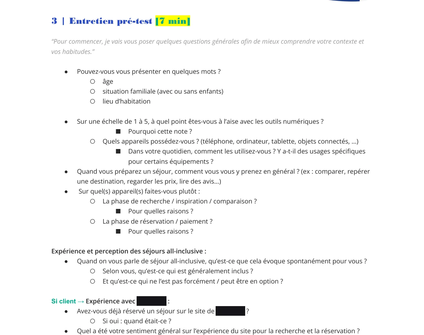
Test guide · the pre-test interviewExcerpt of the French guide, redacted
1Two branches of questions, one for clients and one for prospects: a client is asked about past stays, a prospect about what would make them try.
2Questions on how the person really plans a trip (devices, who decides, where they compare) before showing anything, to read their later behaviour against their habits.
3Wording kept open and neutral; my tutor's review removed the questions that could have suggested an answer.
05User tests · observing
What people actually did, compared with what the journey expected of them.
Sessions lasted 60 to 75 minutes, thinking aloud. As lead moderator I set the frame, gave the tasks one by one, took notes alongside the recording and used open, non-leading probe questions to understand what the person was thinking.
The hardest thing to learn was silence: letting someone struggle without stepping in goes against instinct, but it is the only way to observe the real activity rather than an assisted one.
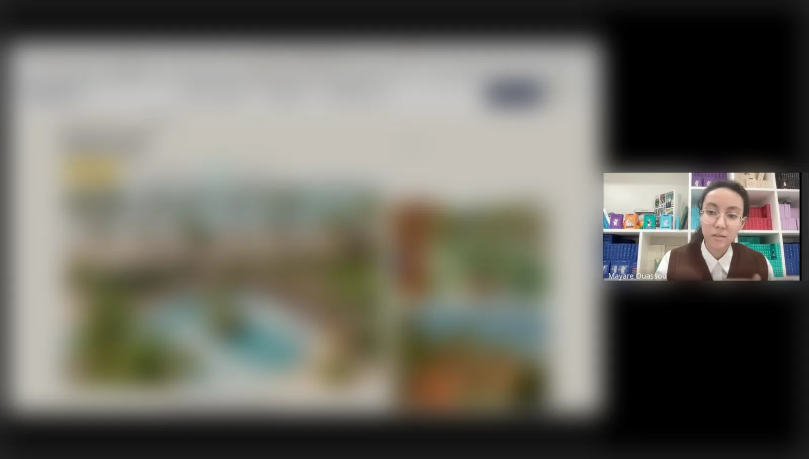
A session on the prototype, shared screenClient interface blurred
Version A · several pages
1
Resort pageSearch criteria entered easily, but four in five looked for kids' club information before even entering dates, and did not find it there.
2
AccommodationAll five paused in front of the room categories, clicked several to compare, and could not see sleeping capacity for children. "I don't understand if the Deluxe is bigger or just more expensive."
3
TransportThe least problematic step; one participant went back to change room after seeing the price summary.
4
ActivitiesMostly skipped in a few seconds, seen as less urgent or not understood as bookable in advance.
5
Participants and paymentCompleted, but everyone looked for a total price before confirming, with visible budget anxiety.
Version B · one dashboard page
1
ArrivalFour in five stayed still for several seconds, looking for where to start. "I don't know in which order I'm supposed to do things."
2
NavigationInstead of the intended freedom, three in five clicked from section to section with no priority, then came back.
3
ChildcareVisible from the main page here, and immediately welcomed: "Here it's good, I see the kids' club info straight away."
4
CompletionThree in five finished the booking; two gave up at the final summary, unable to see how to confirm everything.
Key takeaways
Across the five participants, the same patterns came back: families look for childcare first, nobody can tell room categories apart, people need the total price at every step, and prospects do not know where the all-inclusive stops and the paid options start.
06Analysis · from verbatim to insight
A quote is not an insight: five steps to get from what people say to what to change.
Participants describe what they feel, not necessarily the cause of their difficulty. So I did not stop at quotes: I followed an analysis chain from activity ergonomics, and categorised each gap with Bastien and Scapin's ergonomic criteria.
2Cross with behaviourMatched with clicks, pauses, back-and-forth. A silent behaviour counts as much as a quote.
3Find patternsKept only if it appears for at least three participants on the same prototype: isolated incident or systemic problem.
4InterpretExplain the mechanism: the gap between the prescribed task and the real activity.
5Check the hypothesesConfirm, nuance or reject the hypotheses set earlier.
Raw quote"I don't know if I'm supposed to click on Accommodation first or if it's automatic." (version B)
Observed behaviourA 12-second pause, three clicks on non-interactive areas, a detour to Transport, then back.
PatternFour of five on version B: no visual hierarchy between sections, so the expected order cannot be read.
InterpretationRemoving the explicit sequence creates an orientation load: the person must understand each section, how they depend on each other, and where to start, all at once.
HypothesisPartly confirmed: the open architecture gives faster access to priority information, but disorients without visual guidance. It is conditionally better, not better in itself.
Analysis grid · "User Test Layers"Every session coded along the same layers of the journey.
1. USER CONTEXT· Age· Family situation· Digital comfort (1-5)· Preferred device (search)· Preferred device (booking)· Experience of the brand's website· All-inclusive past experience
2. ALL-INCLUSIVE PERCEPTION· All-inclusive definition· Expected inclusions· Expected optional items· Motivations for this type of stay· Barriers or concerns
3. NAVIGATION & DESIGN· Preferred prototype version· Experience rating (/10)· First impression· Navigation ease· Information clarity· Bottom navigation tabs
Recreated from the shared analysis grid, without names or content. For each participant, one column; for each layer below, the observations and verbatims recorded during the session. The same frame for every market made the sessions comparable.
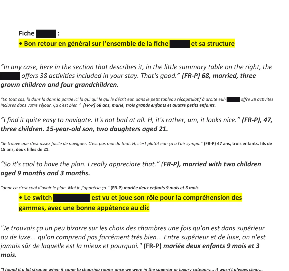
My French synthesisExcerpt, redacted
1One insight per block, highlighted, written as a finding the product team can act on.
2Under each insight, the verbatims that support it, in English for the client and in French as said, so nothing is lost in translation.
3Each quote tagged with an anonymised profile (market, client or prospect, age, family) instead of a name.
Guidance
The interface does not give the information needed at the moment it is needed.
Significance of codes
Opaque or misleading terms, like an unexplained booking option nobody dared to use.
Explicit control
Users cannot pause, correct or resume: "If I close, everything disappears."
Workload
The cognitive demand of each step, highest at the accommodation choice.
Three contrasting cases show why this matters. A retired prospect, methodical, reading every screen: his difficulties came from three local design gaps, not from a lack of digital skill. A marketing manager with two very young children: she came with one prior question, whether babies are catered for, and gave up when the journey never answered it. A new client, an engineer: the open dashboard let him follow his own priorities. A standard reading would see three problems; activity analysis shows three different mechanisms, each calling for a different fix.
07Diagnosis and proposals
Five gaps between the journey as designed and the activity as lived, and what to change.
D1 · A funnel against real strategies
Families move by their own priorities (childcare, then price, then room), whatever order the journey imposes.
D2 · Overload at the accommodation step
Rooms shown one after the other, weak differences, unclear inclusions, and no answer to the families' first question: where do the children sleep?
D3 · Childcare, an entry condition
Without it, families do not even start booking, yet the information is scattered.
D4 · From dreaming to paperwork
The switch from exploring the stay to filling in forms breaks the experience: from pleasure and projection to pure task (Hassenzahl's hedonic and pragmatic attributes).
D5 · AI, wanted and feared
Open to AI in daily life, but many reject it during booking: it has to stay optional, contextual and transparent.
What this changes
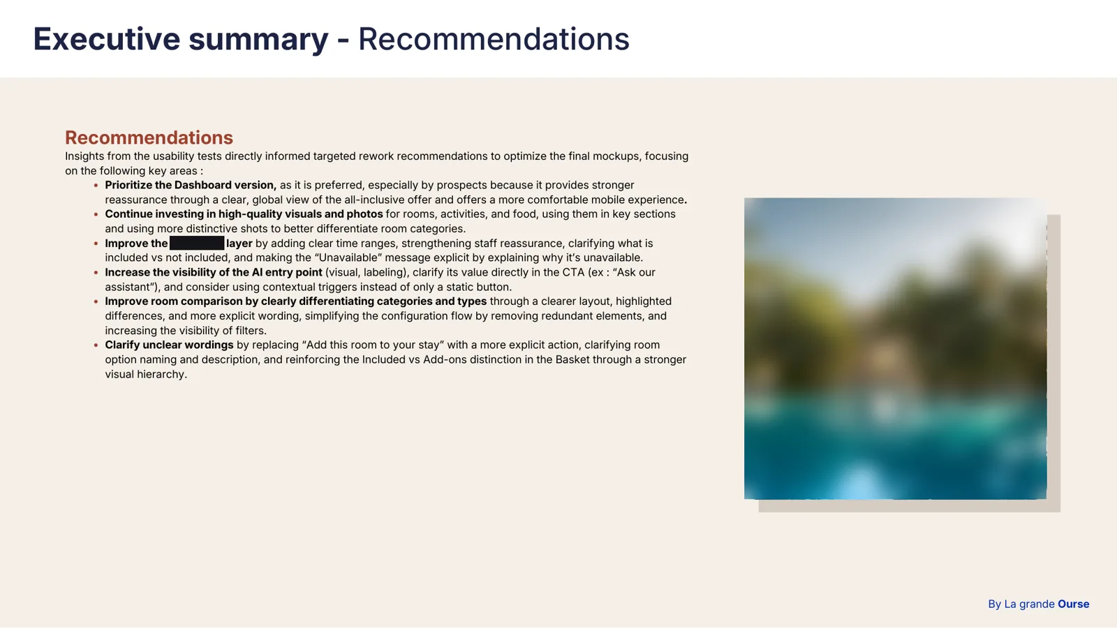
Each proposal below answers one gap, with a priority based on its estimated impact on completion and on cognitive load.
Diagnosis
Area
Proposal
Priority
D1
Navigation
Replace the sequential funnel with a "stay hub" page to move freely between the parts of the stay.
High
D1
Navigation
Show the total price as it builds, updated with every choice.
High
D1
Navigation
Let people resume their booking from any device.
Medium
D2
Accommodation
Compare room categories side by side: photos, layout, capacity, inclusions.
High
D2
Accommodation
Suggest a room based on the group (number and age of children).
High
D3
Childcare
A short childcare sheet (clubs, ages, safety, hours) from the resort page onwards.
High
D3
Childcare
Filter resorts by childcare availability from the first search.
Medium
D4
Journey
Move activities upstream as inspiration, outside the transactional steps; prefill the participants form from the account.
High
D4
Journey
Visually separate what is included from paid options at every step.
Medium
D5
AI
Introduce AI step by step, explain each suggestion and let people change or ignore it.
My French synthesis (observed behaviour, illustrative quotes and a recommendation for each insight) became the French part of the global restitution, presented in English by my tutor to the client's UX, product, marketing and data teams.
08Impact, limits and what I learnt
Research as a shared language between teams that did not speak the same one.
What happened next
The test findings went into the final rework of the mockups before development. In the client's redesign plan, room value, all-inclusive clarity, a smoother journey, the basket and price feedback were handled first; childcare details and transport were set as the next step. Implementation then belonged to the client's internal teams; I recommended a second round of tests once the changes are built.
What research made possible
Aligning product, marketing, data and AI teams with different stakes, and taking decisions out of personal preference: it is hard to say "I prefer this" in front of what users actually did.
Limits
A remote test is not a real purchase: no real money at stake, an observer present. The high-income criterion leaves out people less at ease with interfaces. And arriving mid-project, I did not take part in the framing or the qualitative interviews.
My lessons
Observing before producing; staying silent to see the real activity; separating what comes from the user and what comes from the system; writing for audiences with very different stakes.
CONFIDENTIAL PROJECT
Client identity, figures, verbatims and screens are covered by a non-disclosure agreement. The detailed version of this case study can be presented in an interview.
NEXT_CASE_STUDY
UX RESEARCH : NDA
HEALTH DIRECTORY
UX/UI redesign of the health facility directory of a leading French mutualist group - audit, wireframes, UI, and 6 moderated test sessions with family caregivers. Client under NDA.
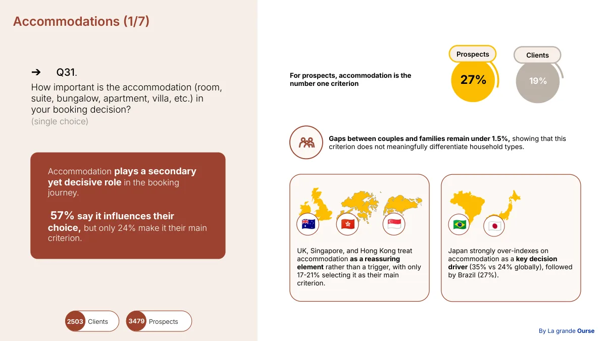 Survey restitution · accommodationAgency deliverable, redacted
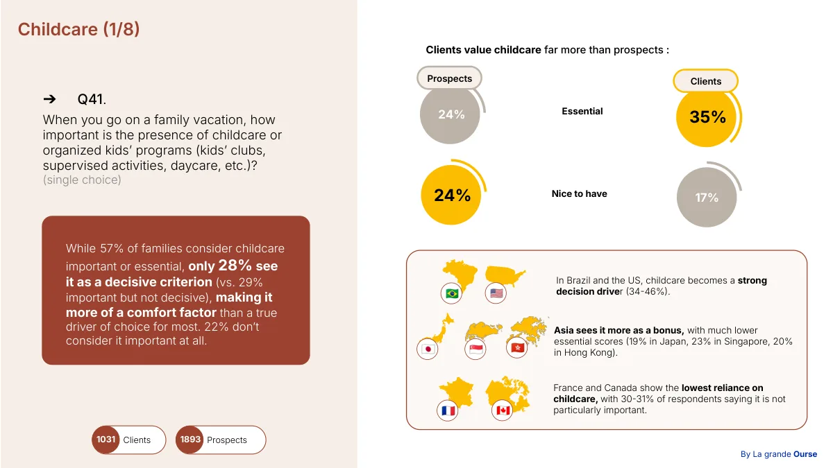 Survey restitution · childcareAgency deliverable, redacted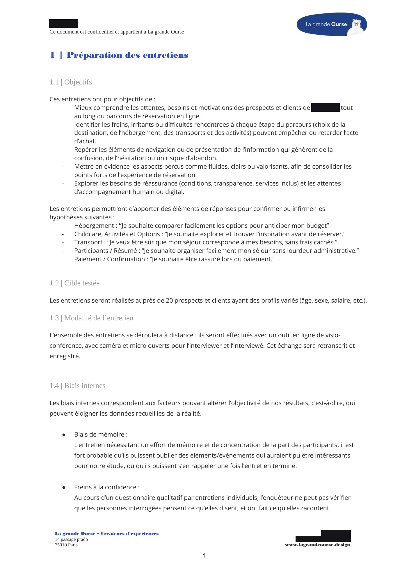
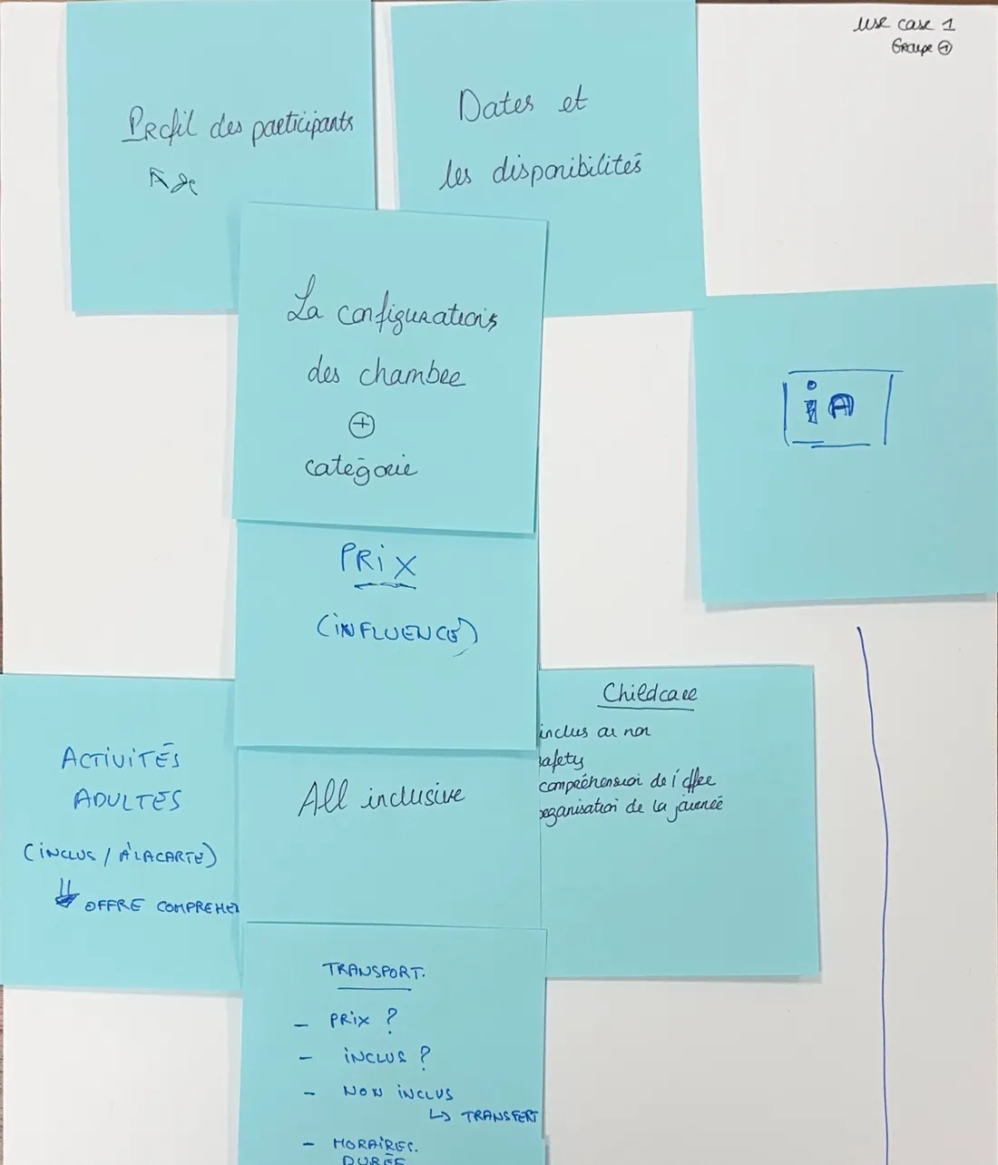 UC1 · the groups' post-it wallWorkshop production
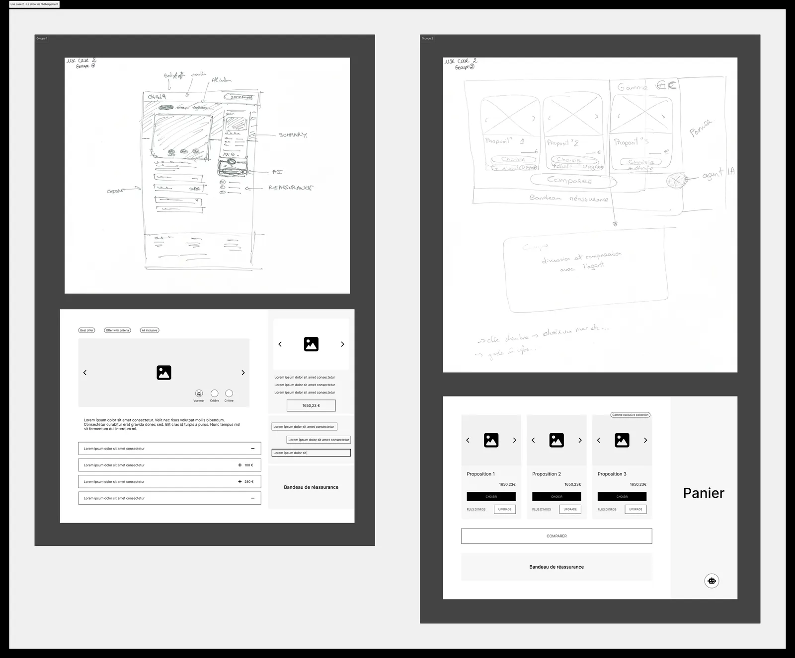 UC2 · from sketches to wireframesSketches redrawn in Figma after the workshop
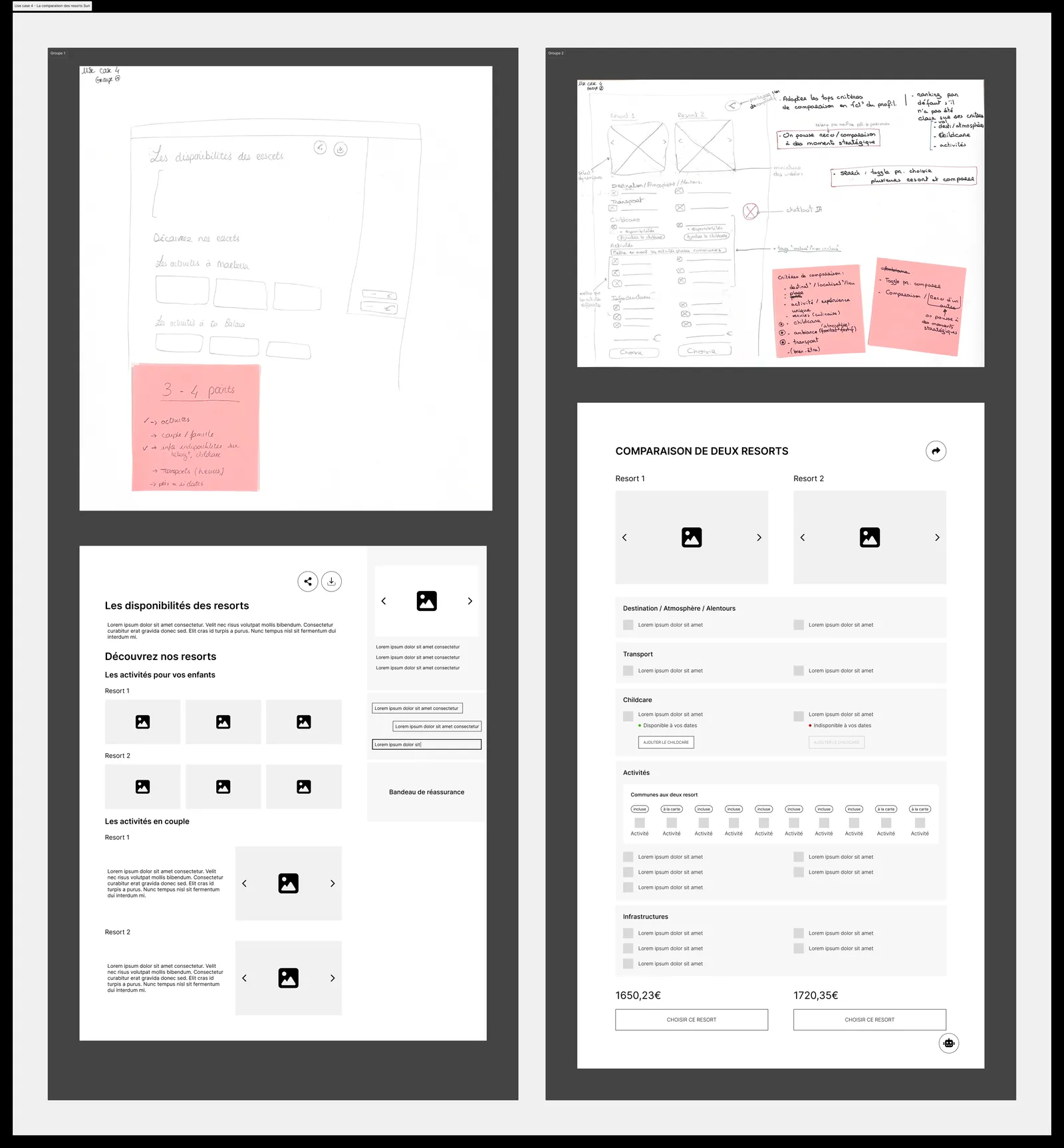 UC4 · comparing resorts, from sketch to wireframePlaceholder content, no client data