NDA
UX RESEARCHNDAHEALTHCARE2026
La grande Ourse Agency UX/UIx Confidential Client HEALTH DIRECTORY
UX REDESIGN & USER TESTING
UX/UI redesign of the online directory of health and care facilities of a large French mutualist group. Audit, site tree, wireframes and UI by the agency; on my side, the test guide and the moderation of user tests with relatives looking for a facility for an elderly parent. All client-identifying details are protected under NDA.
NDA_ACTIVEClient identity, brand assets and mockups are confidential In one sentenceThe test protocol, from a blank page to the sixth session.
On this mission, run alongside my internship, I wrote the test guide, designed the note-taking grid and co-moderated the six sessions with relatives of elderly people. The tests showed that trust came from the phone, from outside reviews and from concrete information, far more than from the group's own discourse.
AContext
A directory people open at the worst moment: when a parent can no longer live alone.
The site lists the health and care facilities of a large mutualist group: health centres, clinics, care homes, home support, services. The client wanted it clearer, more interactive and more consistent, within its brand guidelines, its CMS and its SEO needs. The agency ran the redesign end to end; my tests focused on the most demanding audience: relatives looking for a facility for an elderly parent.
Test audienceRelatives aged 40 to 65 of someone over 65, searching now, in the last 12 months or in the next 6.
What weighs more than elsewhereThe emotional load of the search, legibility and accessibility (RGAA), the credibility of a healthcare provider.
Research questionDoes the new journey guide, reassure and lead to contact, whether arriving from Google on mobile or browsing on desktop?
Feb. 2026Kick-offContext, phases, governance with the client's marketing, SEO and IT teams.
19/02/2026Audit and site treeRestitution of the UX/UI audit and the new site tree.
26/02/2026Navigation and homepageWorking session on the header and homepage wireframe. My minutes.
Spring 2026Test guideSeveral iterations of the guide before the sessions.
Spring 20266 sessionsRemote, moderated in pairs, mobile then desktop.■ Team milestone■ My direct involvement
What I did1Wrote the full test guide: objectives, recruitment criteria, biases, scenario, mobile then desktop protocol, debrief.
2Built the note-taking grid, one column per participant, mirroring the guide step by step.
3Co-moderated the 6 remote sessions with the designer, who handled the prototype.
4Took the structured minutes of the navigation and homepage wireframe meeting.
5Supported the analysis of the UX/UI audit (facility cards, results page, navigation).
What the team did, and I worked from· UX/UI audit and site tree, led by the lead UX researcher and the lead designer· Wireframes, art direction and high-fidelity UI· Figma prototype used in the testsI joined this mission alongside the main project of my internship.
BAudit and site tree
What the audit found, and the site tree that came out of it.
The audit was run by the agency before my tests; I took part in analysing its results on the cards, the results page and the navigation. Its findings became points to watch in my guide.
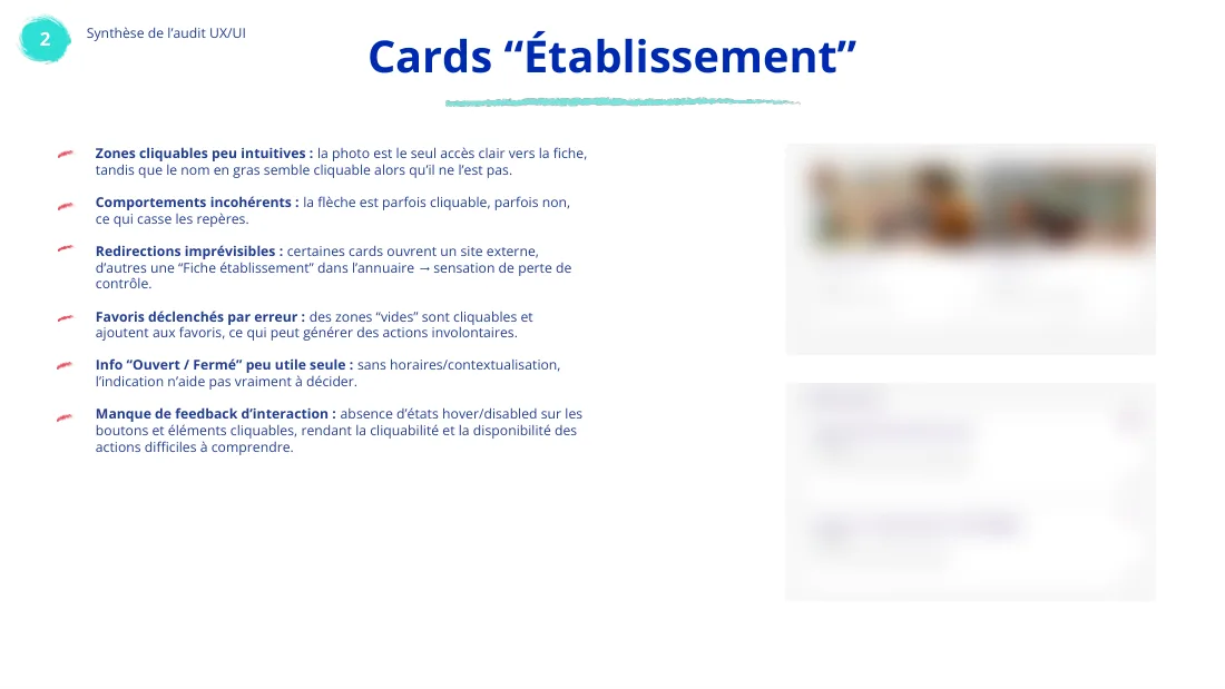
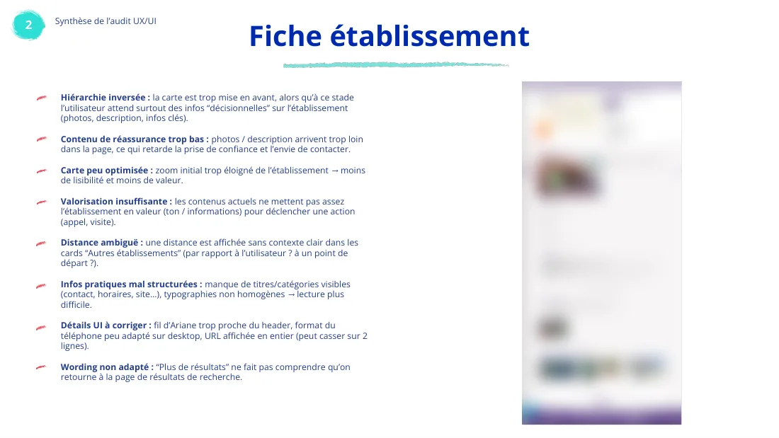
ScreenWhat the audit foundRecommendationHomepageLittle guidance: the site and its types of facility are not explained, the keyword search gives no examples, suggested facilities appear with no visible logic.→ Put the search at the centre, with suggestions and a guided location; show no facility before any criteria.Facility cardsThe photo is the only clear link, the bold name looks clickable but is not, some cards leave the directory for an external site.→ One consistent clickable zone with hover and focus states, always lead to the facility page, explicit opening hours.Results pageLooks like the homepage, no total count, inconsistent filter wording, a typed city is erased if not picked from the list.→ A distinct layout, the count up front, list and map side by side, richer and fewer cards.Facility pageInverted hierarchy: the map comes first, while photos, description and key information arrive too late to build trust.→ An introduction block with description and quality visuals at the top; a common base plus modules per type of facility.FavouritesNo guidance, no saving rule, no sorting, cards not clickable.→ Remove the feature: it adds no value to a directory.
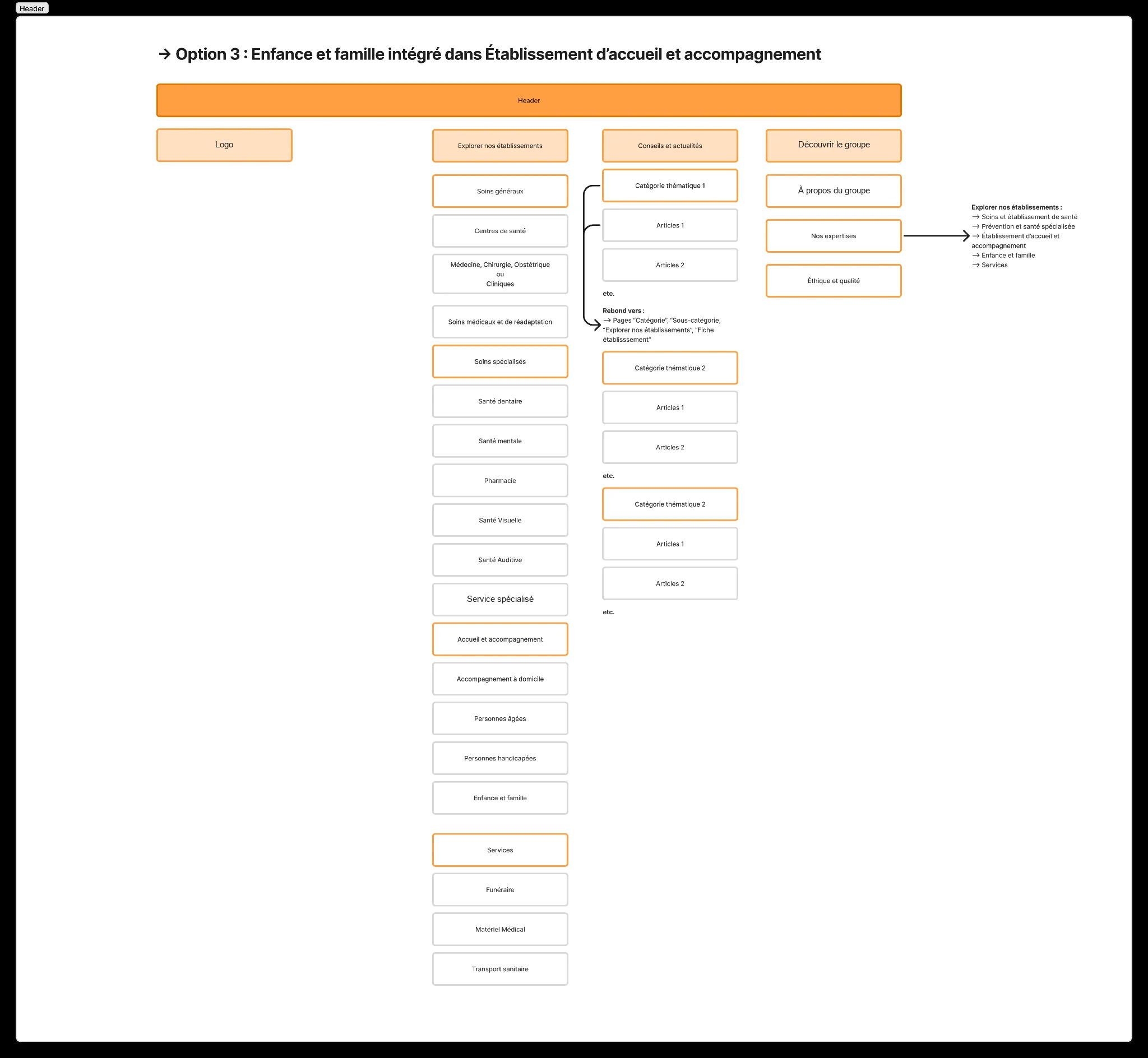 Site tree · the chosen headerFigJam diagram, brand masked
Three entries, four families of care1One option among several: here 'option 3', where childhood and family join support and care instead of having their own entry.
2Facilities are grouped by need (general, specialised, support, services) rather than legal status: the logic a relative follows when searching.
3Advice articles link back to categories and facility pages: editorial content leads back to the search instead of being a dead end.
4This is the structure participants went through on desktop, down to the 'Older people' page.
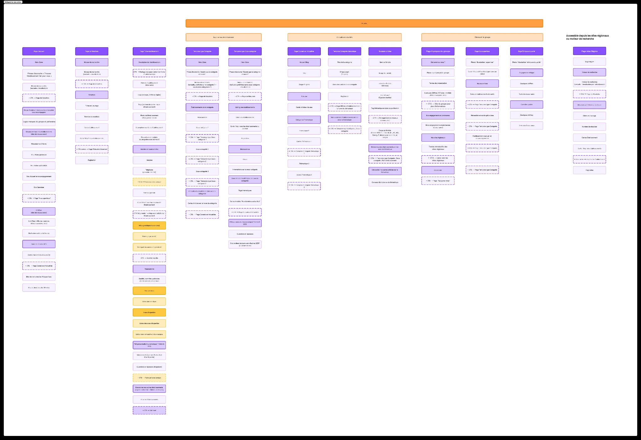 Architecture · zoning of the twelve page templatesFigJam diagram, brand masked
Each column is a page (home, results, facility page, category, sub-category, advice, theme, article, group, expertise, ethics, regional results) broken into blocks in reading order. This document was the basis for the wireframes, then for the prototype I tested.
CSession of 26/02
My minutes: ten decisions, and who raised them.
One hour with the client's marketing, SEO and IT teams to settle the header, the footer and the homepage wireframe. I kept the minutes: each decision, who raised it and its status at the end of the session, so nothing was lost between two meetings.
TopicDecisionRaised byStatusSearchMove the radius out of the search bar into a filter on the results pageConsensus agency, SEO, IT, marketingDone in sessionSearchKeep an explicit action button for accessibilityAgencyKeptHeaderSecond-level items clickable, to add a layer of contentMarketingDecidedHeaderBurger menu on the left or rightNo client constraint; agency recommends leftOpenHomepageMake the four family titles clickable, like the headerAgencyDone in sessionHomepageRemove the expertise block, judged of little useAgency, SEODone in sessionMobileCarousel or stacked cards for the four familiesTwo variants to produceTo arbitrateArticlesOne clickable zone per card, never several linksUX and SEODecidedSEOOn mobile, 4 to 6 links then 'See more', links kept in the page codeSEOTo produceFooterMove the sitemap link next to the legal linksSEODone in session
What I took from it: accessibility has to be argued in the room, facing SEO and marketing. The search's explicit action button was kept for that reason, and the radius became a filter, something participants asked for again during the tests.
DThe test guide
A realistic scenario, two devices, a live switch from one to the other.
Five objectivesNavigation and key journeys (filters, list and map, facility page) · trust and understanding of the group's offer · showcasing facilities · first impression from Google (SEO) · legibility of editorial pages.
Biases anticipatedInternal: courtesy, memory, social desirability, affective and negativity bias. External: researcher subjectivity, self-selection, sample size. One countermeasure: telling participants I do not work for the client.
Phase 1 · mobileSEO entry, about 15-20 min
1 Blank Google page2 Own keywords3 Reads the result title4 'Simple' facility page5 Back to the homepage
Phase 2 · desktopFull journey, about 35 min
1 Homepage2 Search: care home near Tours3 Results, list and map4 Chooses a facility5 'Mini-site' facility page6 Sector navigation7 Sector page8 Looks for advice9 Reads an article10 Looks up the group11 About or ethics page
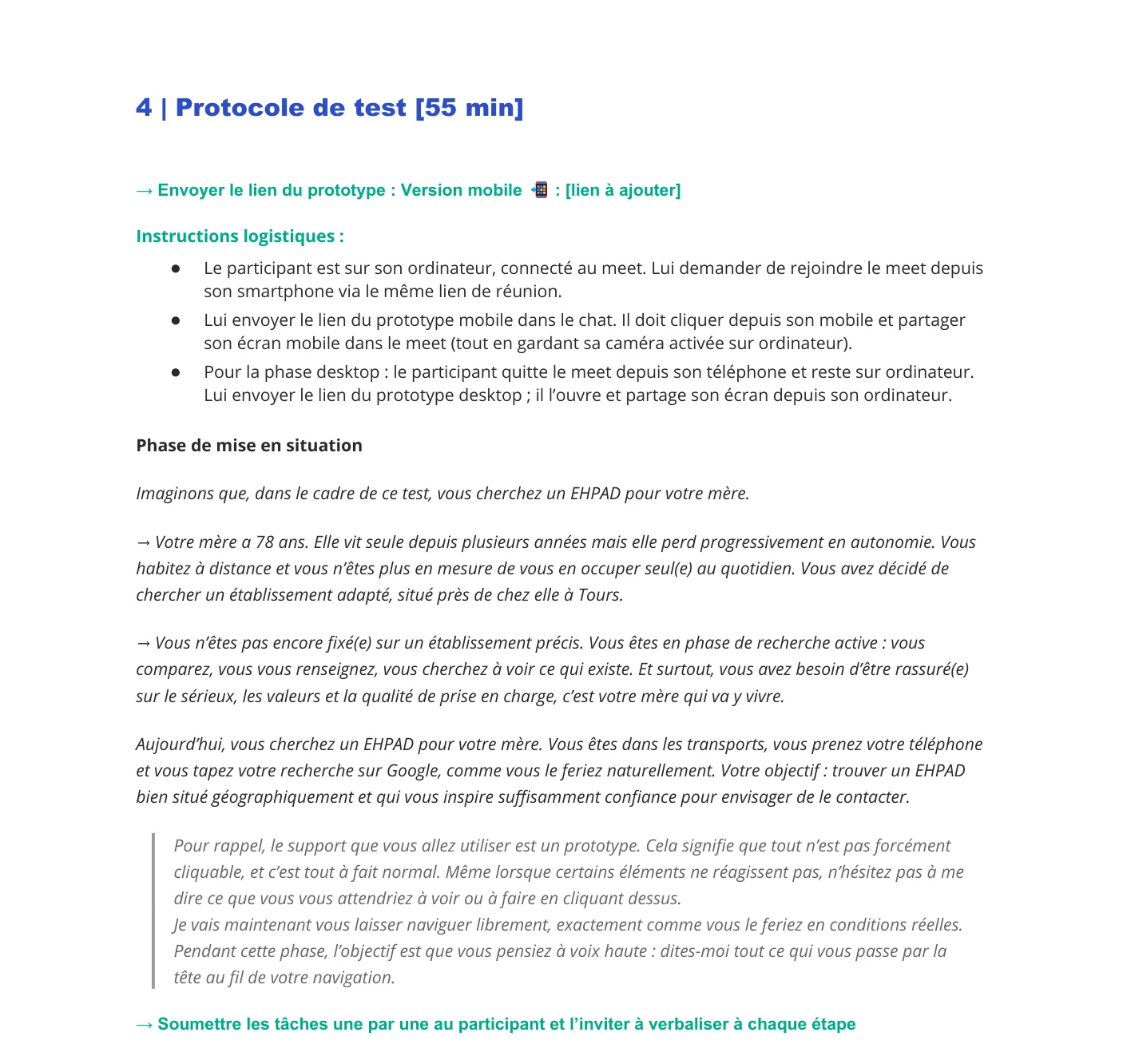 Guide · logistics and scenarioExcerpt, redacted
1A situation participants already knew: a 78-year-old mother losing autonomy, a child living far away. They search 'as they really would', on the phone, on the move.
2The device switch written out step by step: join the call from the phone to share the mobile screen, keep the computer's camera on, then switch to desktop.
3For each step, an instruction, follow-up questions and an analysis goal: what the step should help us understand, not only what the person should do.
EParticipants
Six relatives, six stages of the same search.
Recruited through the agency's network, aged 40 to 65. The criterion that mattered most was the stage of the search: some had already placed their parent, others had not started, one searched several times a year. That spread showed the same screen read with different levels of urgency.
CodeAgeSituationLooking forStageP1Not givenRural area, father losing autonomyCare home close to herPaperwork under wayP250-59City, no dependantRetirement homeAlready placedP340-49Rural area, fatherCare homeAlready placedP440-49Paris, father in his eightiesRest and care staysSeveral times a yearP540-49Rural area, legal guardian of her fatherCare home with a secure unitActive searchP640-49Father losing some autonomyAny suitable facilityNot started
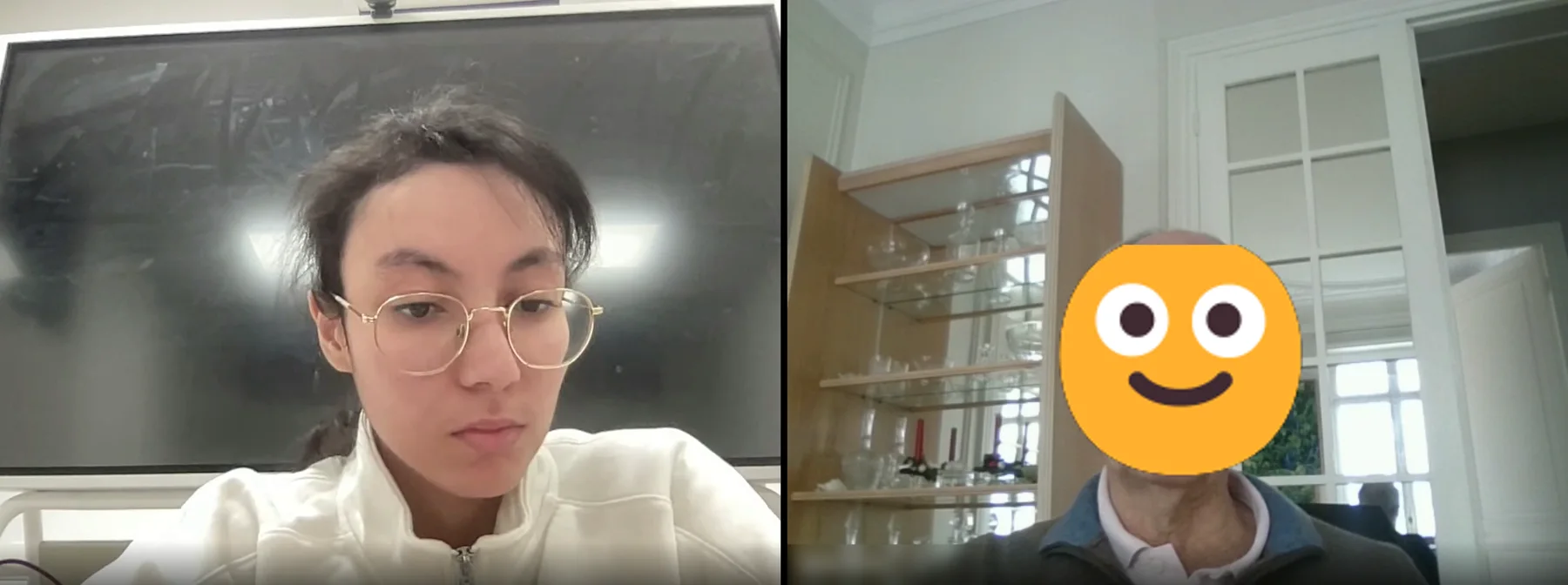 Illustration · a remote test session, moderator on the leftParticipant masked
FWhat the sessions showed
People trust the phone and reviews, not scores or the group's own discourse.
The tested journey, step by step. Each line comes from the analysis grid, counted across the six participants; lines without a counter gather qualitative observations.
BeforeHabits
6/6Start their search on Google
5/6Search mostly on their phone
4/6Did not know the group at all
6/6Had never visited one of its sites
3/6Name distance and availability as their first criteria
MobileGoogle result
3/6Click the first link by reflex
Most read the facility's link as a directory, not as one specific facility.Mobile'Simple' facility page
5/6See and understand the call buttons
5/6Would have contacted the facility, all of them by phone
2/6Thought the service tags were clickable
The A-to-D quality score fell flat: read as a food label, or as a score the group gives itself. Text reviews and stars, like on Google, built real trust.'Opening hours' is ambiguous for a care home: reception or visiting hours? Prices, financial aid and admission terms were missing.DesktopHomepage and search
The search bar was found at once; every participant who commented called it intuitive.
DesktopResults, list and map
4/6Explicitly prefer the list view
Filters they asked for: permanent or temporary stay, availability, ratings, a secure unit, the radius at the top.Desktop'Mini-site' facility page
Tabs understood immediately; more is read on desktop than on mobile. Reviews come first: 'for me it's the most important'. People want to see life inside, not just a building.
DesktopGroup and sector pages
Split reactions: key figures and national presence reassure some, others see 'a big financial group' and only trust outside reviews.
Facility name and photo
Call · Directions · Contact1
Opening hours2
Quality score A B C D3
MealsActivitiesCare4
Map
Reviews ★★★★☆5
Prices · aid · admission (absent)6
1Call buttons seen and understood by 5 of 6. All 5 who would have made contact would have phoned.
2Opening hours are ambiguous for a care home: reception, or visiting hours?
3The A-to-D quality score fell flat: read as a food label, or as partial.
4Service tags look clickable: 2 of 6 tried.
5Reviews and stars, like on Google, are what builds trust.
6Missing and blocking: prices, financial aid, admission terms, photos of life inside.
Schematic redrawn from the guide and the notes, neutral blocks, approximate order · not the client's designP1'Honestly, it's very, very good.' P2Remove the fear of a big group, not personal enough. P3No opinion: had never heard of the brand. P4Would call, but would double-check with their own research. P5Some small pieces of information missing. P6Found everything; not 10 because 10 is perfection. Trust question, 1 = 'I close the site at once', 10 = 'I contact this facility with my eyes closed'. Median 8.One word for: Navigationsimplesmoothclear, easysimpleeasysufficient
One word for: Amount of informationprecisesufficient, legiblea lot on the site, complete on facility pagesreassuringfinesufficient
One word for: Vocabularyprecisevery clearaccessible to allsimplesome terms need explainingfine
Synthesis · user tests01
Finding a care home for a parent: what reassures, what blocks6 relatives aged 40 to 65, remote, moderated in pairsPhase 1: mobile, arriving from Google. Phase 2: desktop, full journeyReading frame: Bastien and Scapin, plus RGAA points of attention5/6 would have called the facility
What works02
Finding and calling is easySearch bar found at once and judged intuitiveCall buttons seen and understood (5/6)Mini-site tabs understood without helpNavigation described as simple, smooth, clear« Honestly, it's very, very good. » · P1
What blocks03
Trust does not come from the groupA-to-D quality score read as a food label or as self-ratingPrices, aid and admission terms missing on the care-home pageOpening hours: reception or visits?Service tags taken for buttons (2/6)« It feels like too big a group, too financial. » · P2
Recommendations04
Put the phone, reviews and hard facts firstShow when to call and that someone will answerBring outside reviews up; rethink or explain the A-to-D scorePrices, aid, admission even on the simple pageCare-home filters: stay type, availability, secure unitPhotos of daily life, not only the building
GLeads and hindsight
Six leads for what comes next, and what this mission taught me.
01Contact is the first criterionNot just a number: knowing when to call and that someone will answer.
02Outside reviews over in-house scoresRethink or explain the A-to-D score; bring reviews and stars higher.
03A care-home page needs its hard factsPrices, financial aid and admission terms, even on the 'simple' template; separate reception and visiting hours.
04Show life insideRooms, garden, shared spaces, menus and activities: relatives project their parent into the place.
05Filters made for this searchPermanent or temporary stay, availability, secure unit, ratings, radius visible from the start.
06Tags that look like what they areNon-clickable tags must not look like buttons.
LimitsSix participants recruited through the agency's network, on a prototype where not everything was clickable, over video: enough to find problems, not to measure them. Some counts still had to be checked against the recordings.
What I take from itWorking in parallel on a holiday booking engine and on this directory showed me that Bastien and Scapin's criteria do not change from one audience to another: what changes is how each gap shows up, and what it costs the user.
The documents shown here are redacted: client name, brands, people and screenshots of the site. Participants are referred to by a code, their ages by a range.