In one sentenceAn emergency site that makes people read before it guides them.
With a UX/UI designer, I audited seven screens and the navigation of the website of a network of on-call veterinary clinics, criterion by criterion. Of 31 findings, 10 are major, and almost all of them touch what a person in an emergency needs first: knowing where to tap and filling in a form without mistakes.
01Context and stakes
People looking for an on-call clinic, often at night, with an animal in pain.
The client is preparing a redesign of its website. Before designing anything, it wanted to know what holds back pet owners in an emergency today. It had five stakes, two of which weigh directly on ergonomics (in red).
Mobile firstRedesign the experience for mobile first, consistent with users in an emergency.
Fewer callsEncourage the 'notify your arrival' form to cut the volume and cost of phone calls.
Keep SEO, add GEOKeep the ranking of 600+ pages and prepare for AI search engines and an international audience.
AutonomyLet the communication team manage the site without depending on one technical profile.
New clinicsAdd partner clinics without heavy technical work.
Main audienceThe general public, aged 55-64, on mobile, in an emergency.
Secondary audienceClinics and vets who want to join the network, through a partner page.
My roleUX research intern, in pair with a UX/UI designer: audit grid, screen analysis, recommendations, then a restitution co-presented to the client.
02Personas
Two owners, two emergencies: the one who knows, and the one who doubts.
During the project, I had built two personas: a long-time owner and a new owner with a rabbit. The original files stayed on the agency's tools; these are reconstructed for this portfolio from that memory, from the audit's target audience and from its findings.
🐕Gérard61 · an 11-year-old dog · experienced owner
« I know when it's serious. What I want is to know where to go, right now. »SituationHis dog is getting old; he has been through night emergencies before. He searches on his phone, often at night or at the weekend.
GoalFind the nearest on-call clinic, call it or notify his arrival, and leave.
FearLosing time on a site that makes him read instead of guiding him while his animal suffers.
ConstraintsMobile, one hand busy, stress; glasses not always at hand: small text and small buttons get in the way.
What the current site makes hard (audit)Two competing actions at the top of the homepage, a postcode field with no example, blocks of text before the action, white text on dark blue that is hard to read.
🐇Camille34 · a rabbit adopted a few months ago · new owner
« I don't even know if it's an emergency, or whether they treat rabbits there. »SituationFirst pet, a rabbit, an exotic pet. Her rabbit has stopped eating since this morning; she doubts everything.
GoalUnderstand whether she should go now, and find a clinic that treats her rabbit.
FearMaking the trip for nothing, or waiting too long, and choosing the wrong clinic.
ConstraintsFew landmarks in veterinary vocabulary; she fills in a form under stress without knowing what is expected.
What the current site makes hard (audit)A form with no required fields or expected formats, an ambiguous 'Send request' button, the clinic's address disappearing once selected.
What the site prescribesWhat happens (likely real activity)Find the on-call clinic by postcode from the homepage→ Arrives from Google on a city page, sometimes taps 'Contact' first because it sits at the same level as the searchFill in the 'notify your arrival' form→ Calls directly: under stress, the phone feels faster and safer than a form whose requirements are unclearRead the clinic page to prepare the visit→ Scans for the address, phone and opening hours, skipping long descriptive text
03Method
One grid, eight criteria, a severity scale, a journey as the common thread.
ScopeThe journey, the homepage, a clinic page, a city page with two clinics, a secondary page, online registration, contact, the partner page, then navigation and site tree. Mobile first.
The gridEach finding is tied to a screen, a Bastien and Scapin criterion and sub-criterion, with a comment, a severity and a recommendation, completed by accessibility, mobile and visual checklists.
PositiveTo keep
MajorTo change
CriticalTo change, mandatory
InformativeNot to forget
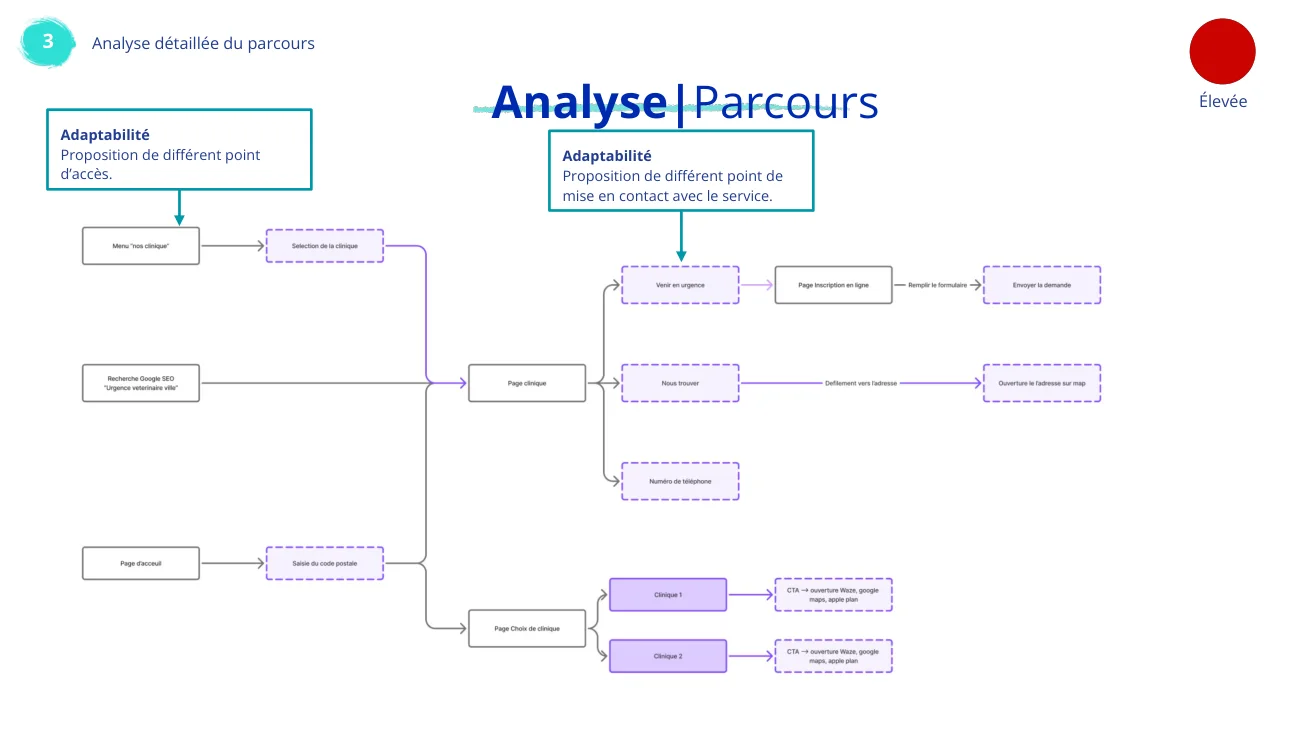 Restitution · the journey analysedReal deliverable
1Three real entry points: the menu, a Google search for 'emergency vet + city', the postcode on the homepage.
2Three ways to reach the clinic: call, notify your arrival, send a request. This is where the client's stakes play out.
3A journey rated high severity, read through adaptability: several entry points and several ways to reach the service, to be made clear for someone in a hurry.
04Findings
31 findings, and seven of the ten major ones are errors the site lets through.
By screen and severity■ Major · 10■ Minor · 13■ Informative · 8
By Bastien and Scapin criterion1GuidanceHelp users know where they are and what to do
11 2WorkloadReduce cognitive and visual effort
5 3Explicit controlThe system acts only on request
1 4AdaptabilityFit profiles and contexts
0 5Error managementPrevent, flag and correct errors
9 6ConsistencySame conventions everywhere
1 7Meaningful codesTerms and icons understood at once
2 8CompatibilityMatch real habits and contexts
2 Number of findings in the audit grid per Bastien and Scapin criterion (31 findings in all). The forms concentrate the problem: registration, contact and partners never say which fields are required, which format is expected, or what happens on error. For someone filling them in under stress, that is exactly where people give up and pick up the phone, which the client wanted to avoid.
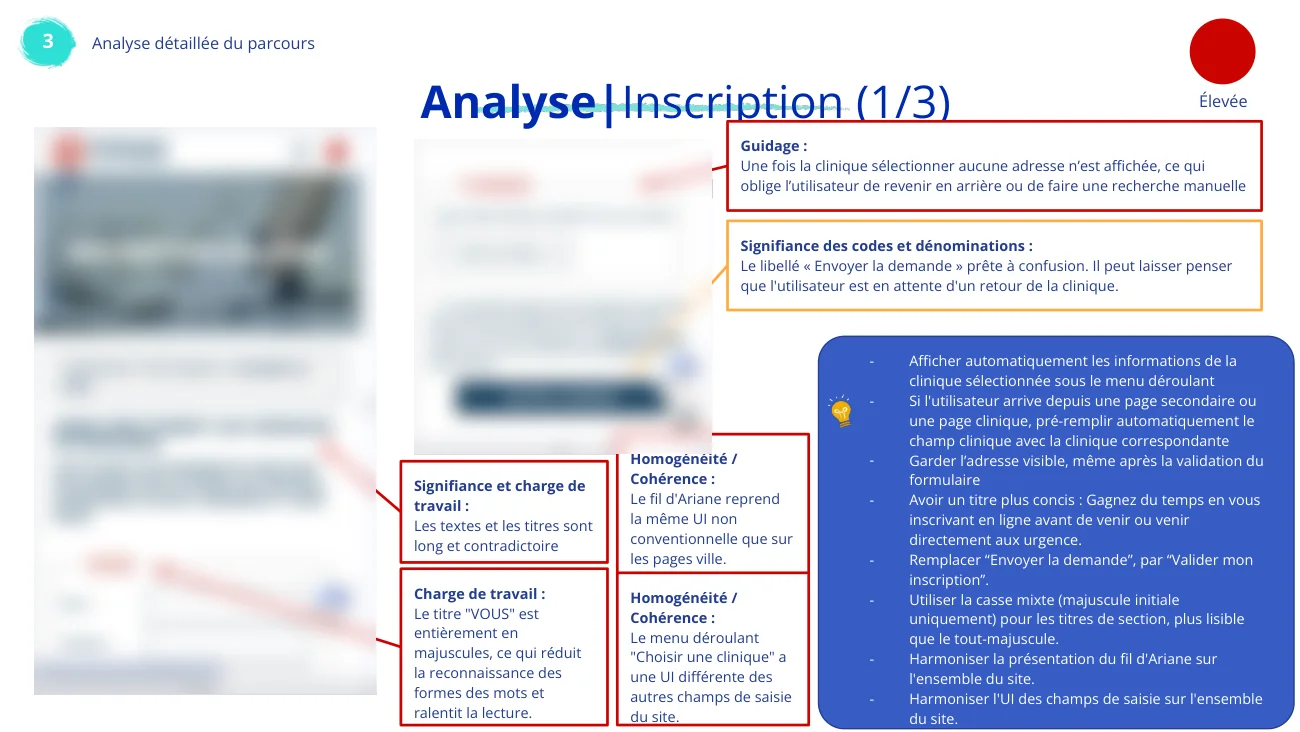
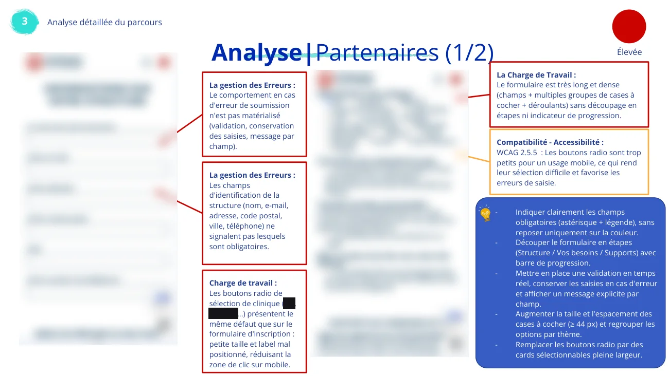
Five major findings, from the gridScreenCriterionFinding (major)RecommendationHomepageGuidanceTwo competing actions at the top (search by postcode and 'Contact') with no clear priority: in an emergency, users do not know which path to take.→ Make finding an on-call clinic the visual priority; demote and rename 'Contact'.HomepageCompatibilityVideo, advice sheets and reviews come before the essential action.→ Emergency number and nearest on-call clinic at the very top.RegistrationError managementNo required field is marked and no format is given (postcode, phone, email, age).→ Asterisk plus legend, examples in each field, typed fields to open the right mobile keyboard.ContactError managementNothing shows what happens when submission fails.→ Real-time validation, keep what was typed, a message next to each field.Partner clinicsWorkloadA very long form, many checkbox groups and drop-downs, no steps or progress.→ Split into steps (structure, needs, supports) with a progress bar.
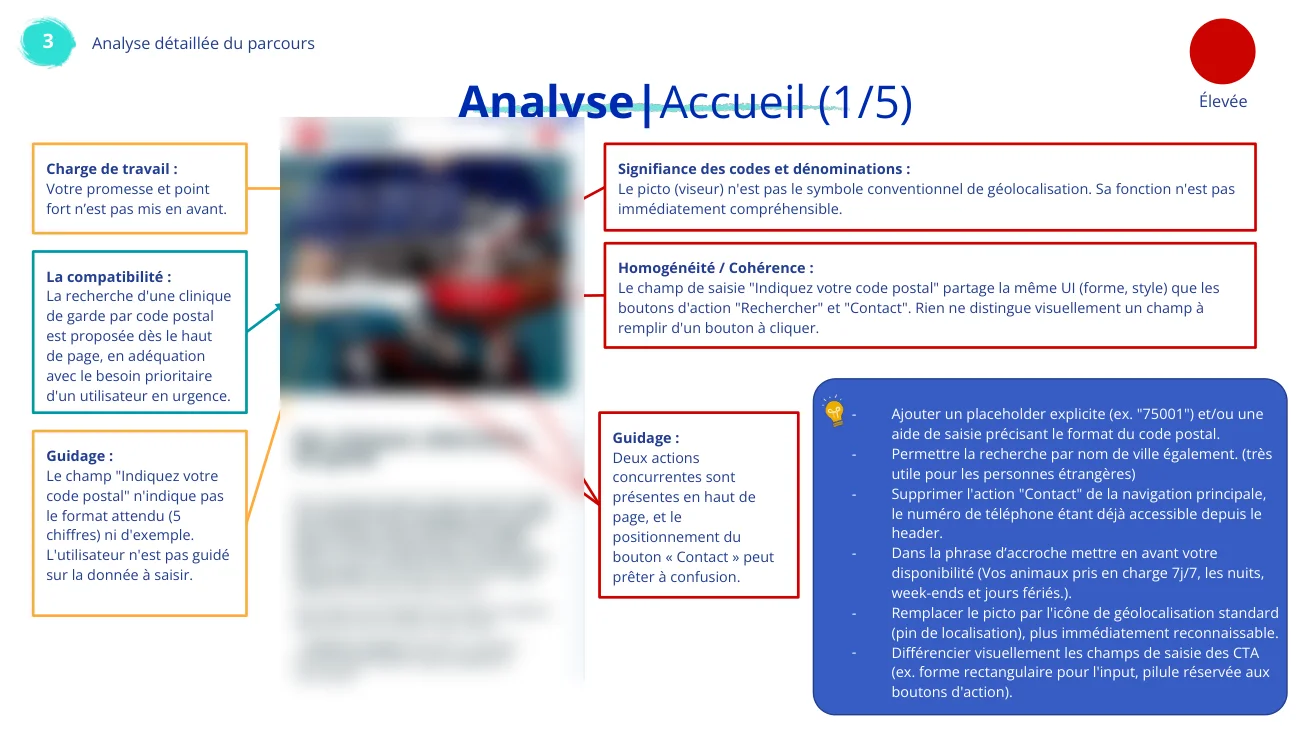 Analysis · homepage (1/5)Screenshots blurred
1Each box links a flaw on the screen to a criterion: the frame colour gives the severity, the blue box gathers the recommendations.
2Here, searching by postcode is the right idea (compatibility) but poorly guided: no example, an unclear icon, the same style as the 'Contact' button.
05Recommendations
Three workstreams: ergonomics, pages, and AI search engines.
Ergonomics· A shared set of labels and standard components (cards, buttons, forms)· Three calls to action per page at most, with a clear hierarchy· No all-caps text, AA contrast, a text label with every icon· Red kept only for emergencies and errors
Pages· Address, phone and hours above any editorial content· Short, punchy sentences instead of blocks of text· A permanent sense of position: active menu item, breadcrumb· Long SEO content moved to the bottom of the page
GEO (AI search)· LocalBusiness structured data on every clinic page· A FAQ section per page, the format AI answers draw from· Editorial authority: named veterinary author, sources, updates· Translate the pages with the most tourist traffic first
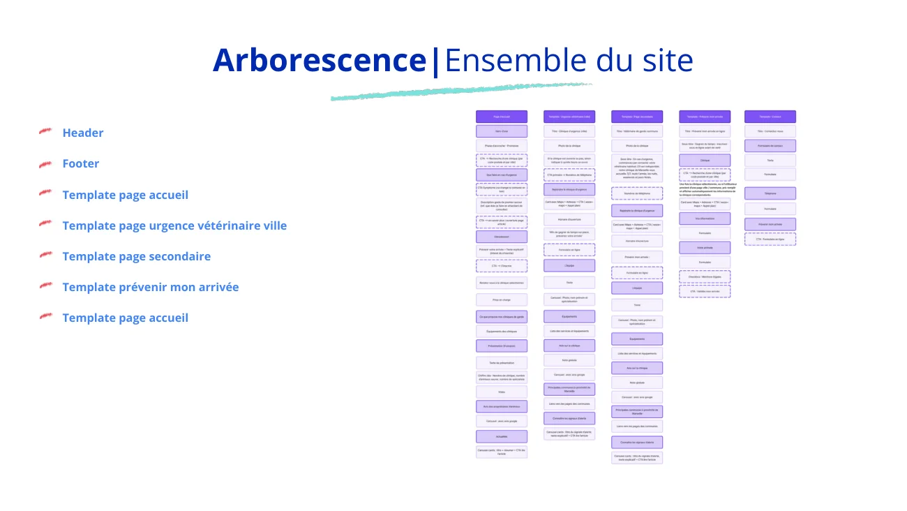 Restitution · the target site treeWorking link removed
1Five templates instead of case-by-case pages: home, emergency page per city, secondary page, 'notify my arrival', plus header and footer.
2This answers two stakes at once: adding a clinic without a developer, and keeping a structure that search engines and AI can read.
06Hindsight
What this audit taught me, and what it does not say.
LimitAn expert audit, without users: the findings are strong hypotheses, not observations. The logical next step would be to test the forms with owners in a situation close to an emergency.
What I take from itContext of use changes the weight of a flaw: a field with no example is minor on a leisure site, and becomes a real obstacle when you fill in the form with a sick animal next to you.
What I discoveredGEO: preparing a site to be cited by AI search engines (structured data, FAQs, editorial authority), a new subject for me that the audit had to include.
The documents shown here are redacted: client name, cities, screenshots of the site and links. The personas are reconstructed for this portfolio from the audit's target audience.