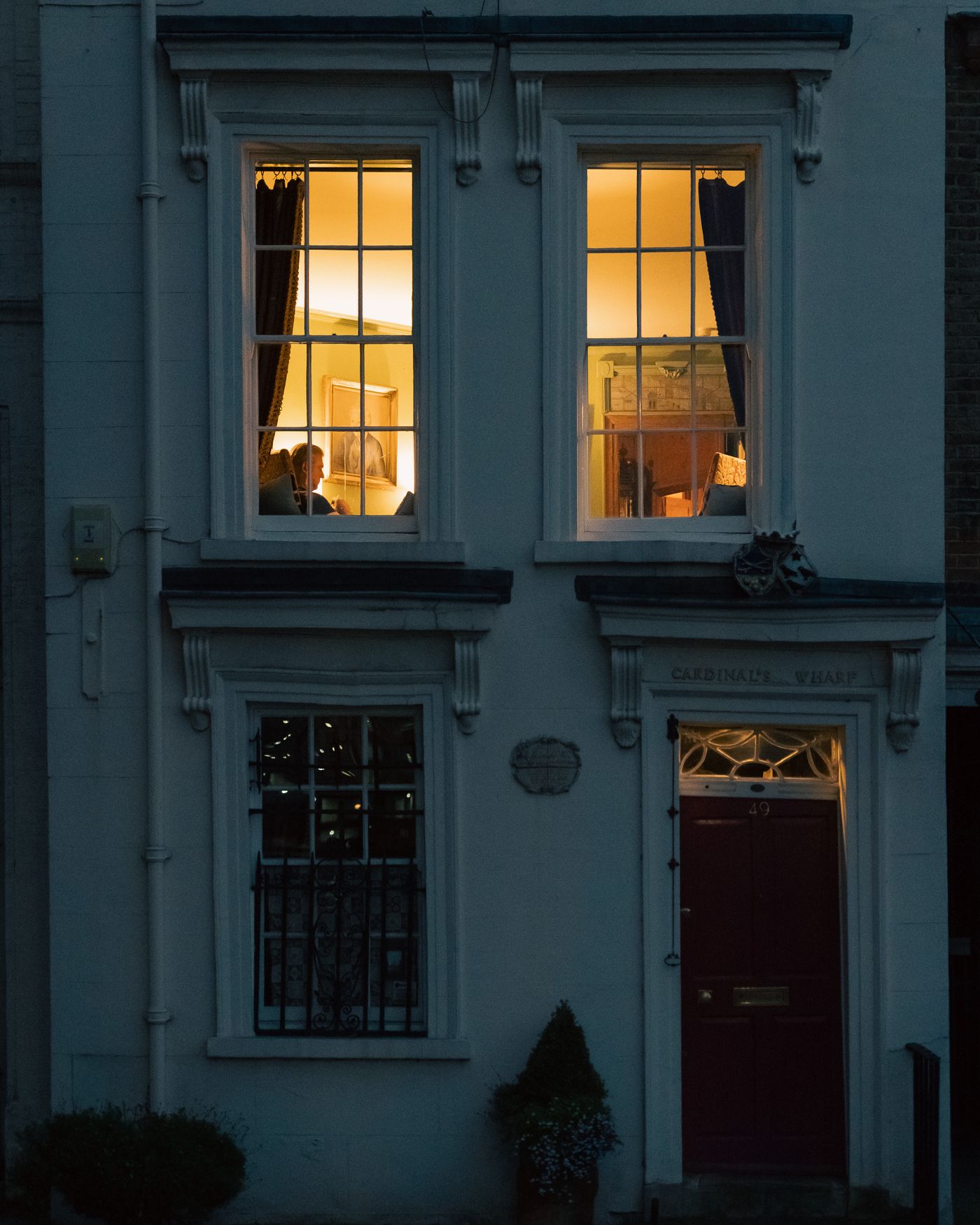

KNOW WHO YOU'LL LIVE WITH
A research-led rebrand
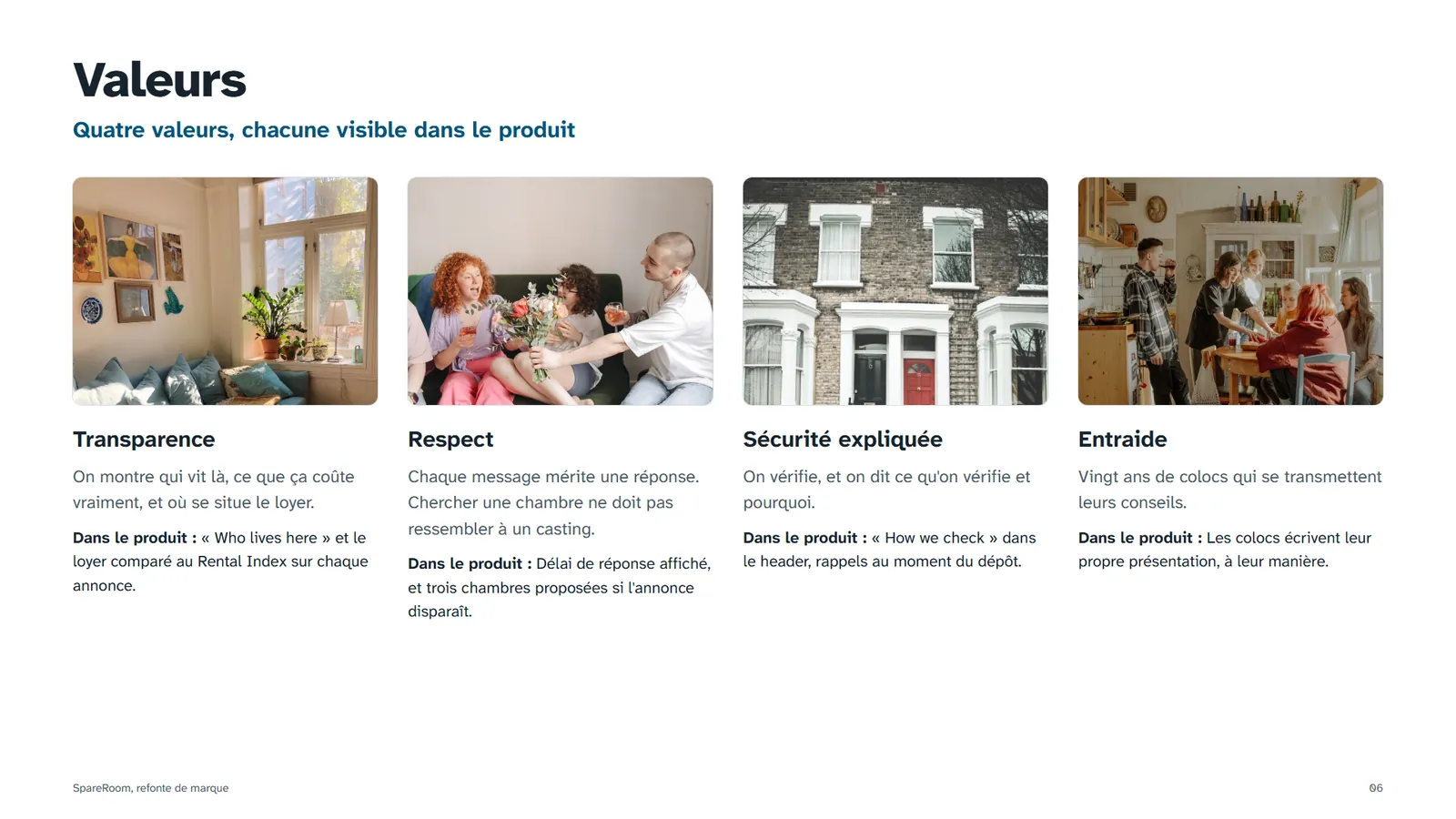
A rebrand of the UK's biggest flatshare platform, built on research first. I audited the live site, read what renters fear most, and rebuilt the brand around one promise: you meet the people before you move in.
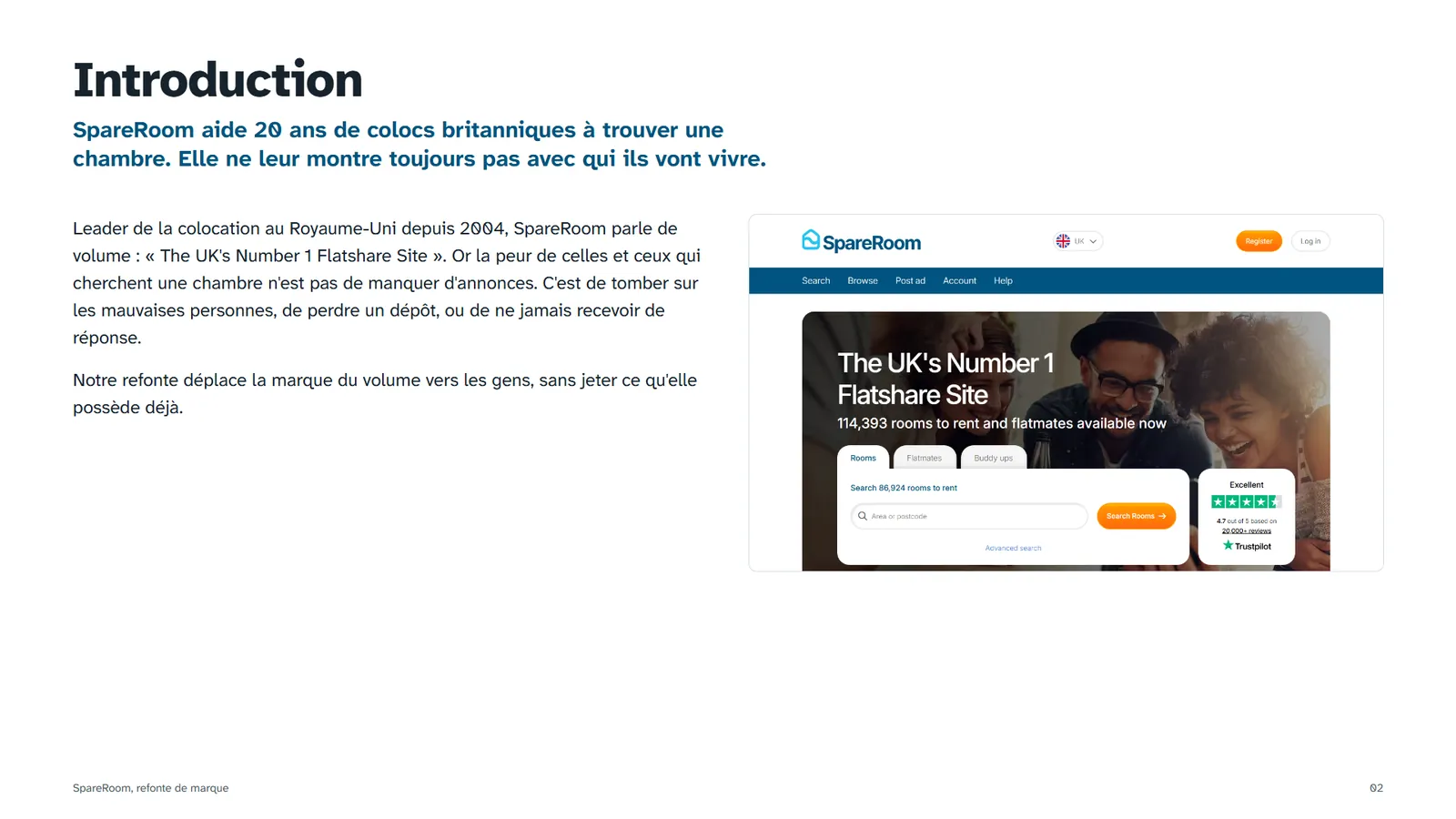
SpareRoom sells volume: "The UK's Number 1 Flatshare Site". People looking for a room fear something else: losing a deposit, being ignored, moving in with strangers. And the site never shows who lives in a room.
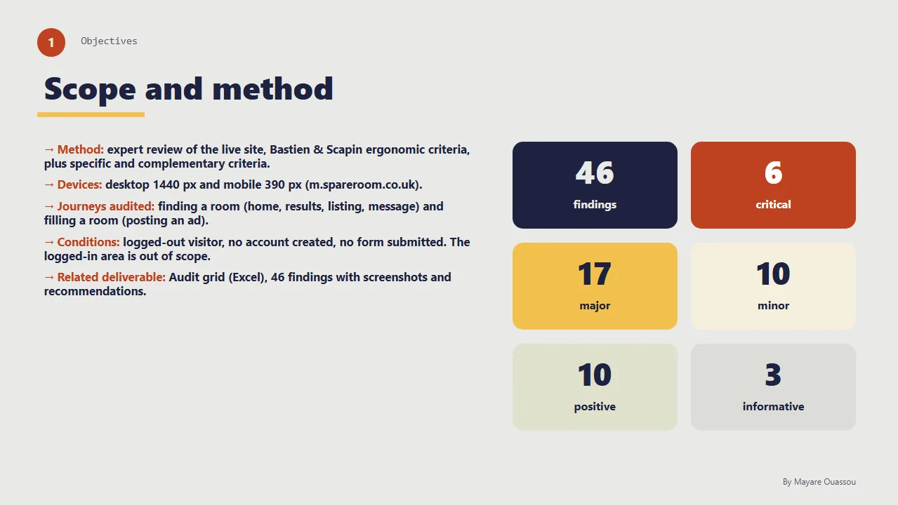
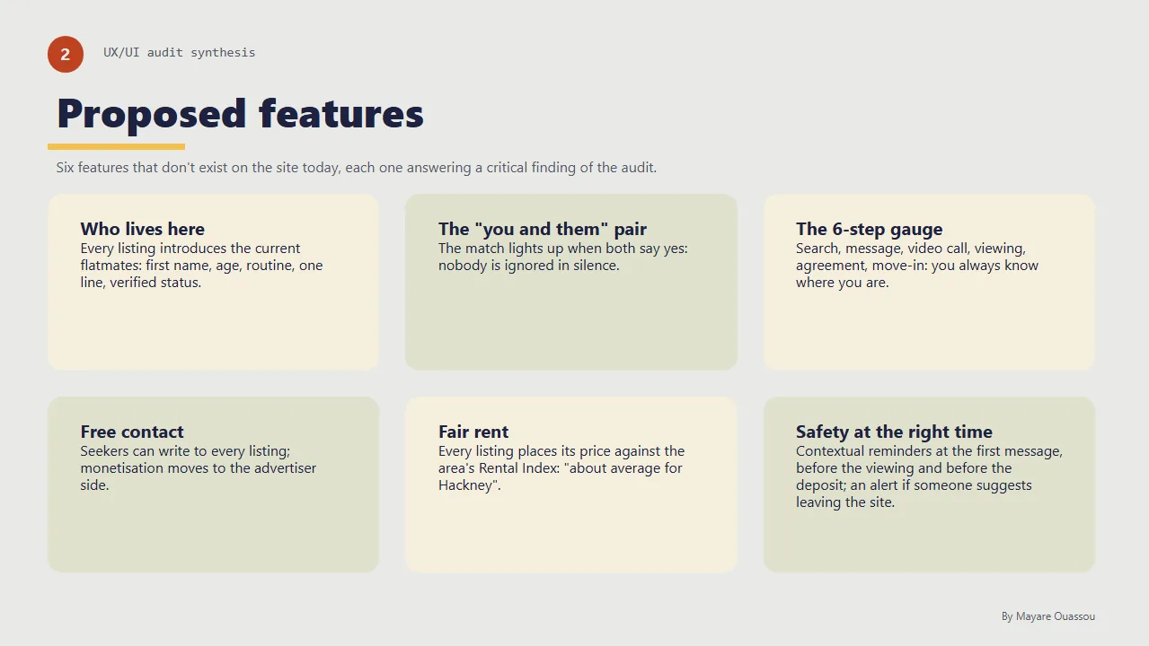
An expert audit with 46 findings, a close read of real reviews, personas and a user journey, then wireframes before any colour. Only after that: positioning, identity and screens.
A brand that puts people first, 5 desktop pages and 6 mobile screens that answer the critical findings, and a 56-board brand book with print, social and merch.
What the workshop asked for
The module, "Creative Design: visual culture and graphic design", supervised by Pierre-Louis Bouvier, asked us to build a coherent visual identity from a strategic brief: not just a logo, but a brand positioning, a visual territory, an understanding of a sector's codes, and the ability to defend art direction choices.
Relevance of the positioning, coherence of the art direction, graphic quality of the identity, ability to argue the choices, quality of the oral presentation.
The brief starts from competitors and moodboards. As a UX researcher, I started earlier: an expert audit of the live site, a reading of real reviews, personas, a user journey, a restitution deck and wireframes. Every brand decision that follows comes from that research.
A leader that looks like everyone else
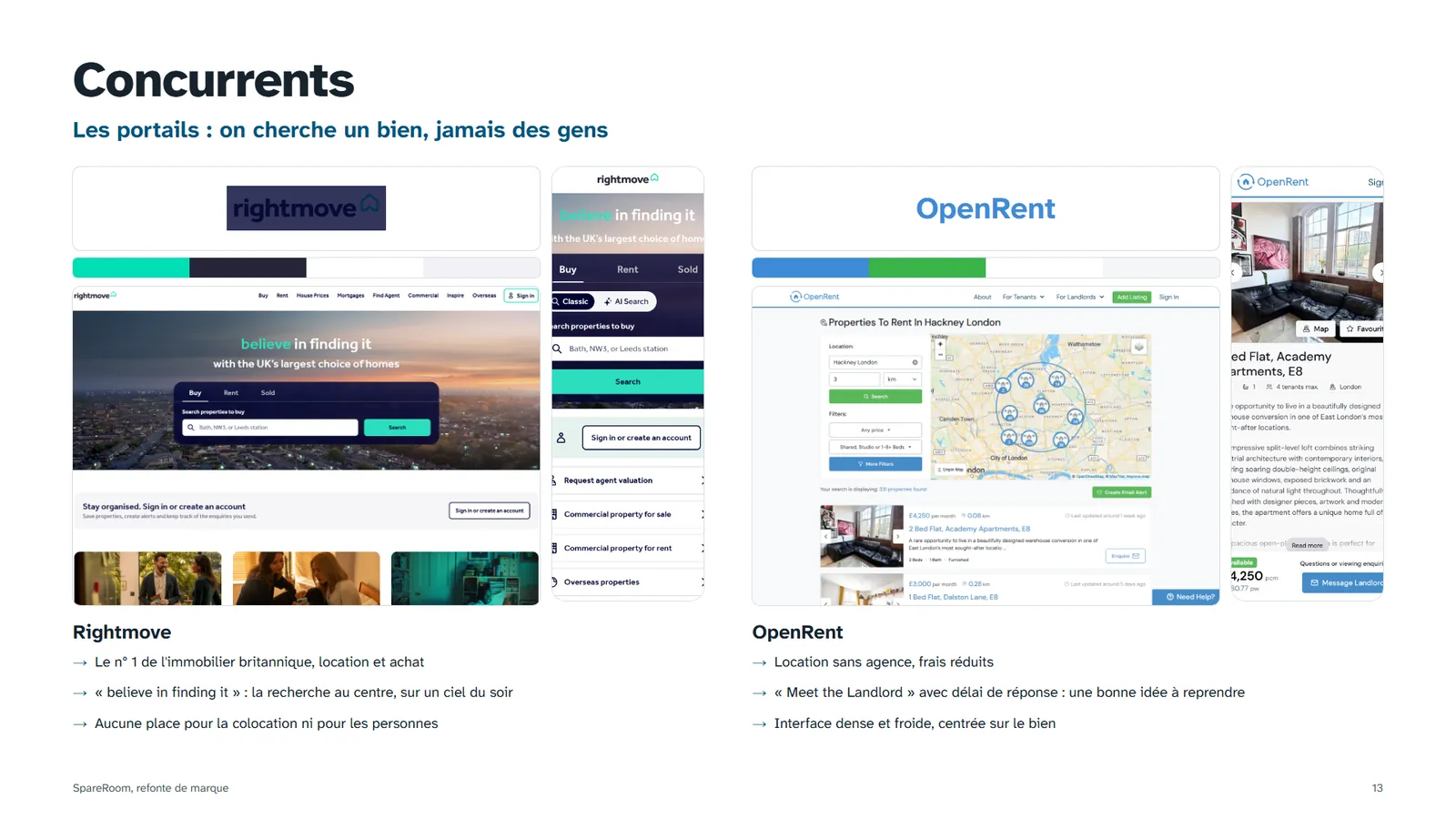
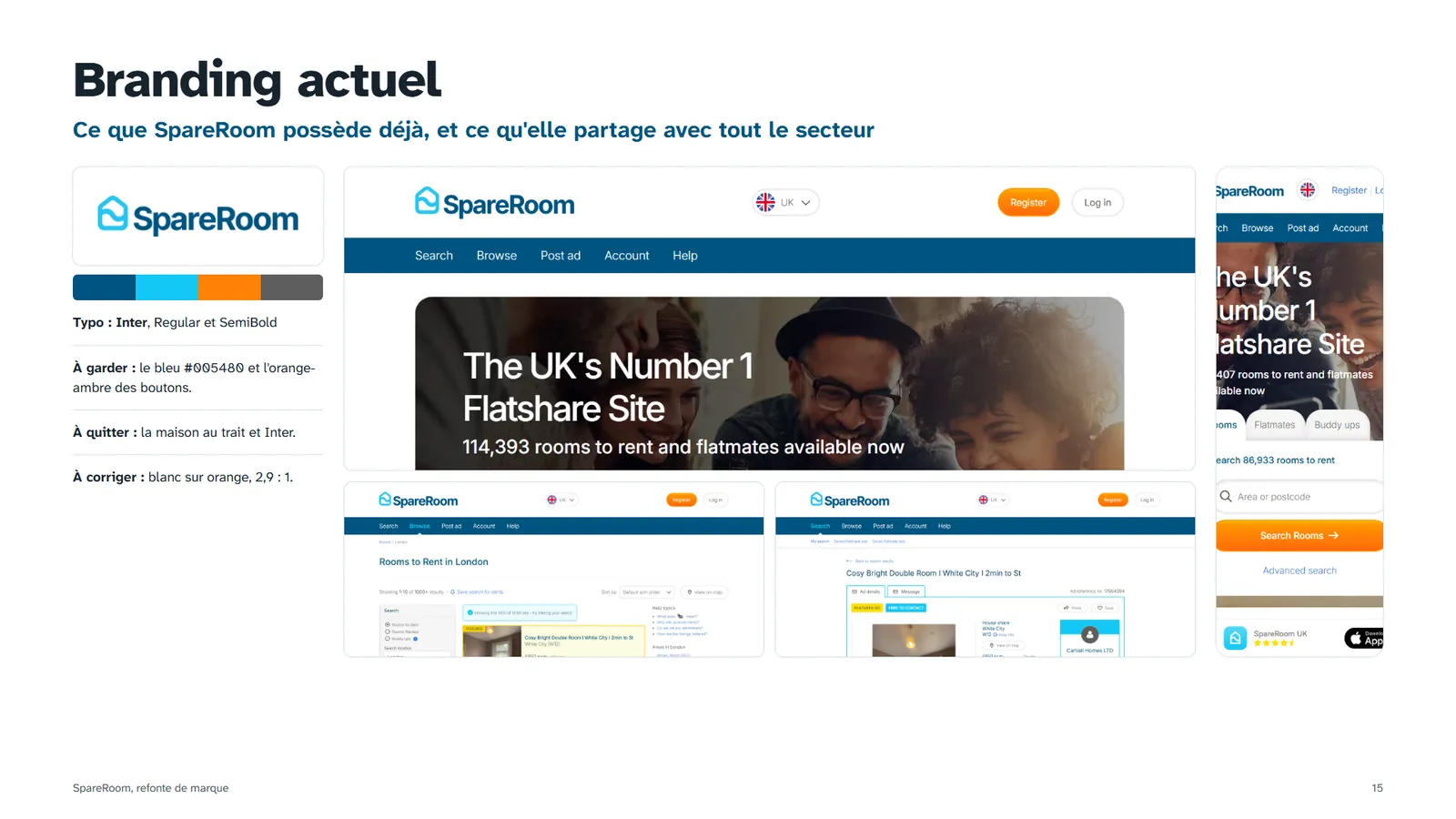
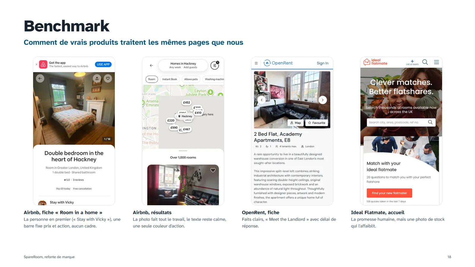
The brief: rebrand an existing brand in five days. I picked SpareRoom because it has everything a leader needs and nothing that makes it recognisable. Its house icon, its trust blue and its free sans-serif are the same codes as four of the six competitors I benchmarked.
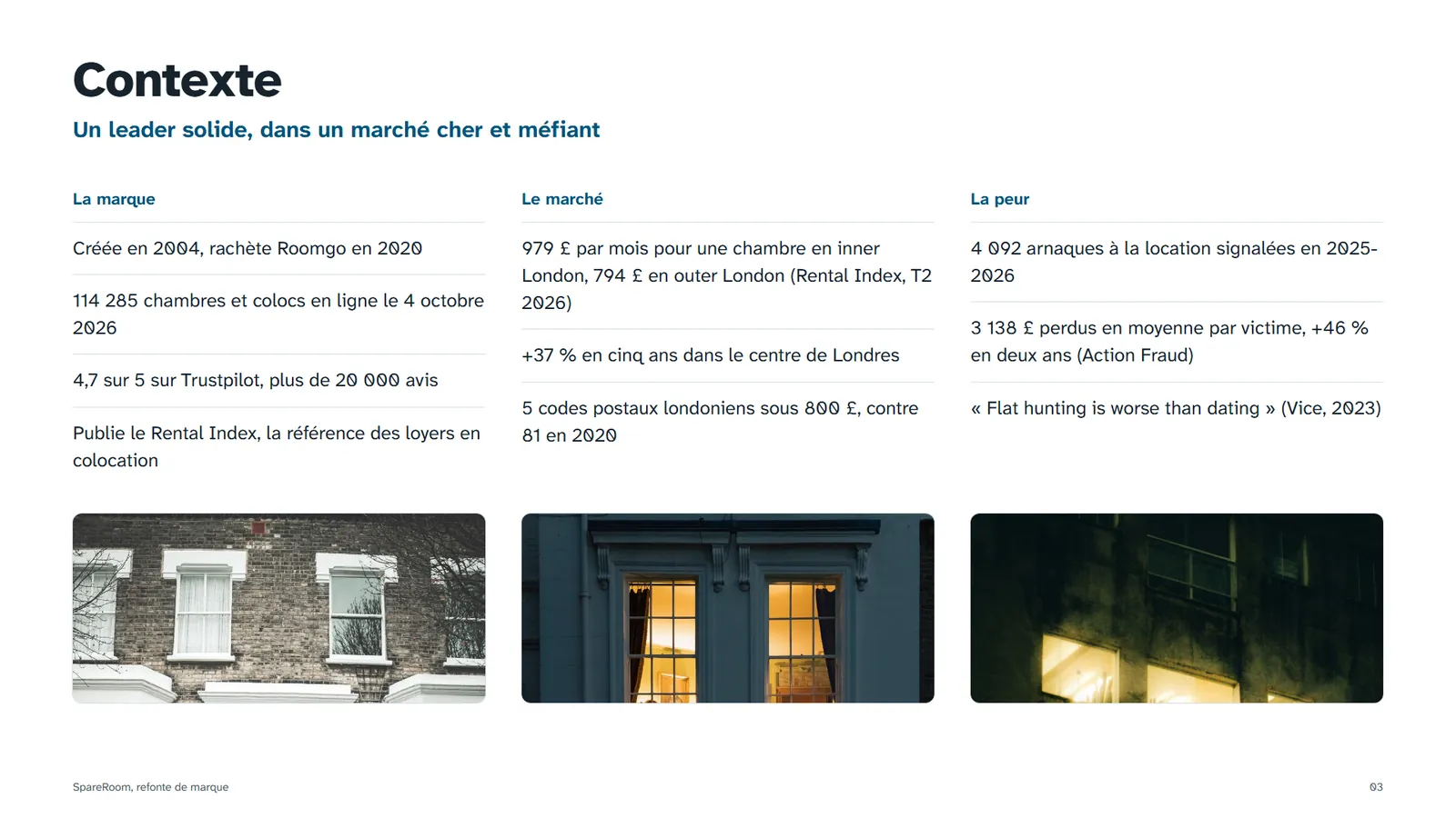
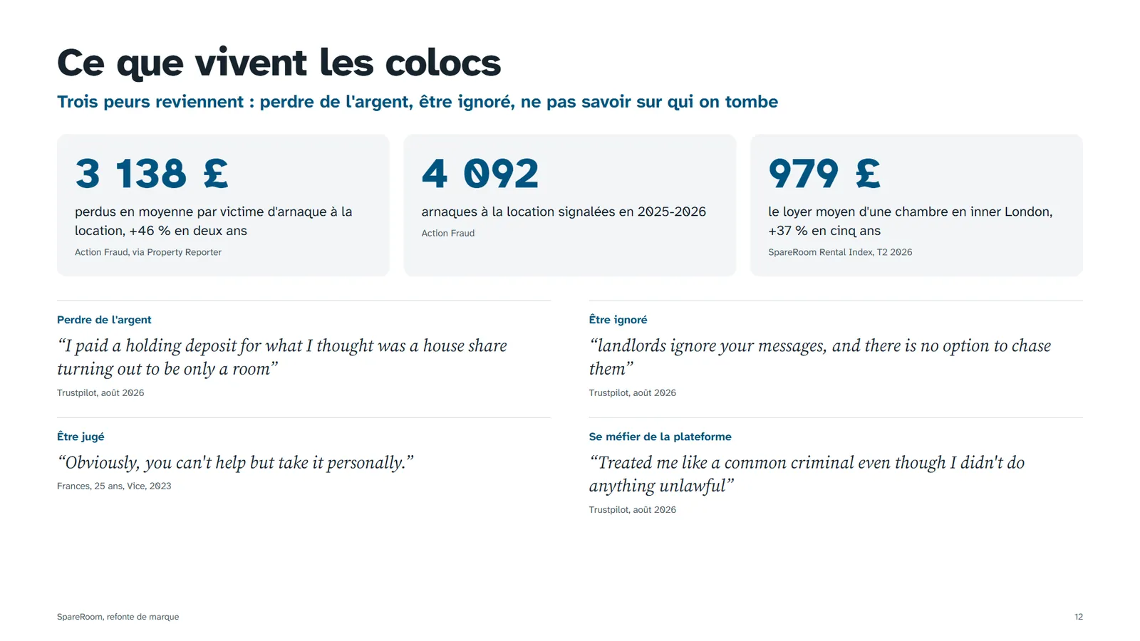
Founded in 2004. 114,285 rooms and flatmates listed on 4 October 2026. Rated 4.7 out of 5 on Trustpilot by more than 20,000 people. Publishes the reference index for room rents.
A room in inner London costs £979 a month on average (SpareRoom Rental Index, Q2 2026), up 37% in five years. Only 5 London postcodes are still under £800.
4,092 rental scams reported in 2025-2026, with £3,138 lost per victim on average, up 46% in two years (Action Fraud).
Auditing the live site
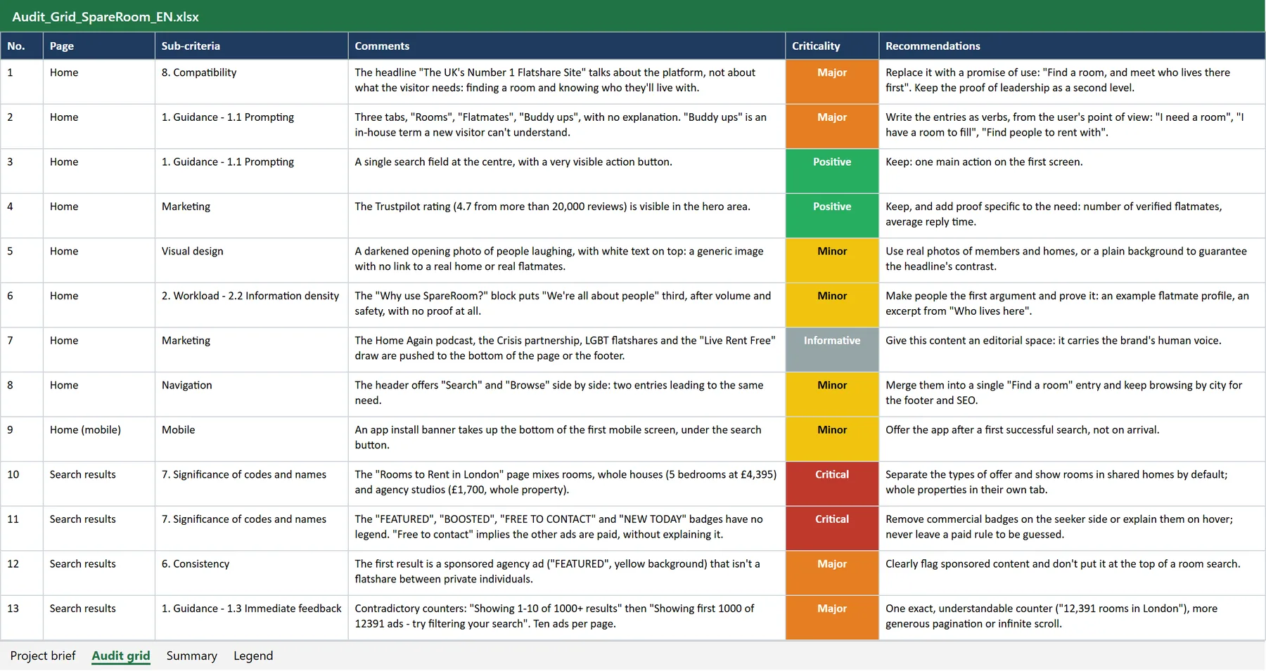
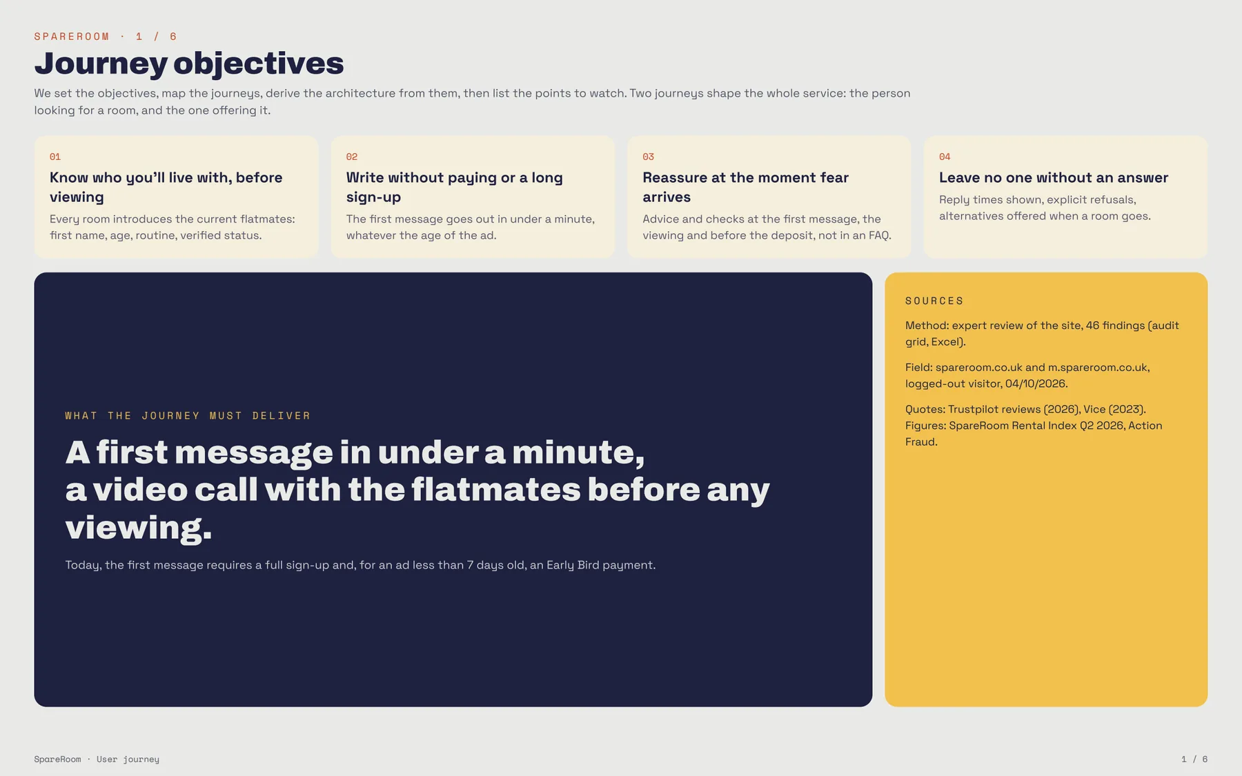
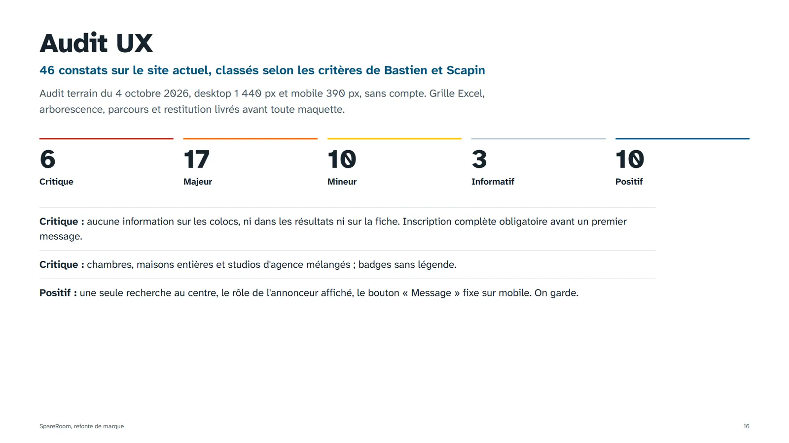
Before drawing anything, I went through spareroom.co.uk as a logged-out visitor, on desktop (1440 px) and on mobile (390 px), along two journeys: finding a room, and listing one. Every finding is tied to a Bastien & Scapin criterion, rated on five levels, documented with a screenshot and a recommendation a designer can act on.
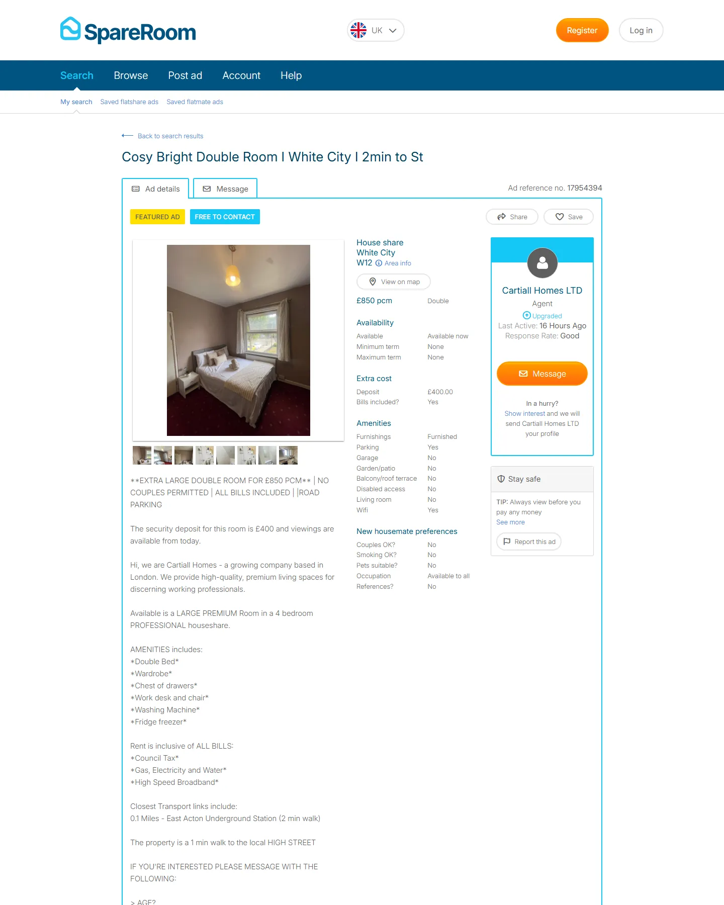
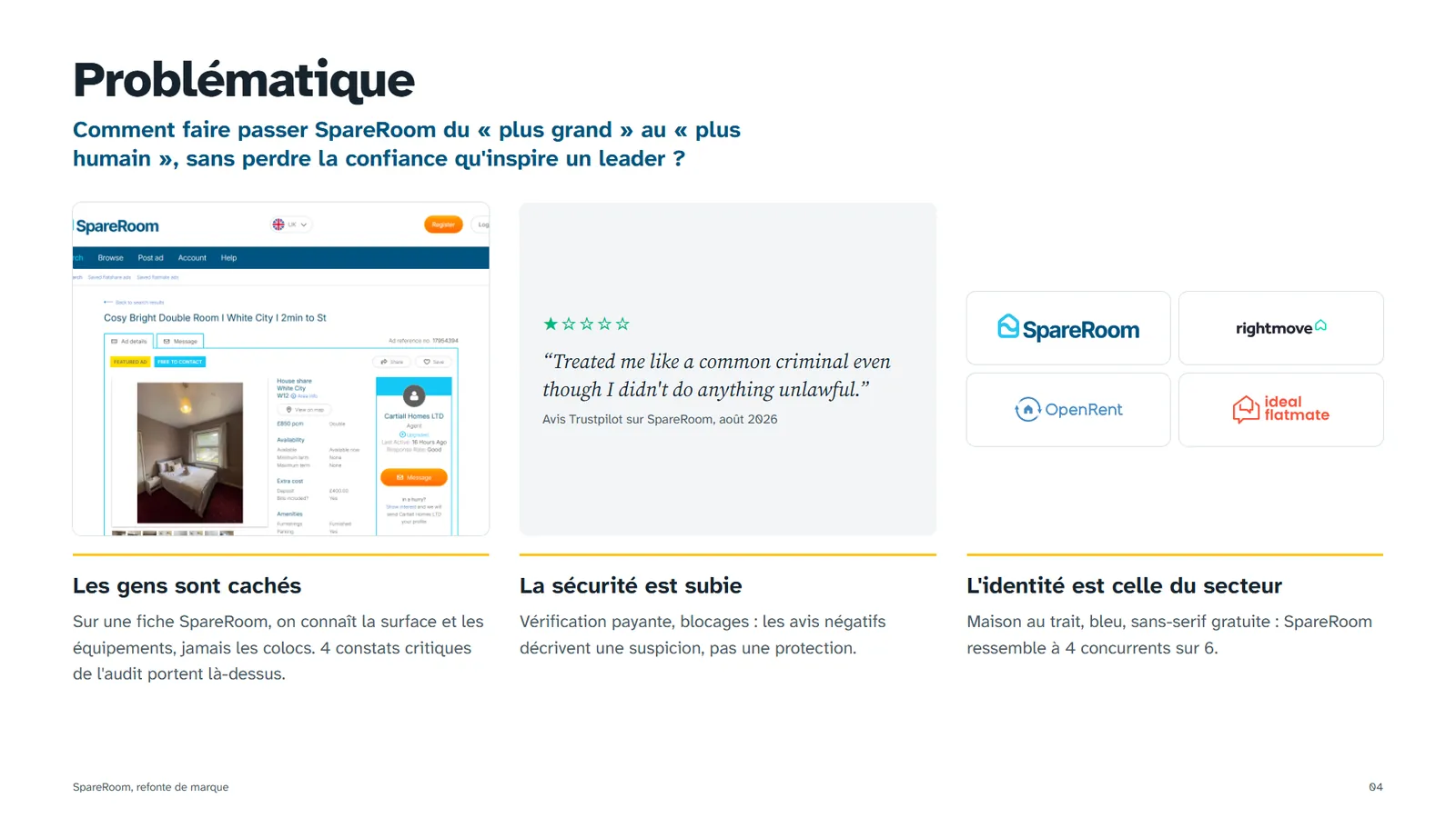
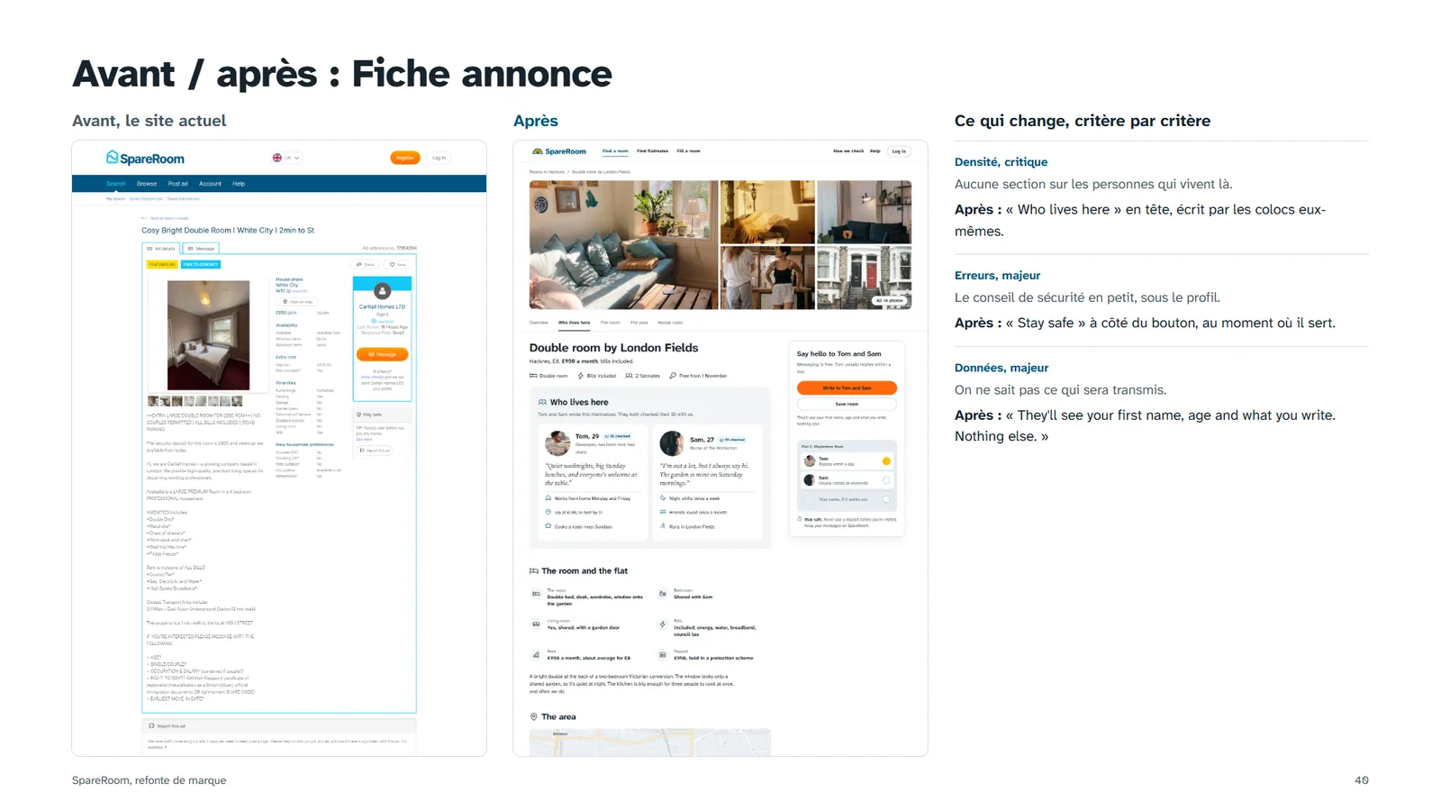
A listing describes the parking and the garden, never the flatmates. Yet who lives there is the first thing a renter wants to know, and the main thing they fear.
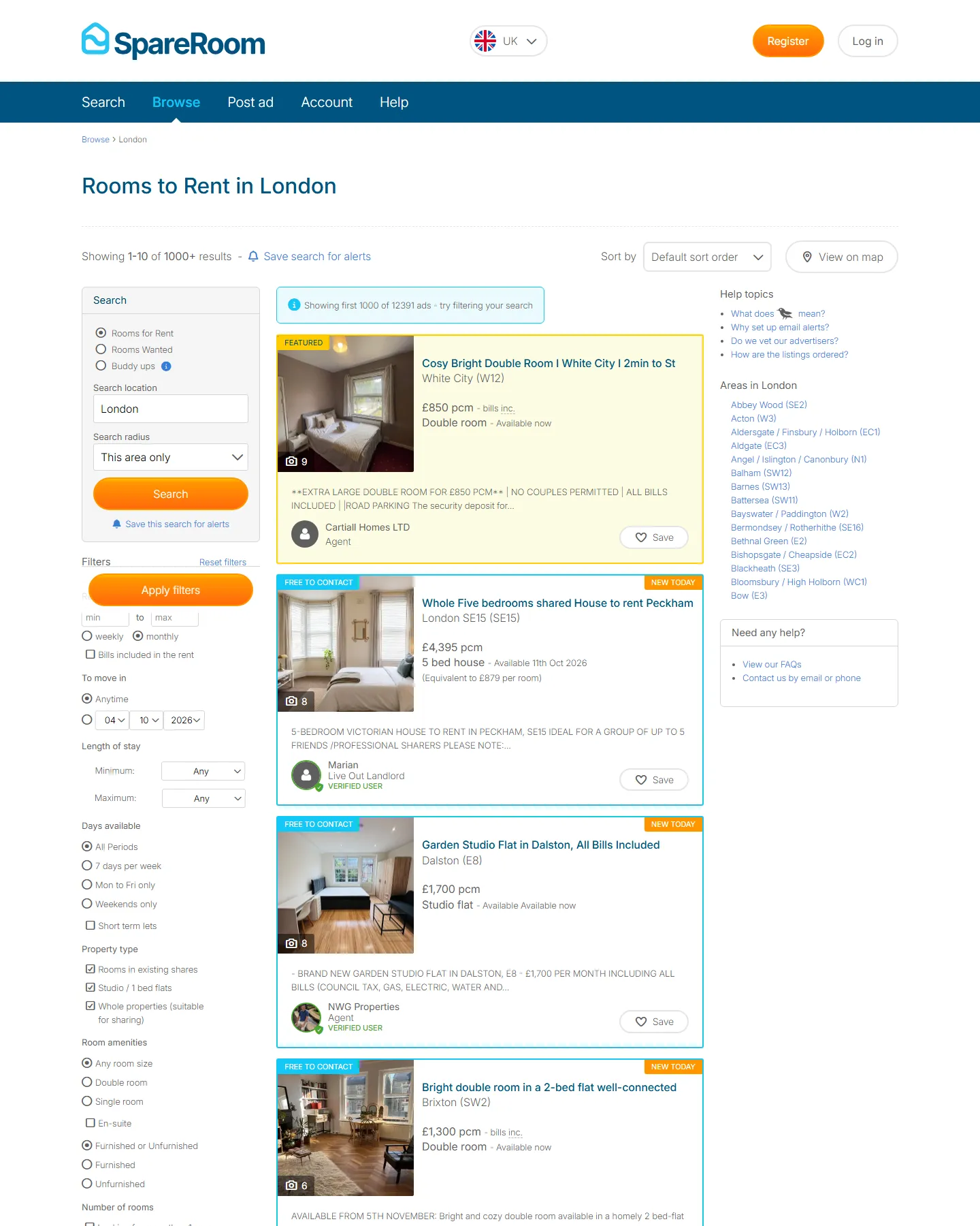
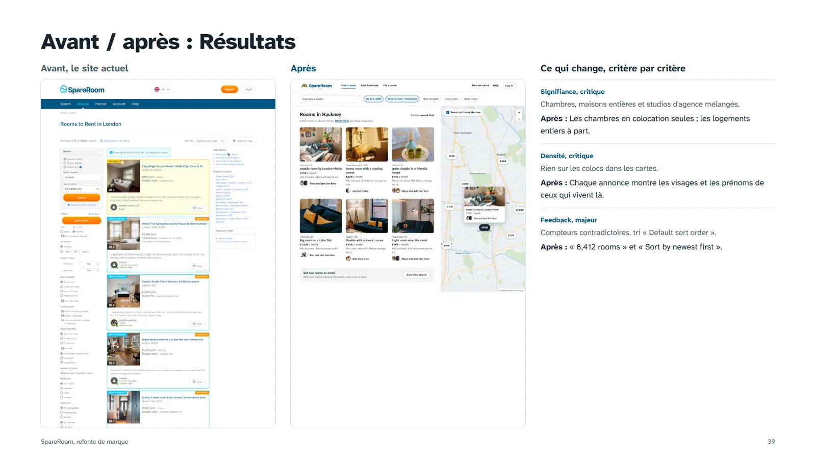
"Rooms to Rent in London" mixes rooms, whole five-bed houses and agency studios, with unexplained badges like FEATURED or BOOSTED.
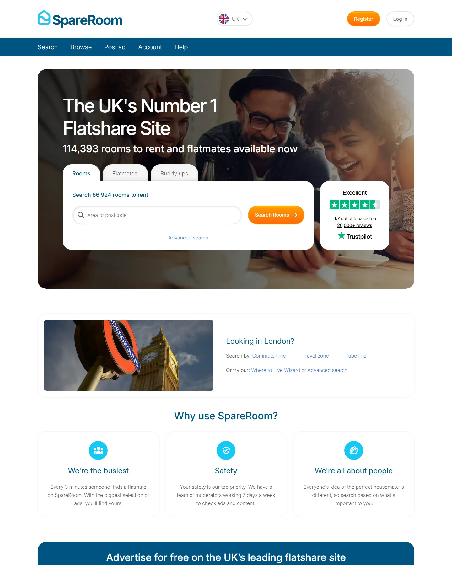
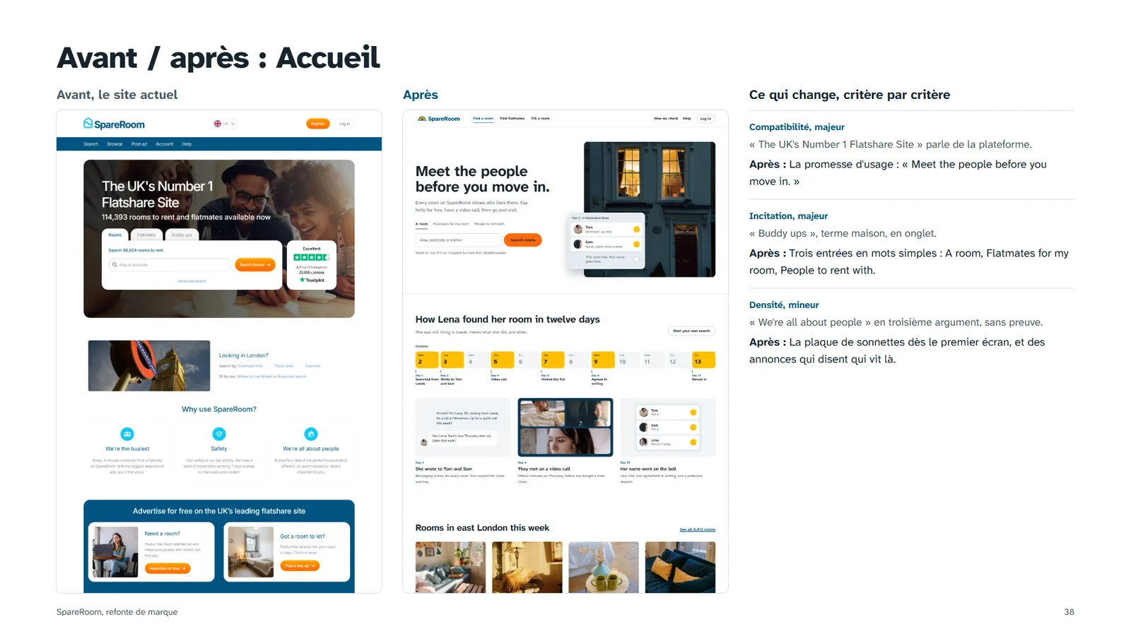
"The UK's Number 1 Flatshare Site" talks about SpareRoom. The person arriving wants a room and wants to know who they'll live with.
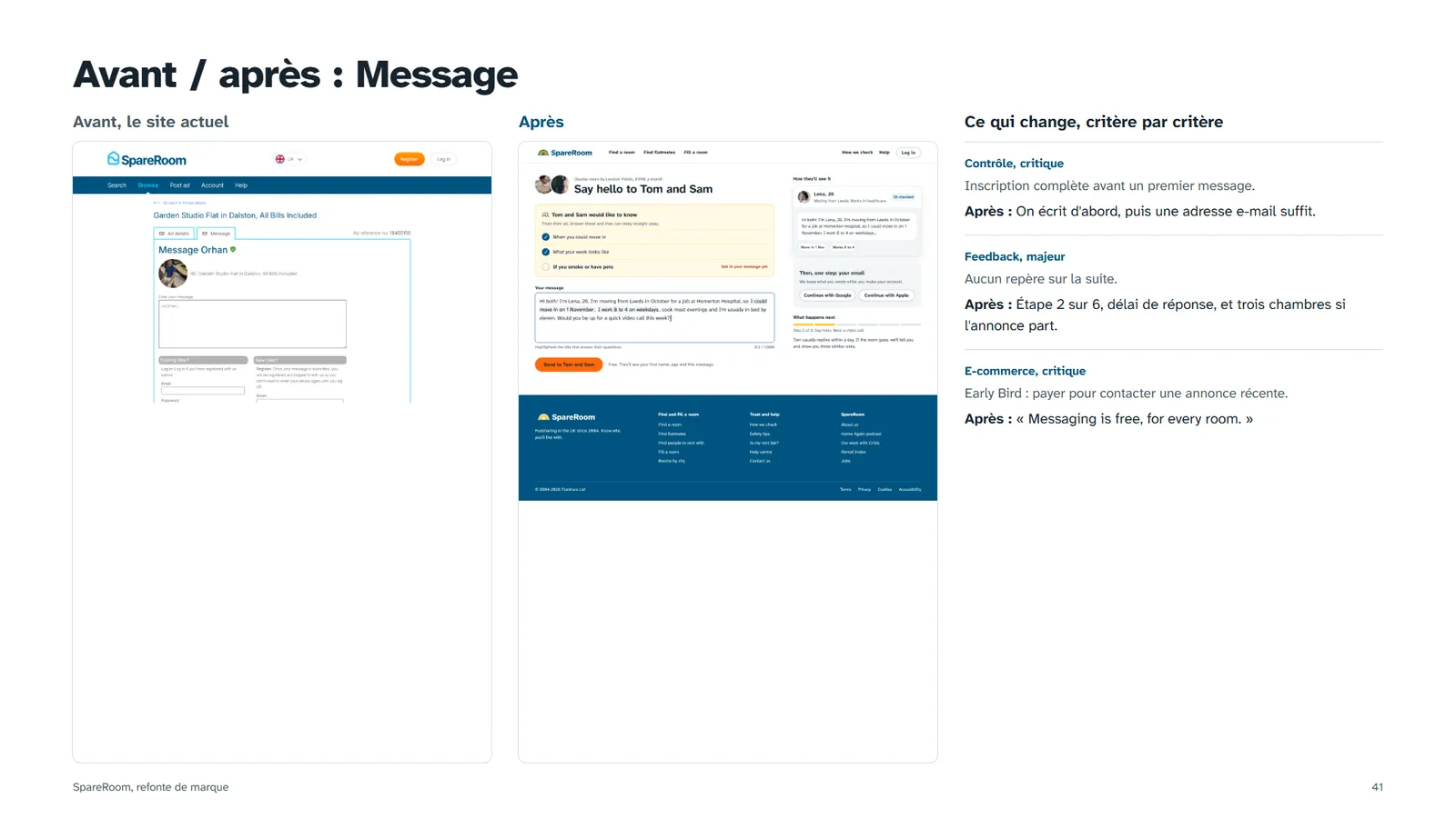
Two more critical findings sit behind the Message button: a full sign-up form before the first message, and the Early Bird rule that stops free accounts from contacting ads younger than 7 days.
- One search field at the centre
- The Trustpilot rating, visible straight away
- The advertiser's role shown on each result
- A sticky Message button on mobile
What renters actually say
Then I read the 1 and 2-star reviews on Trustpilot and the press. Not to measure satisfaction (the average is 4.7), but to find the fears. Three keep coming back: losing money, being ignored or judged, and not knowing who you'll end up with.
"I paid a holding deposit for what I thought was a house share turning out to be only a room"
"landlords ignore your messages, and there is no option to chase them"
"Obviously, you can't help but take it personally."
"Treated me like a common criminal even though I didn't do anything unlawful"
Looking for a room works like dating: you sell yourself, you wait, you get ghosted. The brand can make that moment more dignified.
Personas, journey and restitution

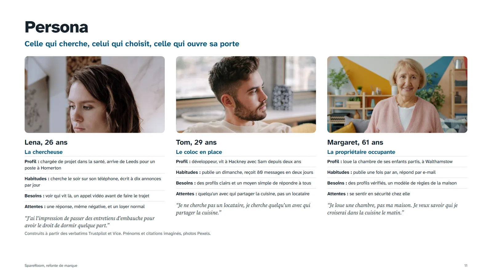
Moving from Leeds for a job at Homerton. Searches at night on her phone, writes to ten ads a day, gets one or two answers.
"I feel like I'm going to job interviews for the right to sleep somewhere."

Developer in Hackney. Posts the ad on a Sunday, gets 80 messages in two days, can't answer everyone.
"I'm not looking for a tenant, I'm looking for someone to share the kitchen with."
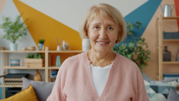
Rents out her children's old room in Walthamstow. Posts once a year, answers by email.
"I'm renting a room, not my house."
Wireframes
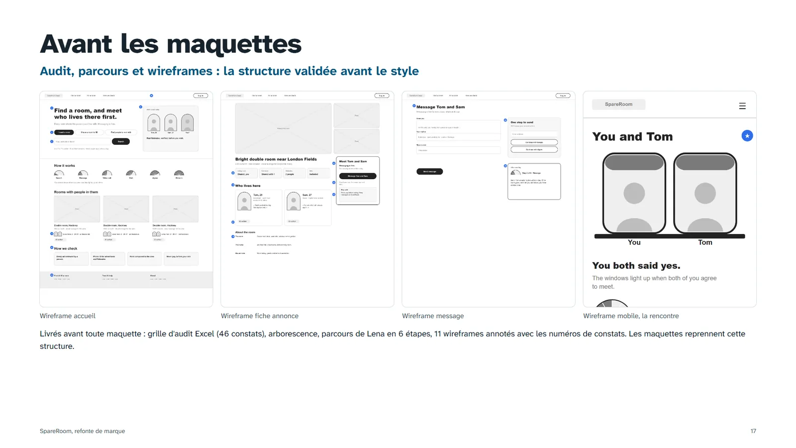
Eleven annotated wireframes, five desktop and six mobile. Each note points to the number of the finding it answers, so every decision can be traced back to the audit. Colour and type came only once this structure held.
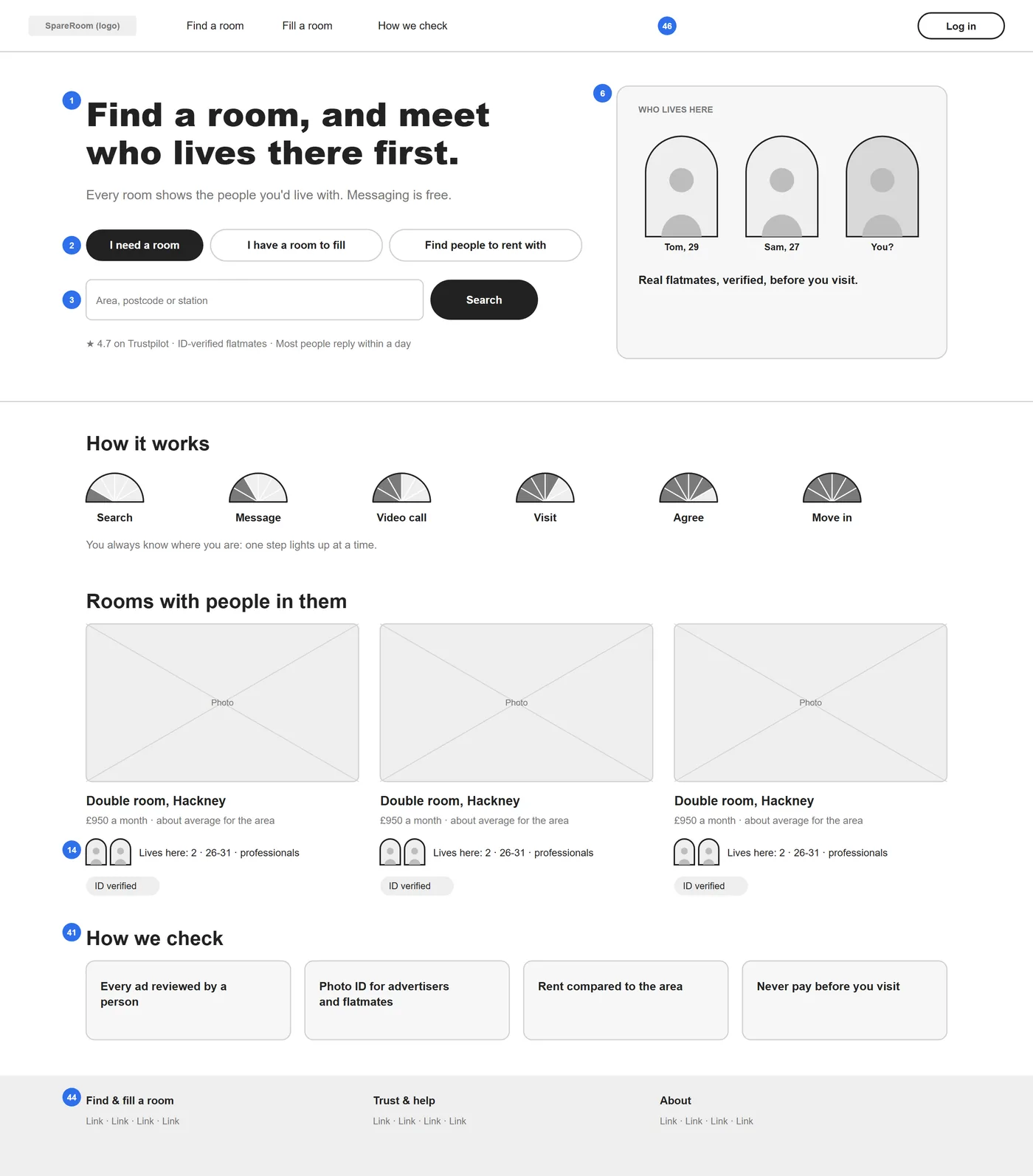
The promise of use replaces "The UK's Number 1 Flatshare Site" (finding 1). Three entries written as verbs replace "Rooms / Flatmates / Buddy ups" (2), the single search stays (3) and every card says who lives there (14). The footer goes from 40 links in 7 columns to 3 columns (44).
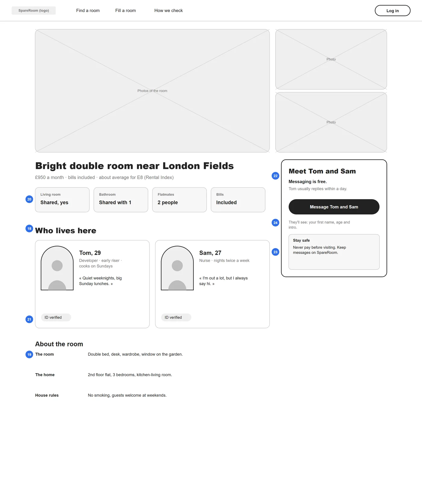
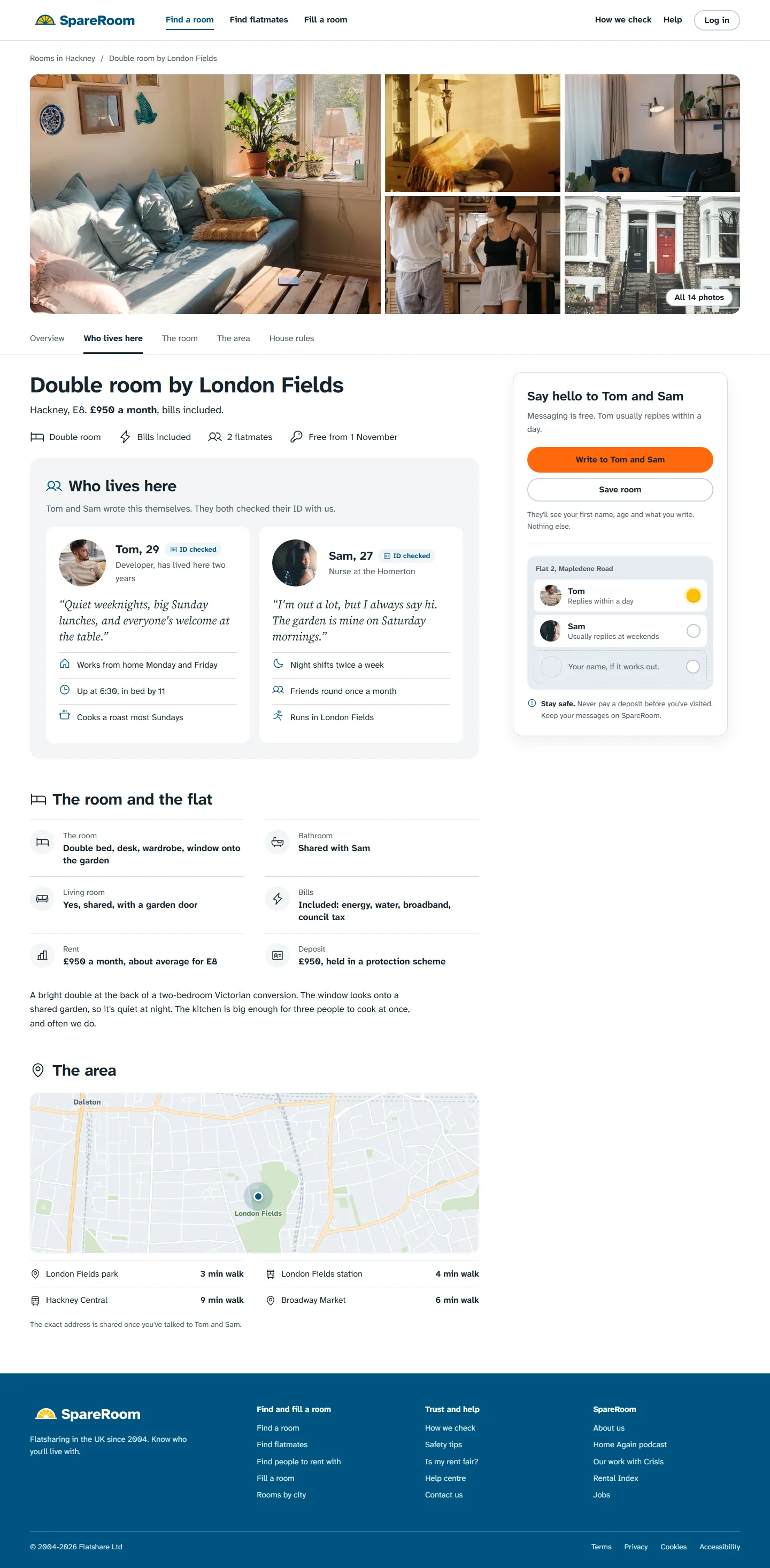
"Who lives here" moves to the top, before the description (18), with ID verification on each person (21). The four deciding facts come first (20), free text in capitals becomes guided fields (19), and the reply time sits next to the button (22).
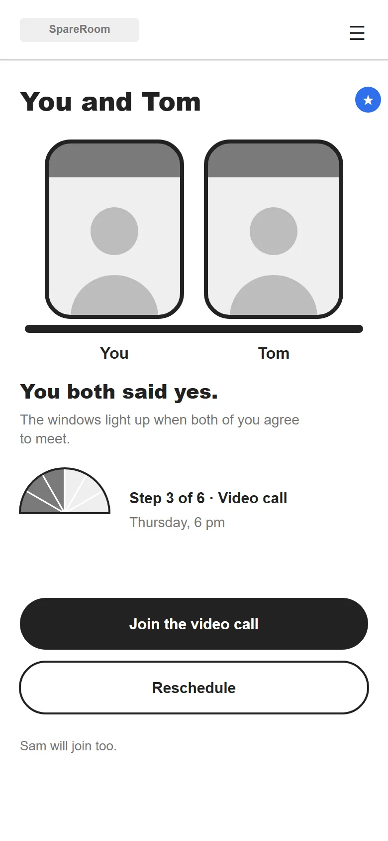
The one screen that answers no finding: it's a new feature. The pair lights up when both sides say yes, and a 6-step gauge shows where you are, so nobody is ignored in silence.
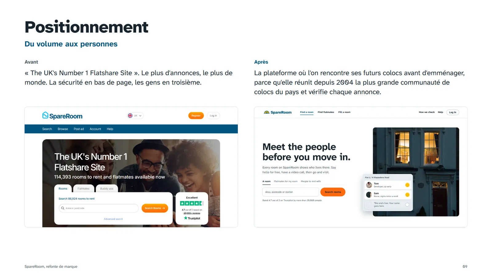
From volume to people
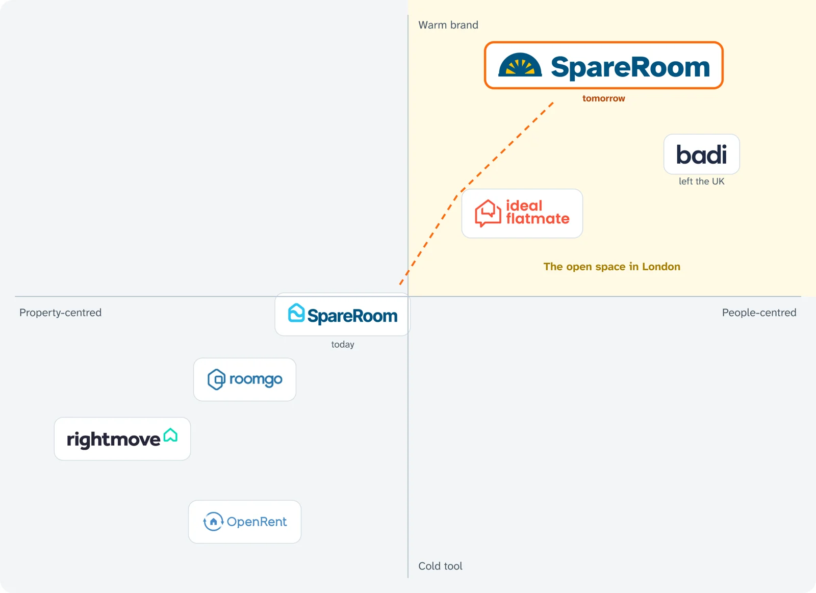
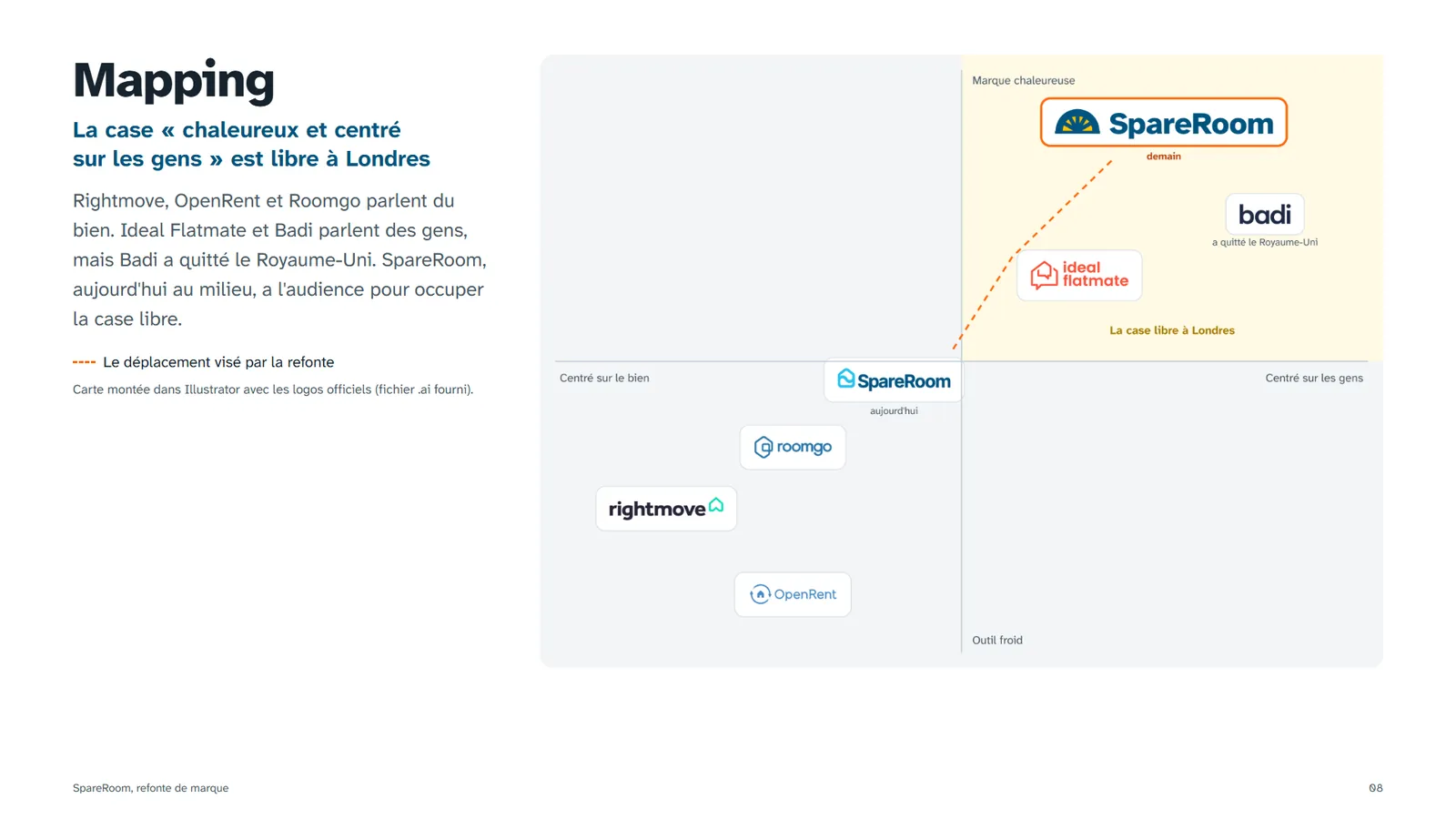
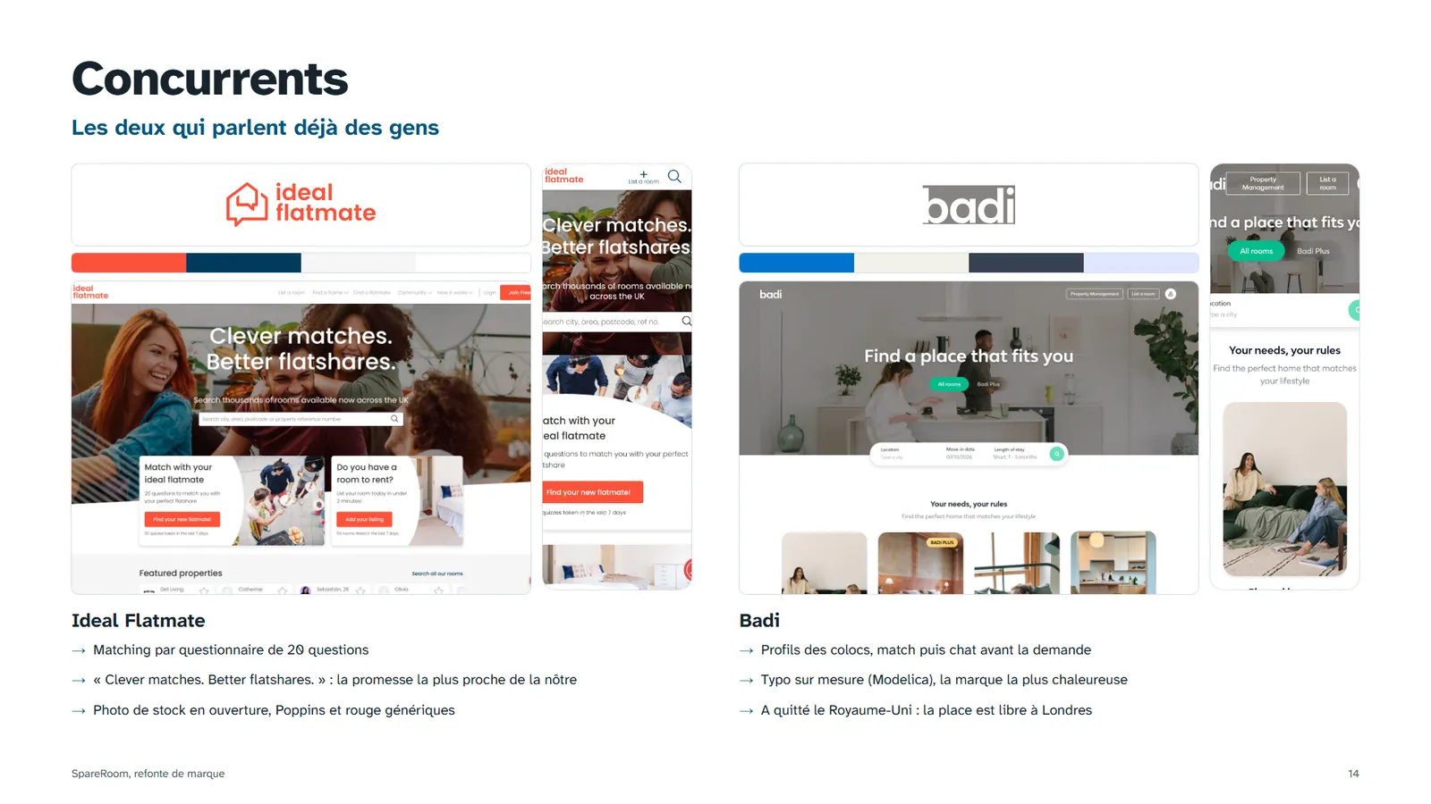
The positioning map showed an empty space in London: a warm brand centred on people. Ideal Flatmate and Badi talk about people, but Badi has left the UK. SpareRoom, sitting in the middle, has the audience to take that space.
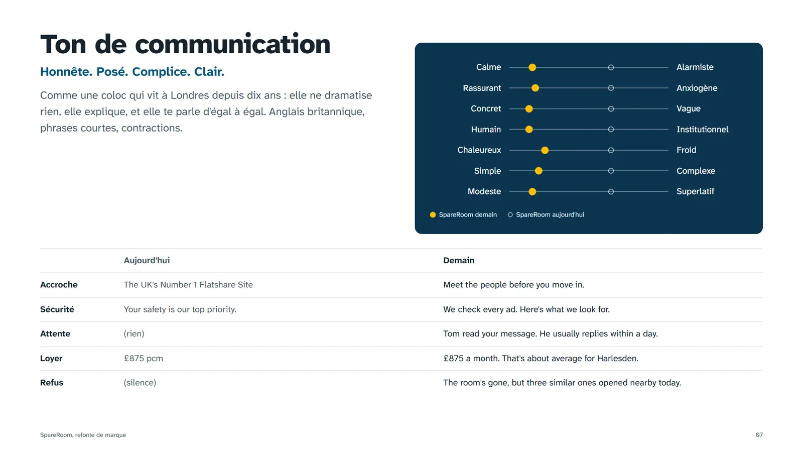
"The UK's Number 1 Flatshare Site." The most ads, the most people. Safety at the bottom of the page, people third.
The flatshare platform where you meet your future flatmates before moving in, because it has gathered the UK's largest flatshare community since 2004 and checks every ad.
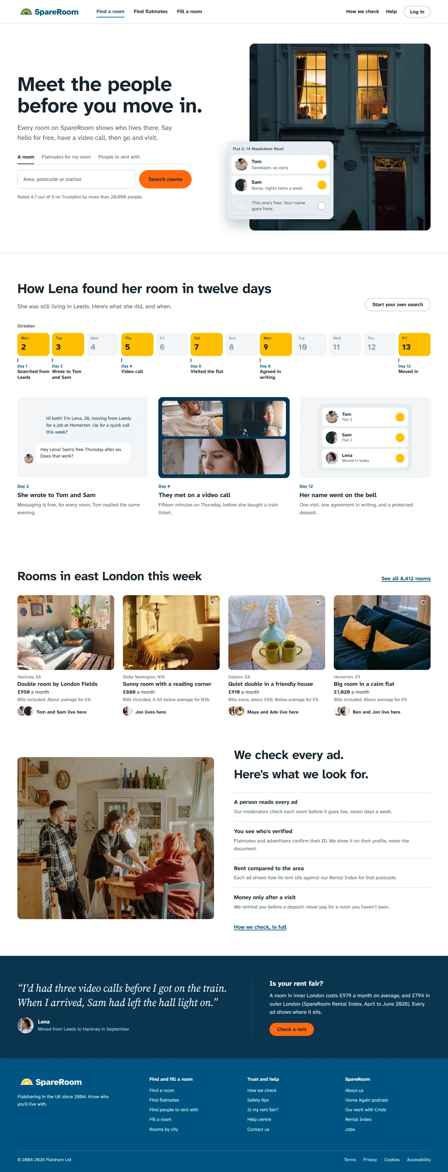
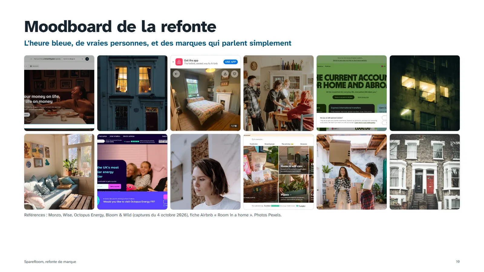
A lit window means someone's home
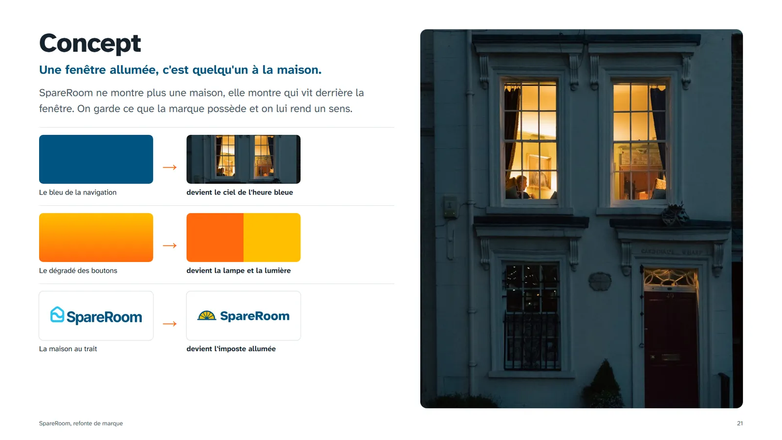
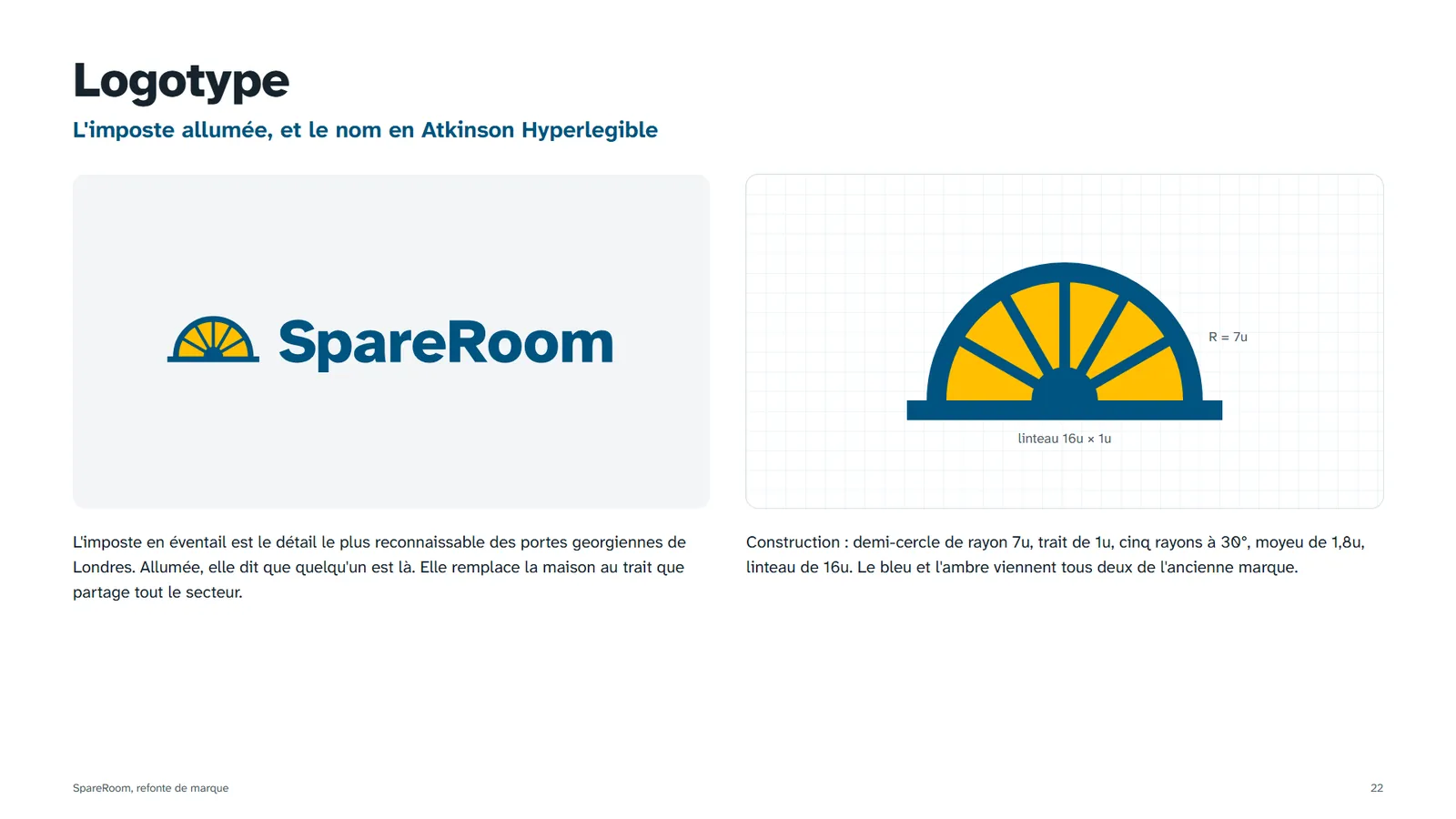
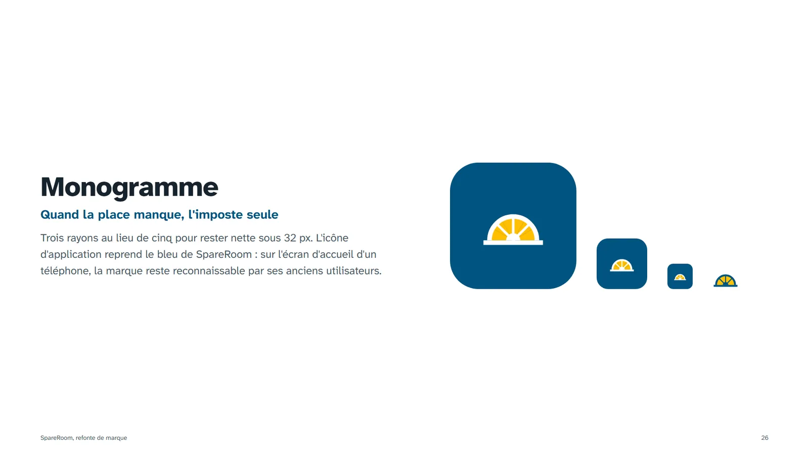
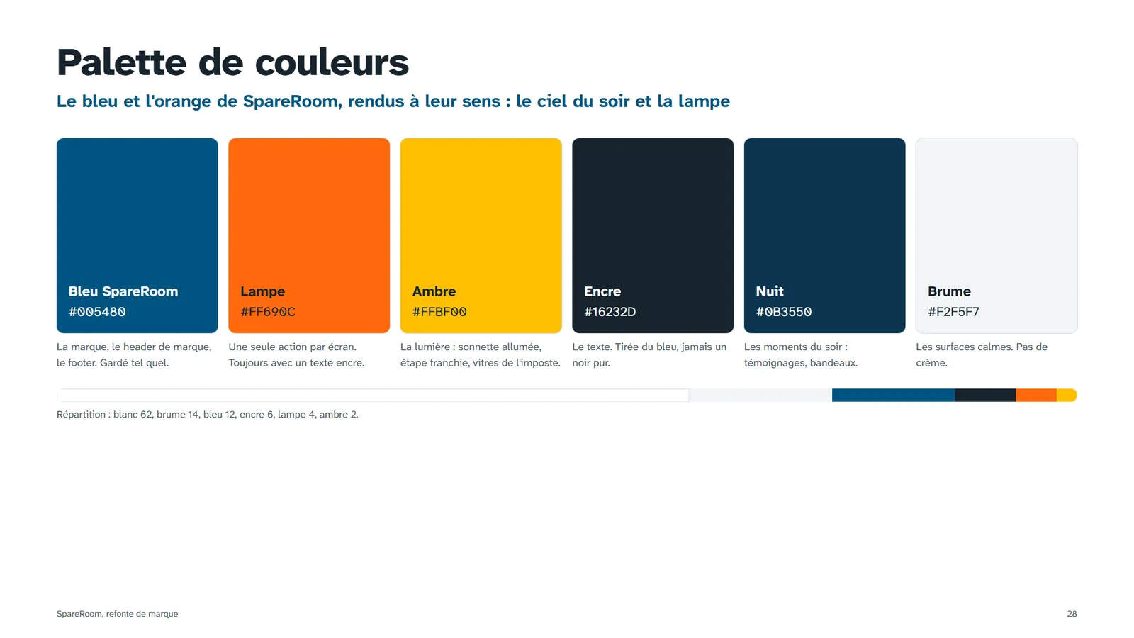
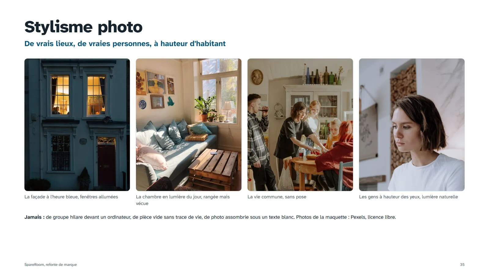
I kept what the brand already owns and gave it a meaning. The navigation blue becomes the blue-hour sky, the orange of the buttons becomes the lamp, and the house icon, shared by the whole sector, becomes a lit Georgian fanlight: the most recognisable detail of London front doors.
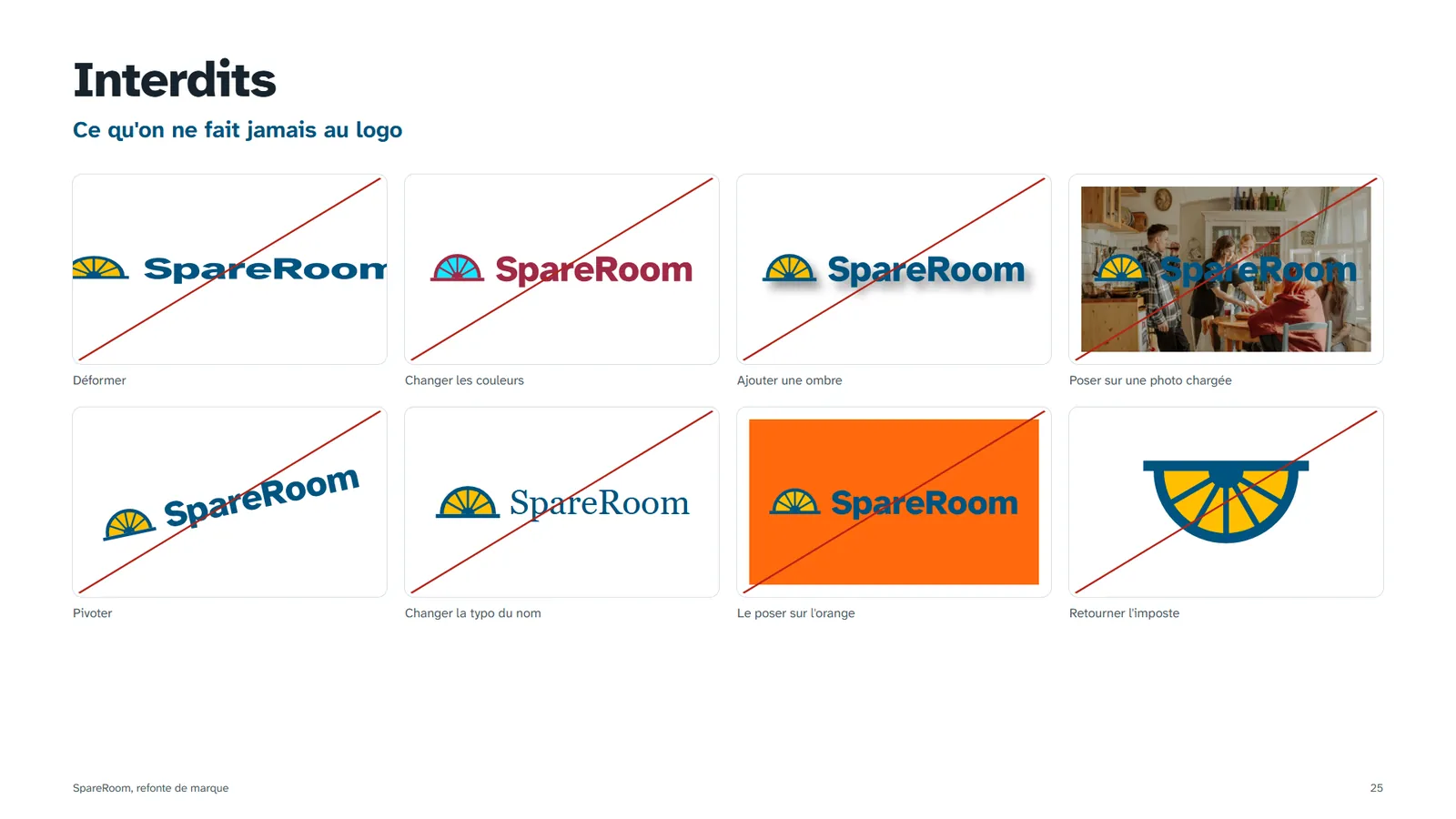
The name, the blue and the place of the logo stay, so regular users recognise it on day one. What changes is what the icon says.

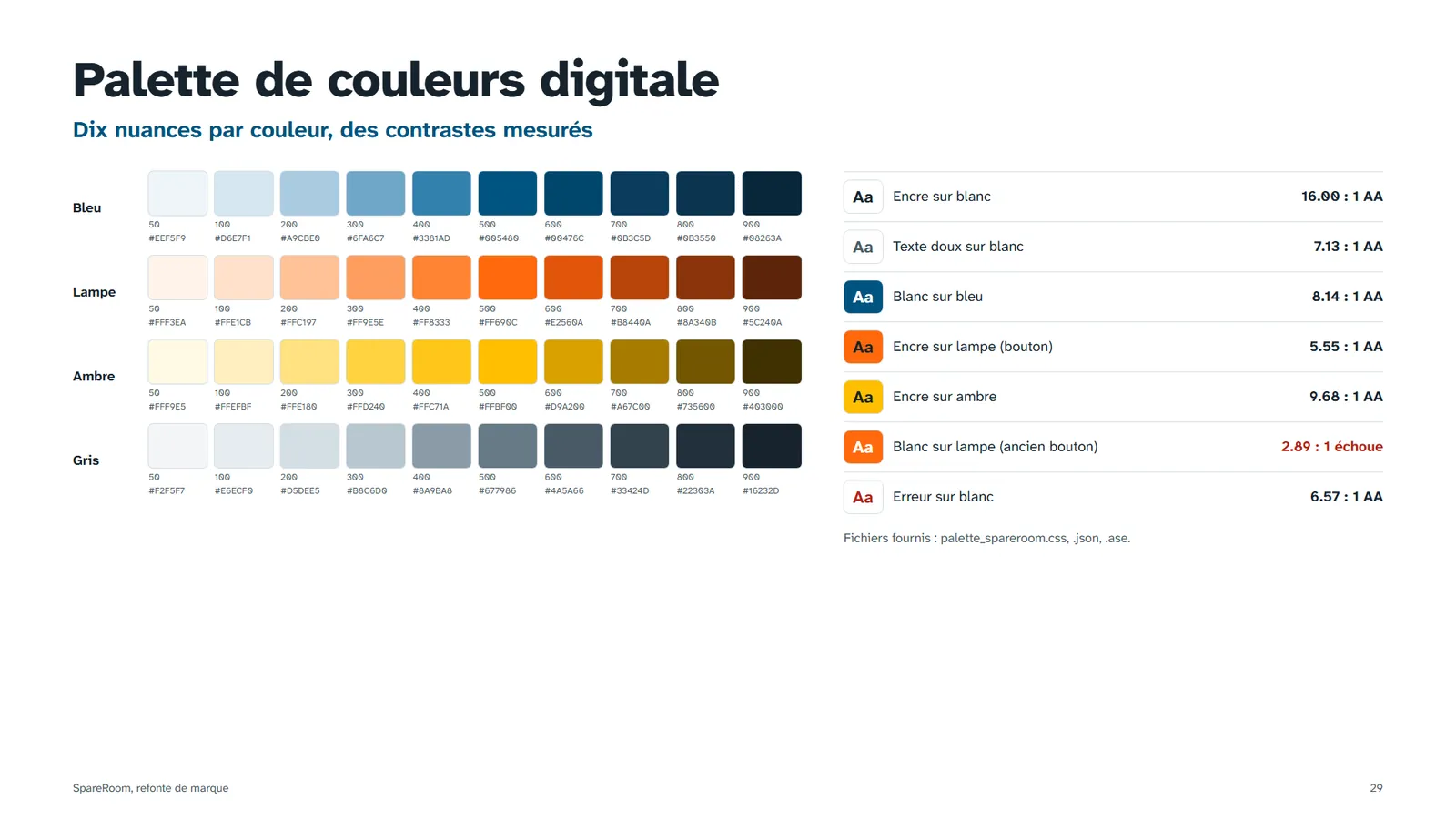
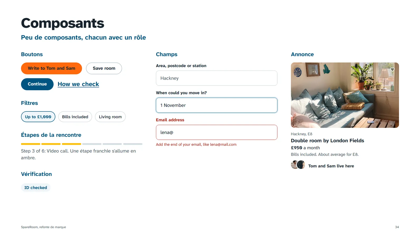
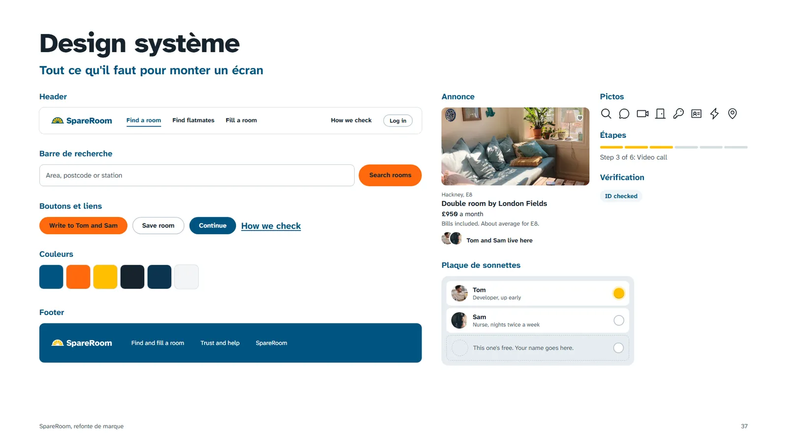
SpareRoom's own blue #005480 is kept. The orange is flattened and always carries dark text (5.6:1, where the current white-on-orange fails WCAG at 2.9:1). Amber means light: a verified flatmate, a step completed.
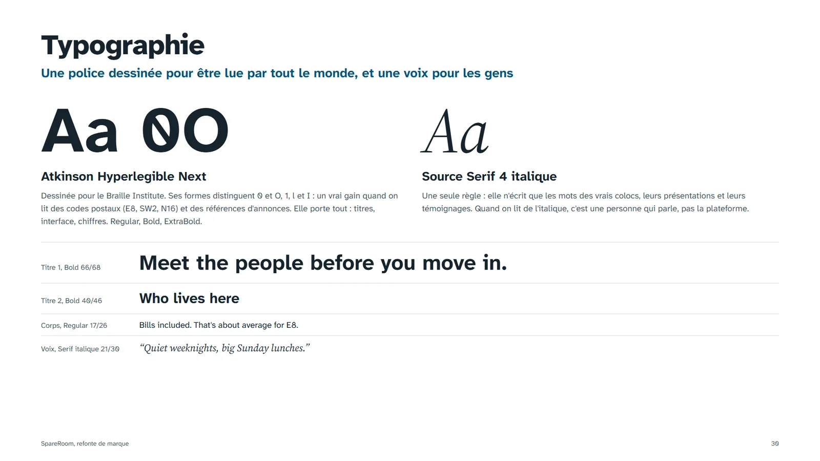
Atkinson Hyperlegible Next, designed for the Braille Institute. It tells 0 from O and l from 1, which matters when you read postcodes like E8 or N16. A serif italic is reserved for one thing: the flatmates' own words.
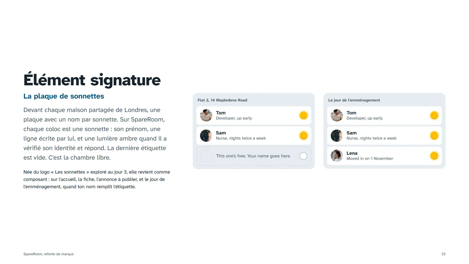
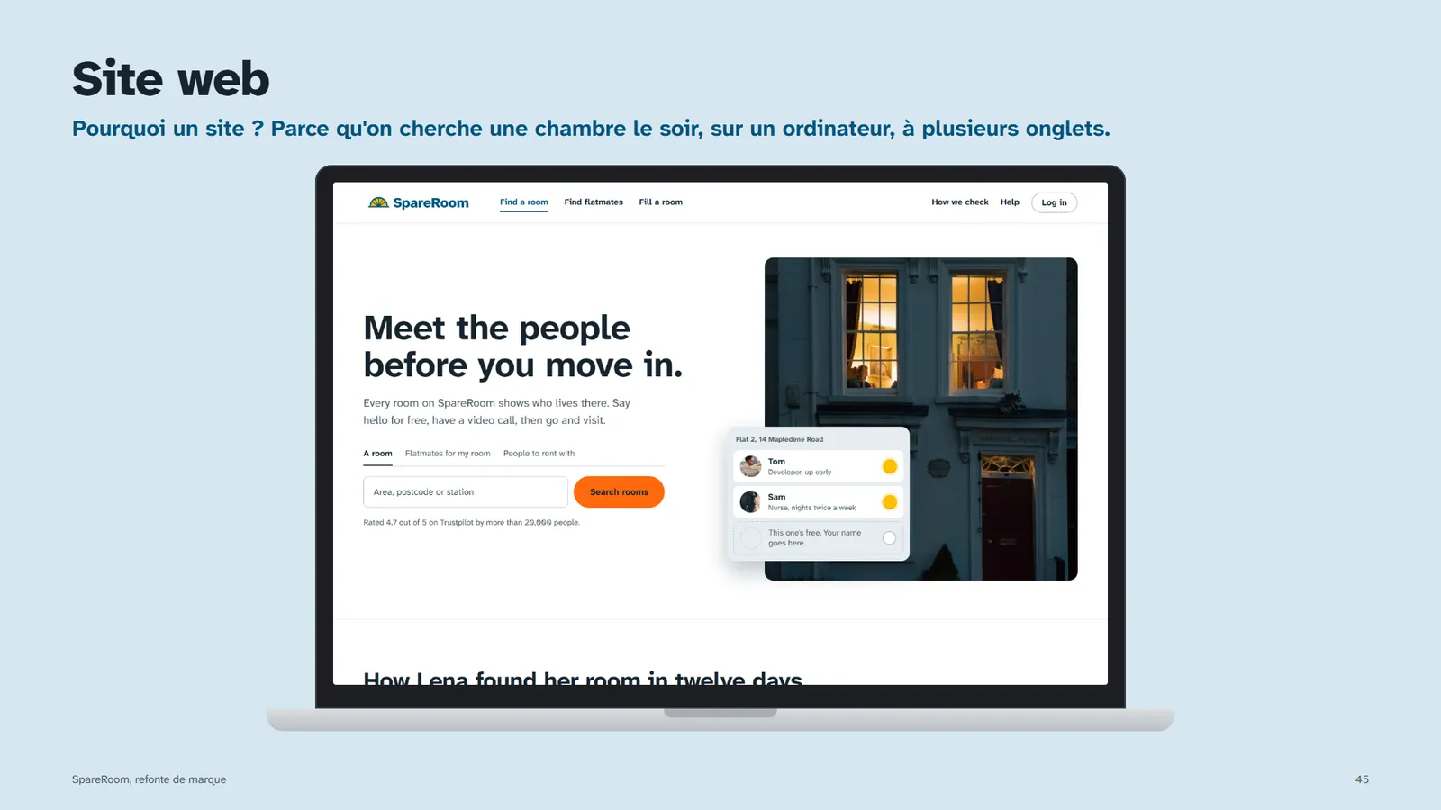
The doorbell plate. Every flatmate is a bell with their name, and it lights up when they've verified their ID. The last label is empty: that's the spare room.
Each screen answers a finding
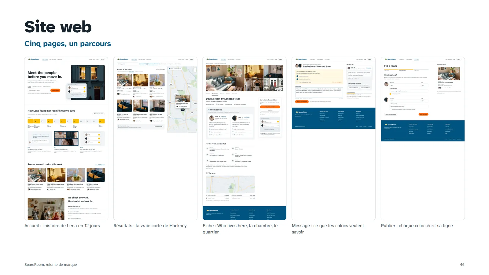
Five desktop pages, presented before and after. Each change is tied to the finding and the criterion it answers.
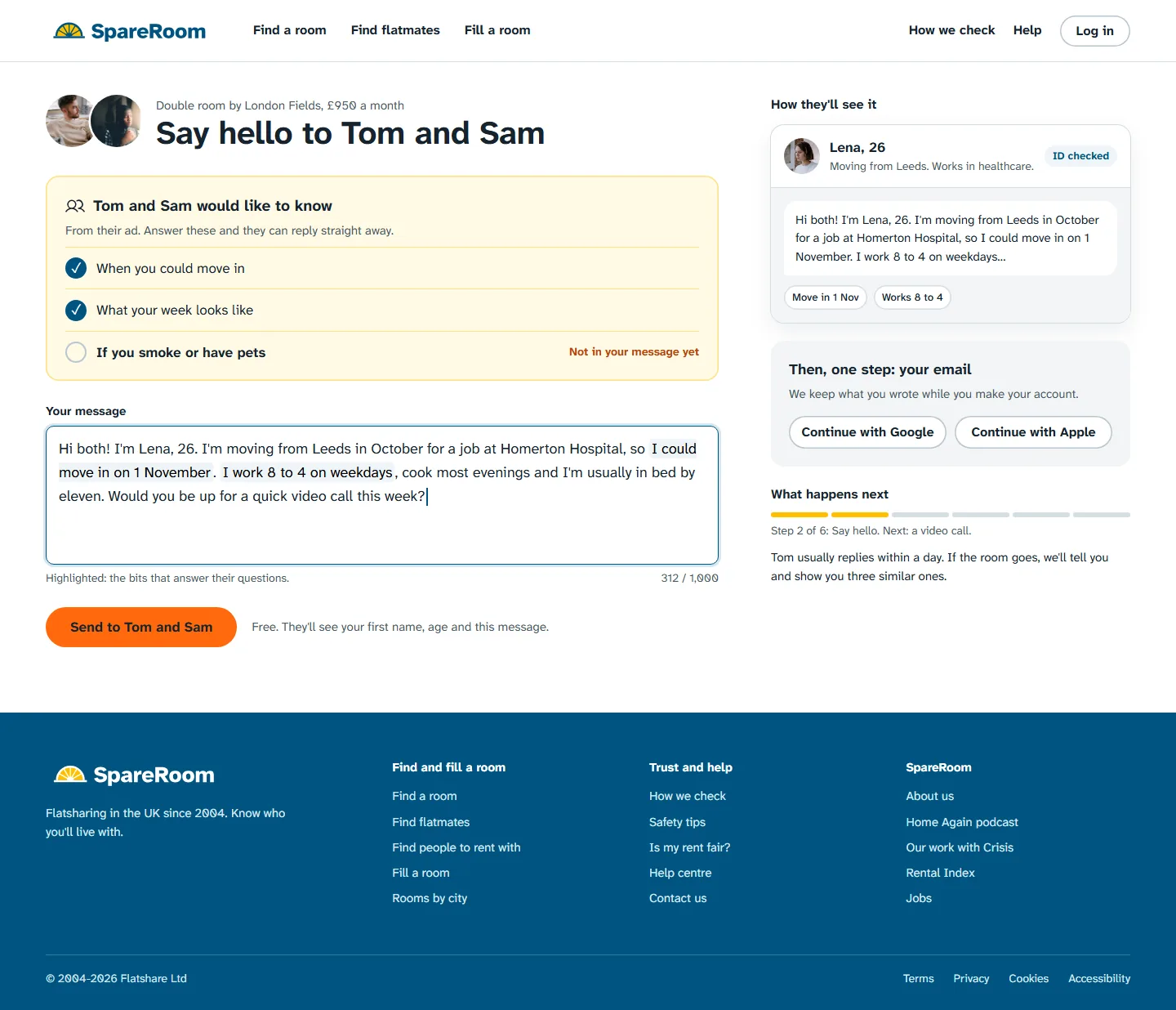
Findings 26 and 27 were the two biggest walls: a full sign-up before the first word, and Early Bird making new ads paid. Here contact is free and you write first. The account comes after, in one step with Google, Apple or an email.
Tom and Sam's questions, taken from their ad, tick themselves off as you type, so the message answers what they need. A live card shows exactly what they'll see, and the line next to the button says what is shared.
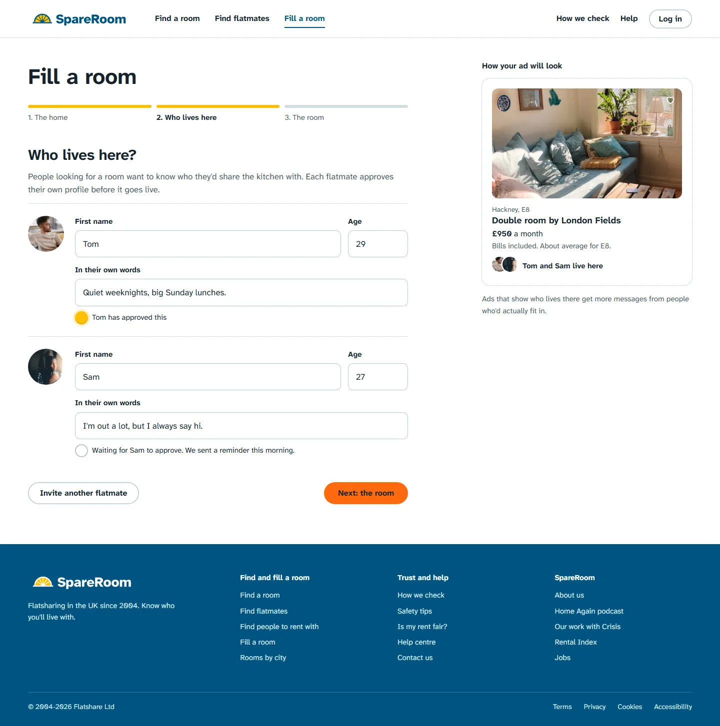
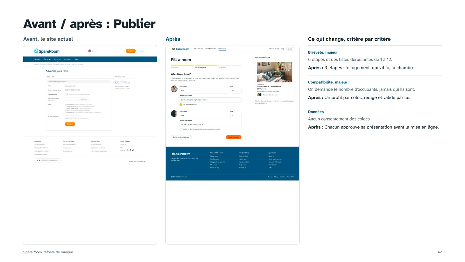
Posting went from six steps to three (finding 34). The new "Who lives here" step introduces each flatmate instead of a number (35), and each one approves their own profile before it goes live: consent is part of the flow.
The progress bar uses the brand's amber. On the right, the card updates as you type, so the advertiser sees what seekers will see. The serif italic is kept for the flatmates' own words.
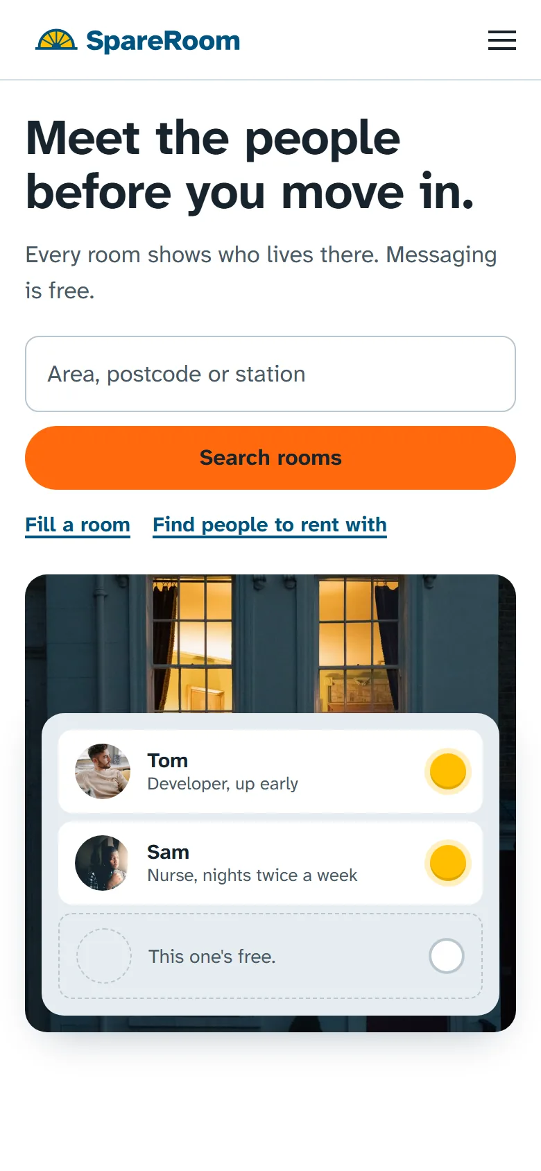 Home
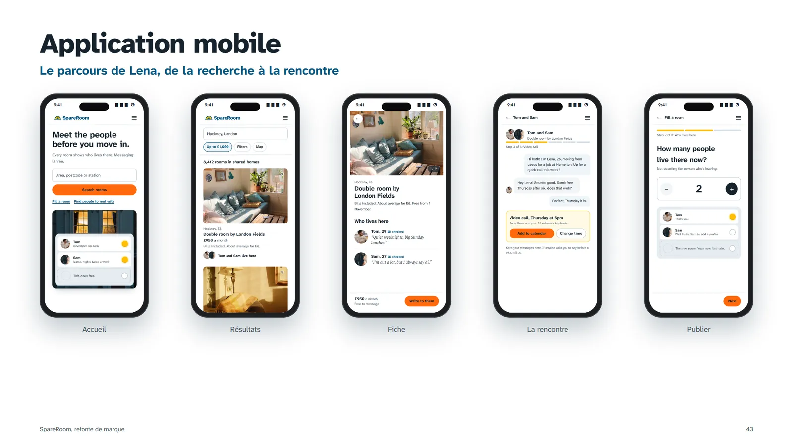
HomeThe promise first, one search, and the two other entries as plain links. No app banner on the first screen (finding 9). The doorbell plate shows the idea before any text explains it.
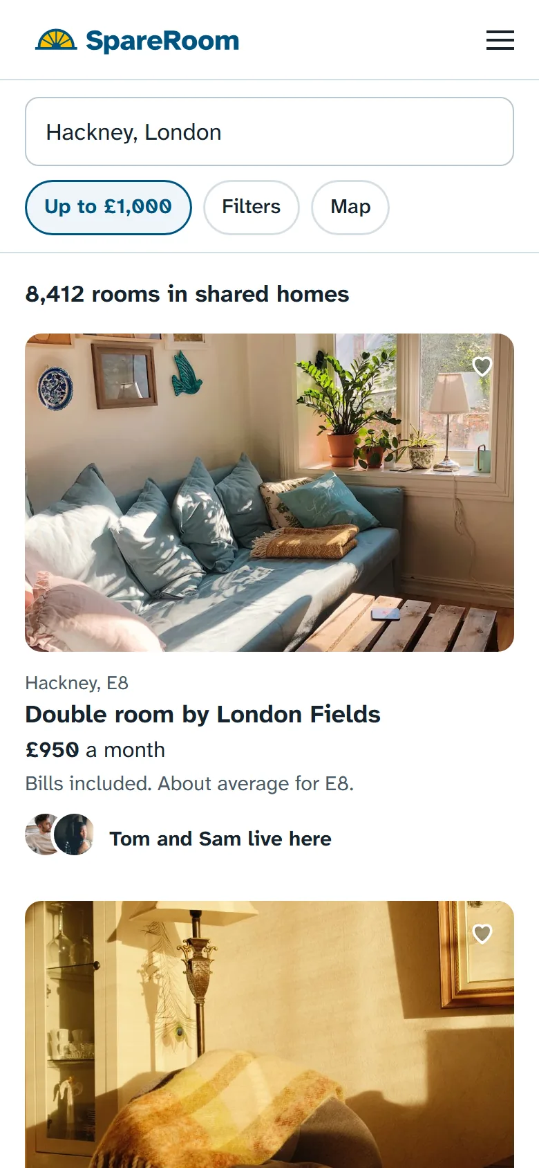 Results
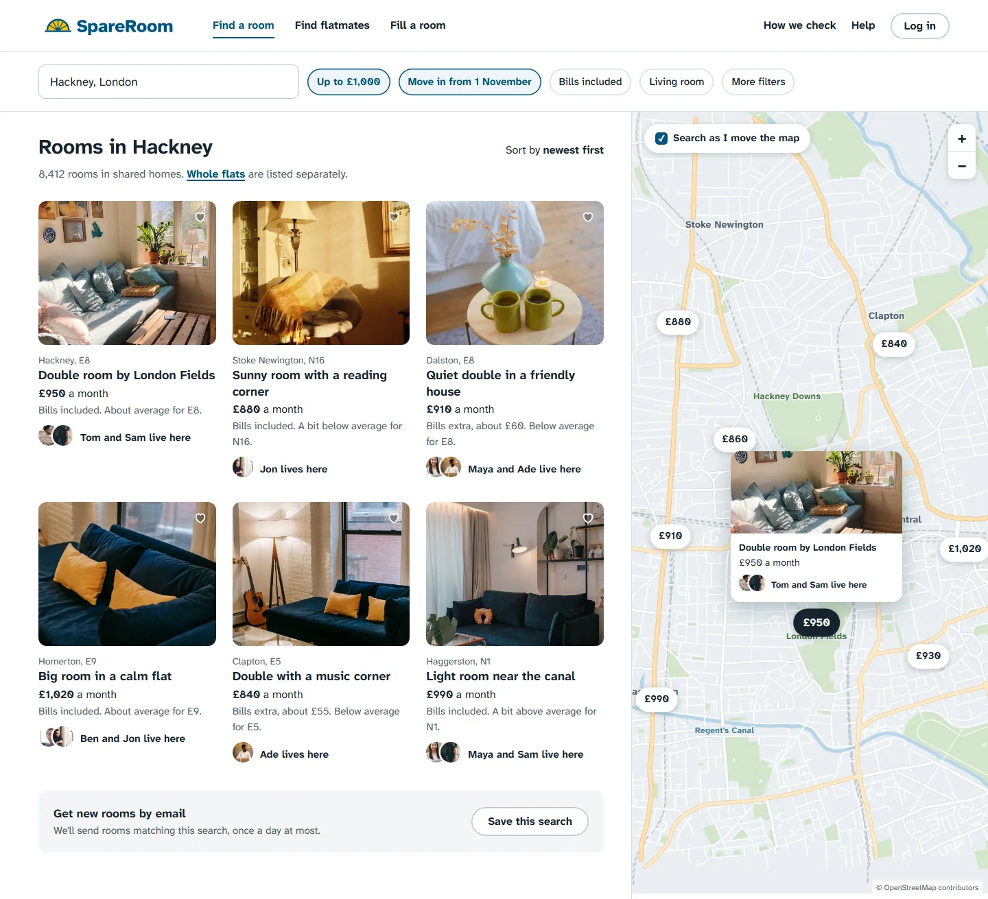
"8,412 rooms in shared homes": an exact count, rooms only (10, 13). Each card gives the price against the area average and the faces of who lives there (14).
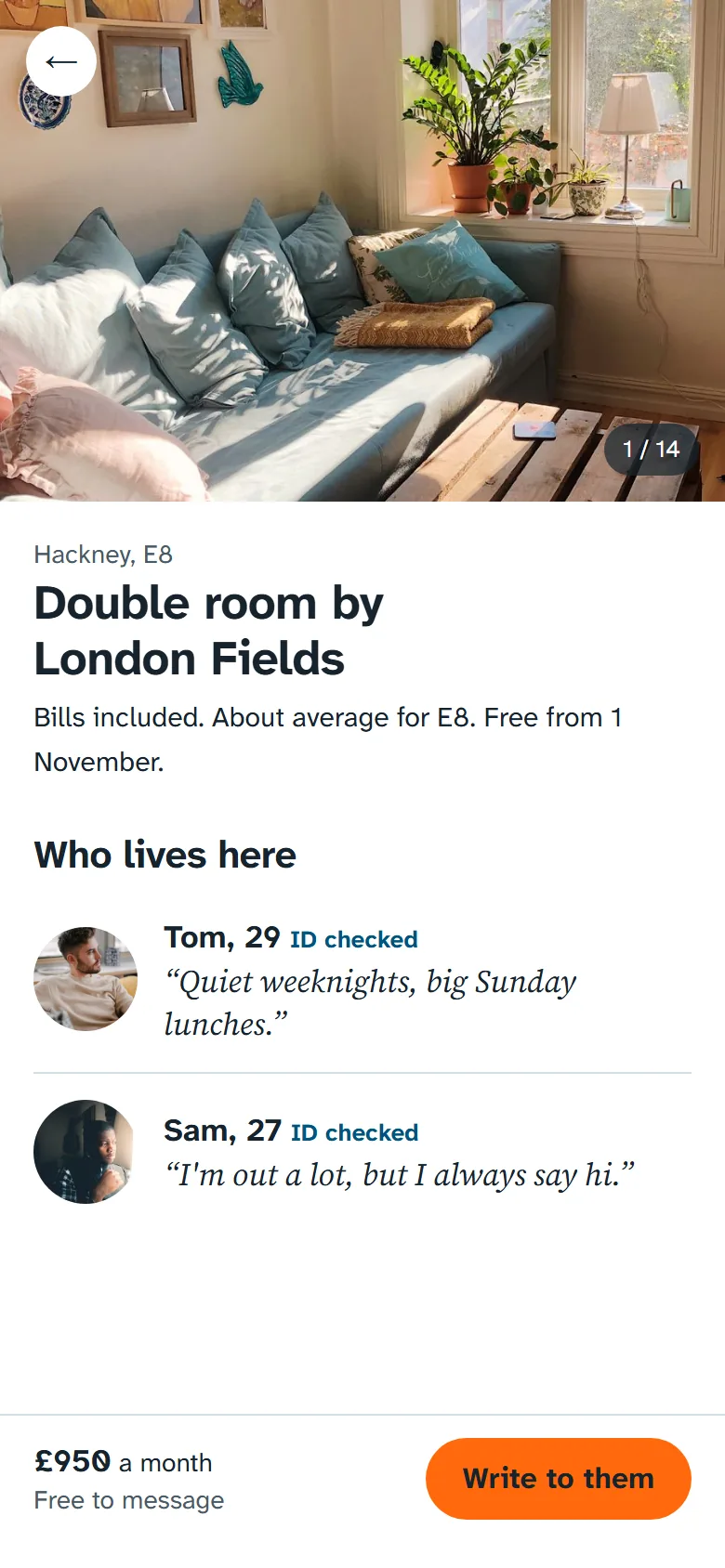
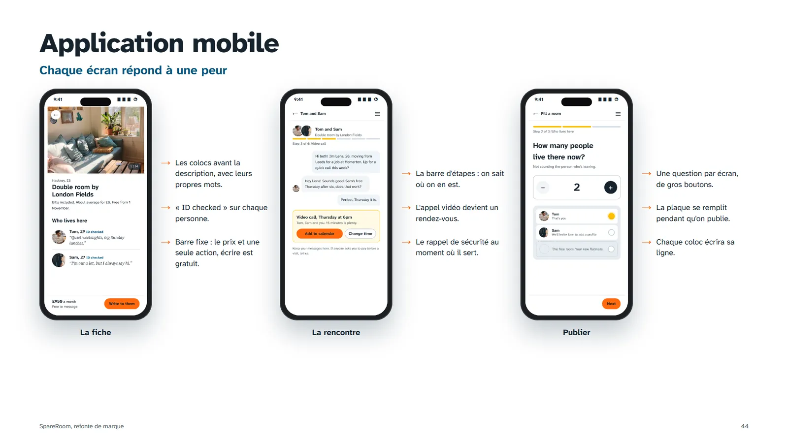
Listing"Who lives here" comes before the description, in the flatmates' own words, with "ID checked" next to each name. The fixed button says messaging is free (22).
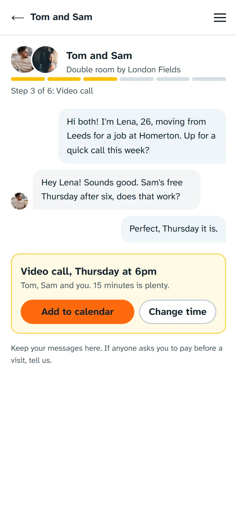 Video call
Step 3 of the gauge: the call is planned inside the conversation, with a reminder to keep messages on SpareRoom. Lena meets them before travelling anywhere.
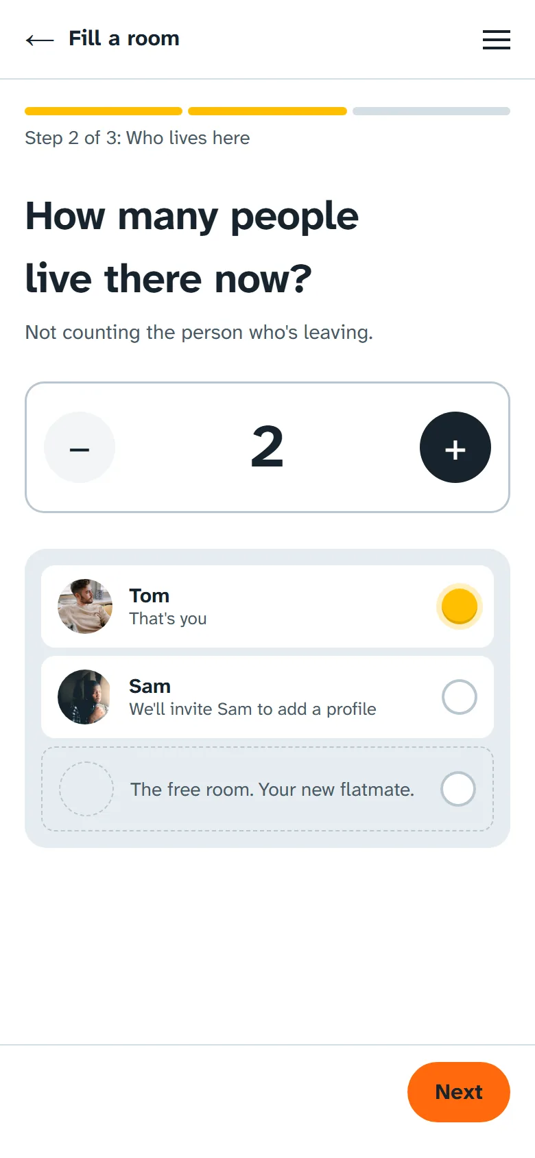 Fill a room
One question per screen, big + and − buttons instead of dropdowns from 1 to 12 (37). Flatmates appear as doorbells and light up once they approve their profile.
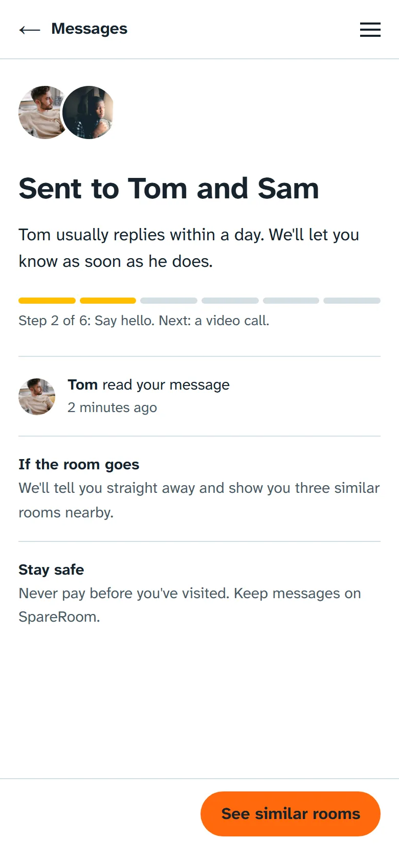 Sent
SentNever silence (29): reply time, what happens if the room goes, and a safety reminder at the moment it matters (23).
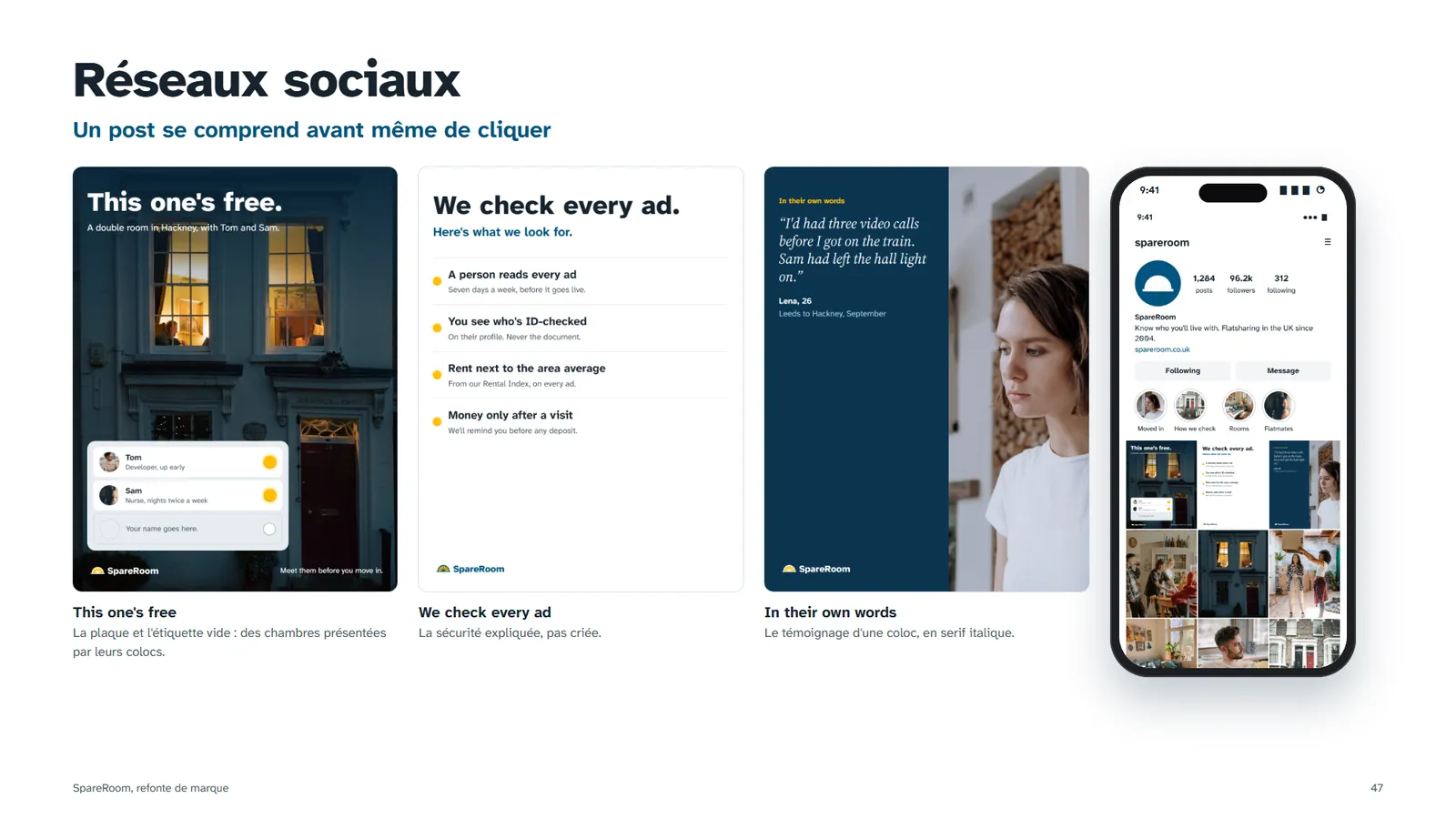
Instagram: show it, don't claim it
Three posts and a profile built from the same system. Each post answers one fear from the research instead of repeating "Number 1".
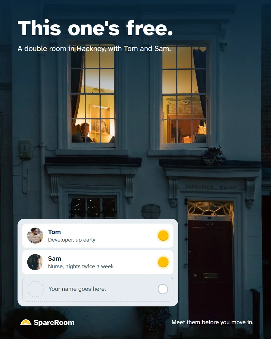
This one's free.The doorbell plate on a real London front: two flatmates lit, an empty bell for you. The promise, shown without a word of advertising.
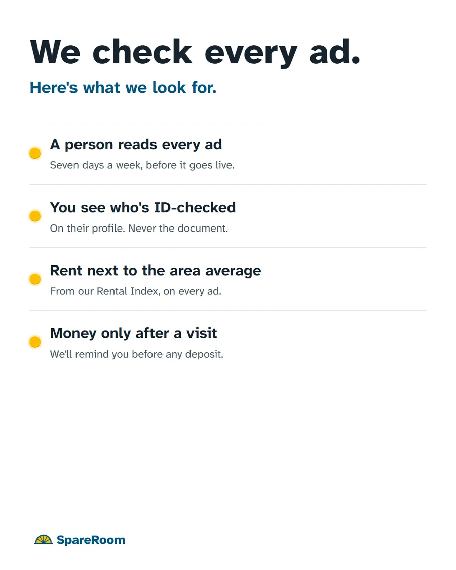 We check every ad.
Answers the first fear in the reviews, losing money. Four checks in plain words, the same as on the "How we check" page.
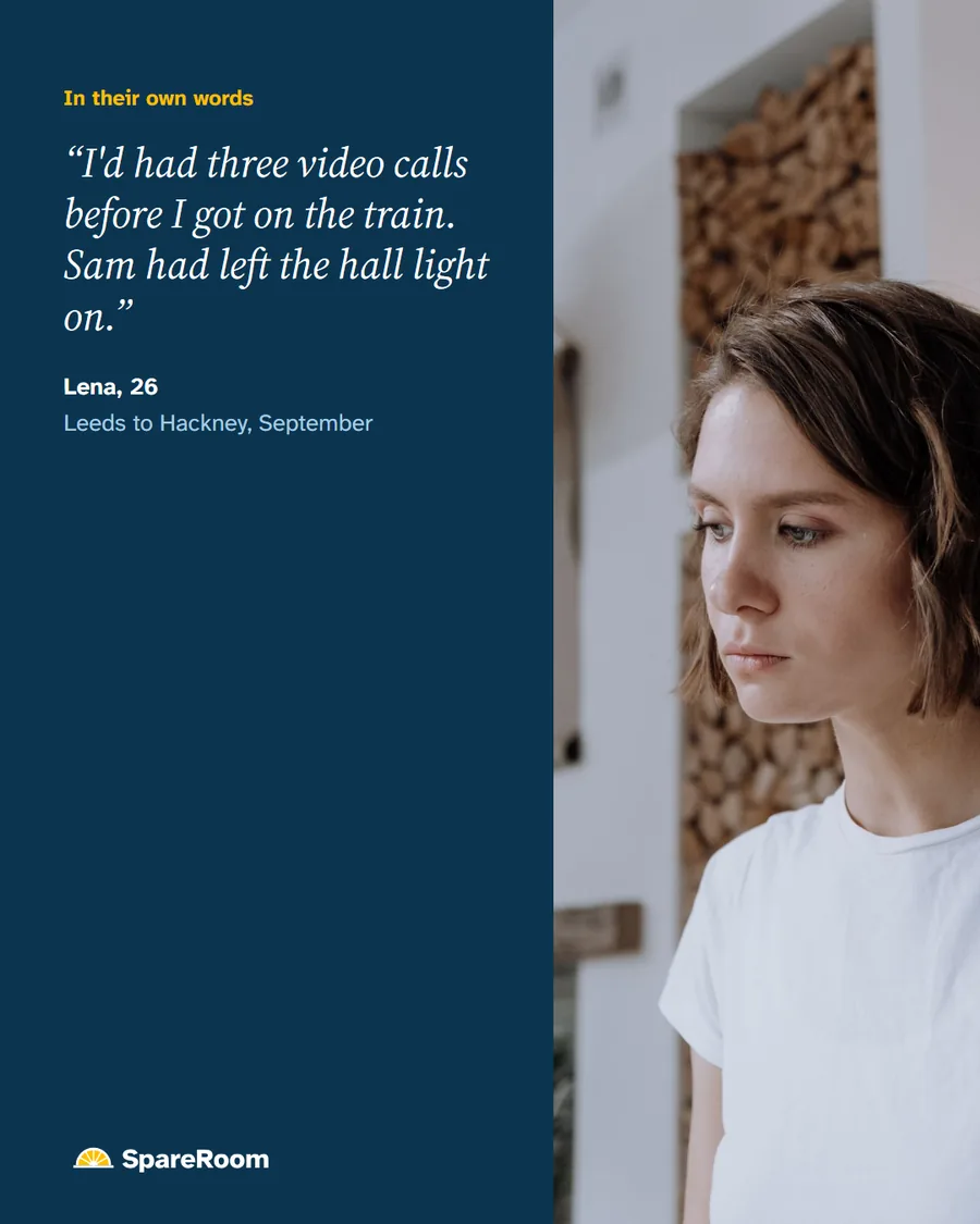 In their own words
A testimony in serif italic, the flatmates' voice from the brand book. It tells Lena's story: three video calls before the train.
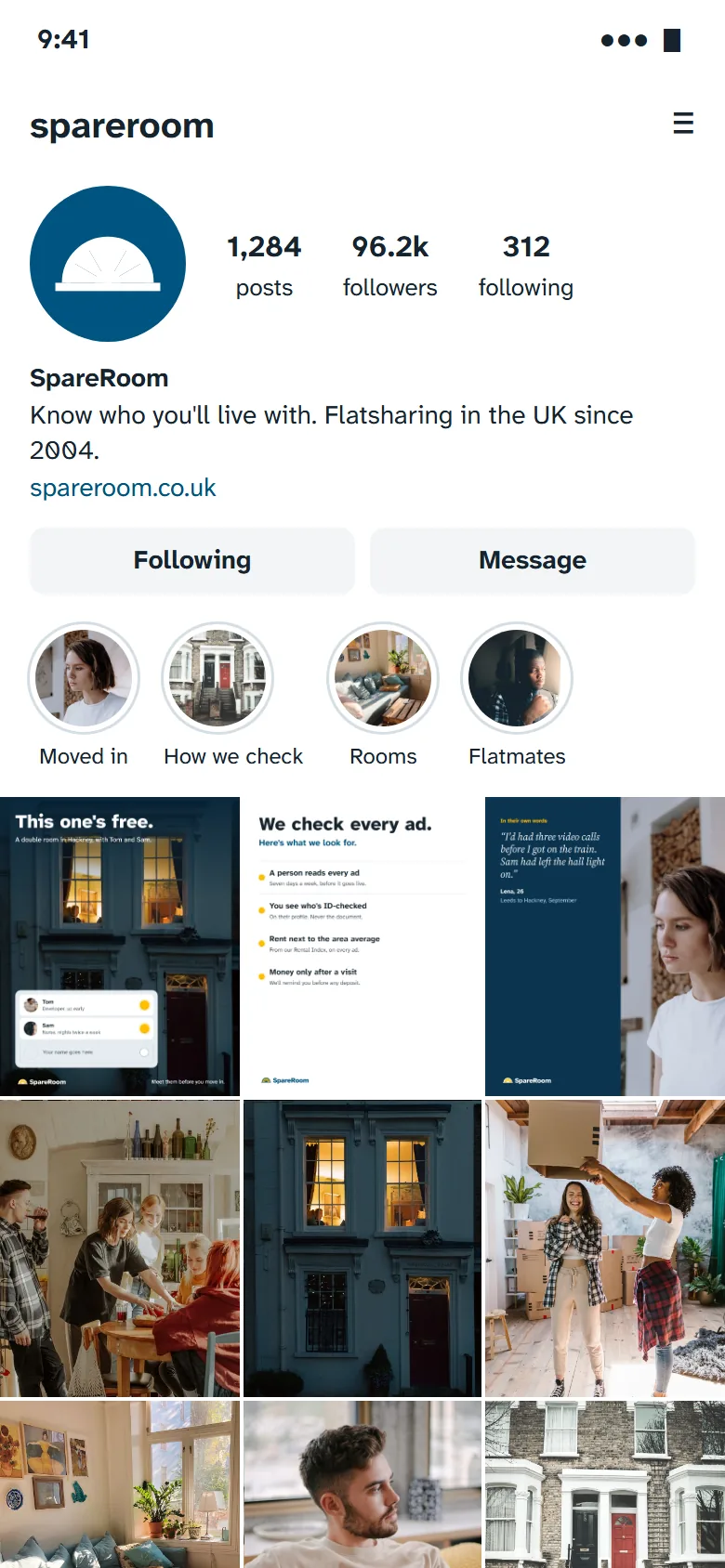 The profile
The highlights follow the site's entries: Moved in, How we check, Rooms, Flatmates. The grid alternates designed posts and photos of homes and people.
Objects people would actually use
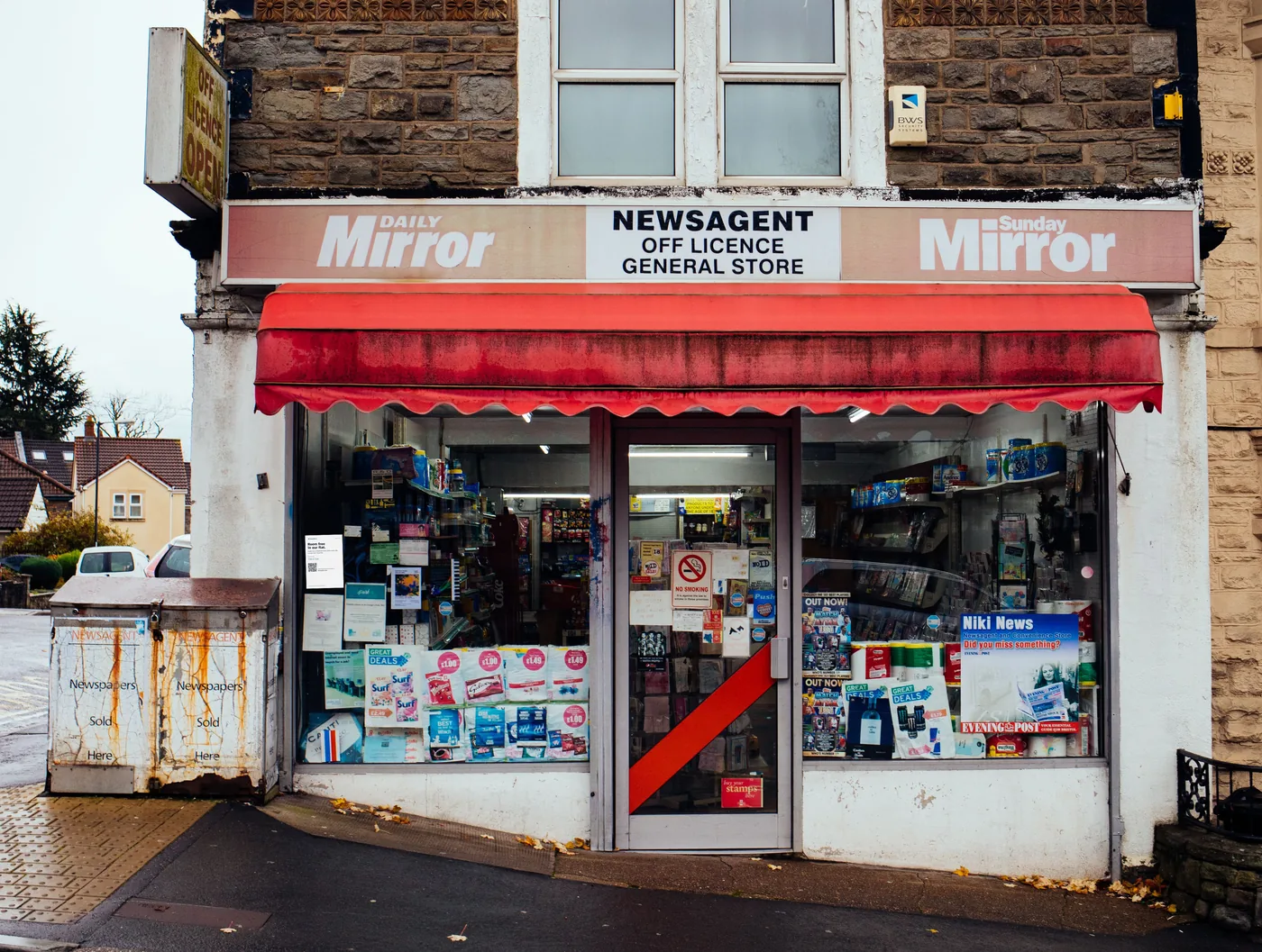
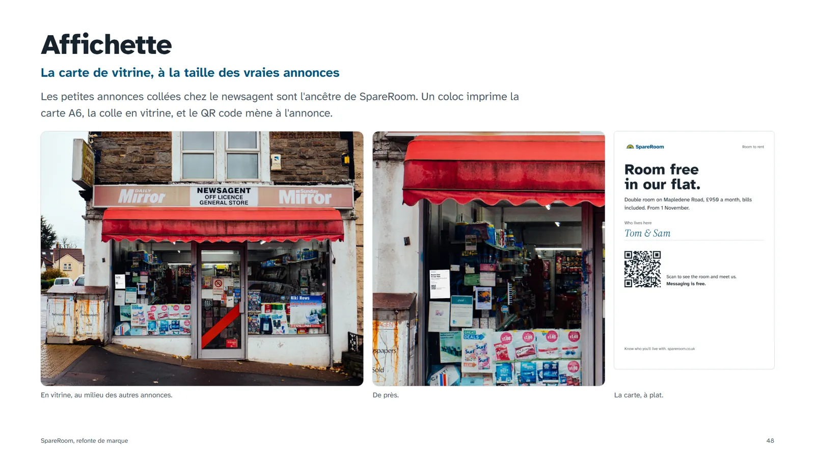
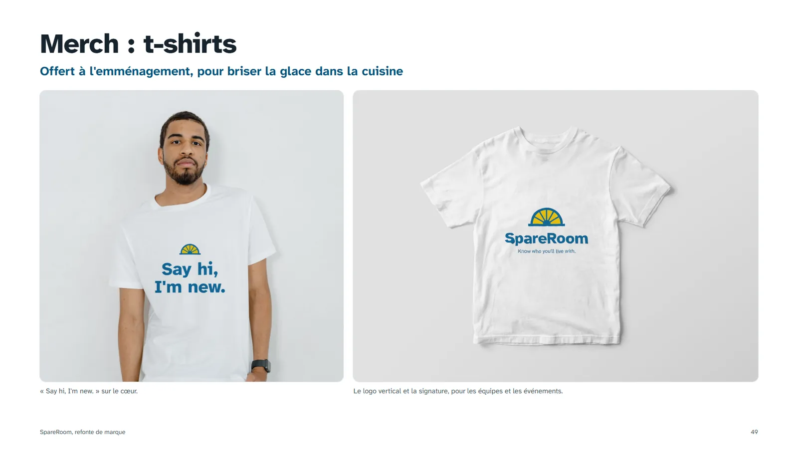
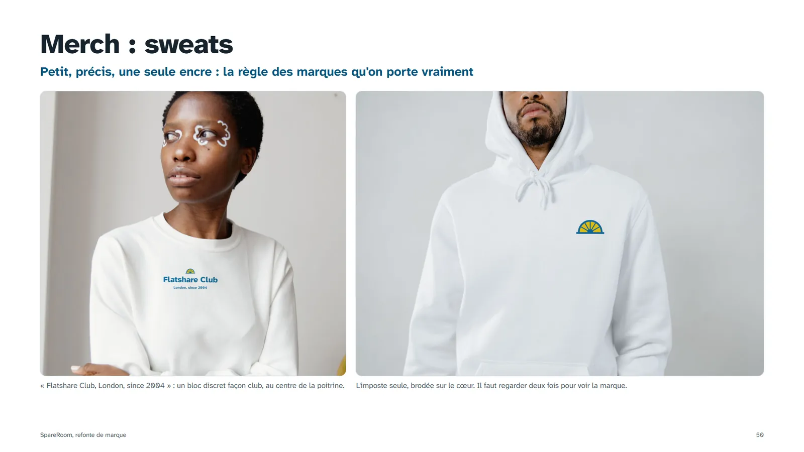
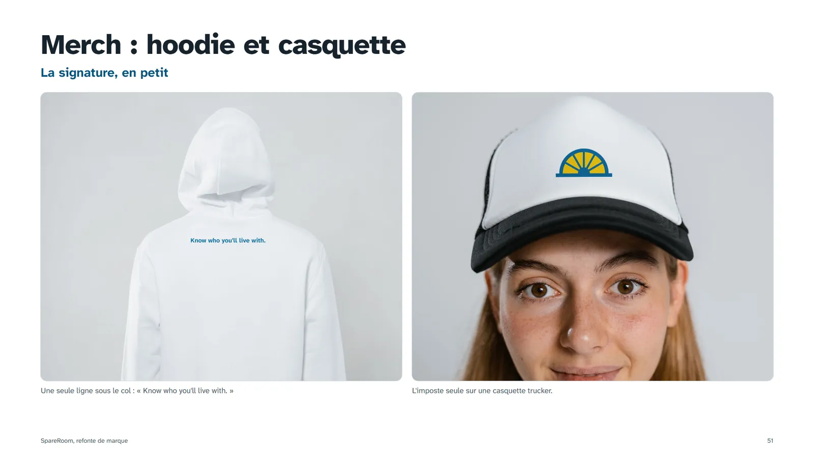
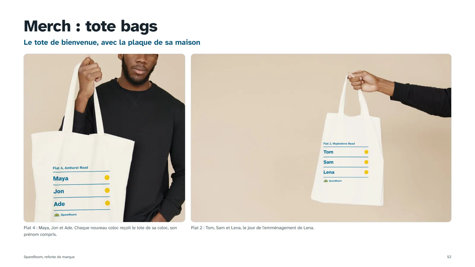
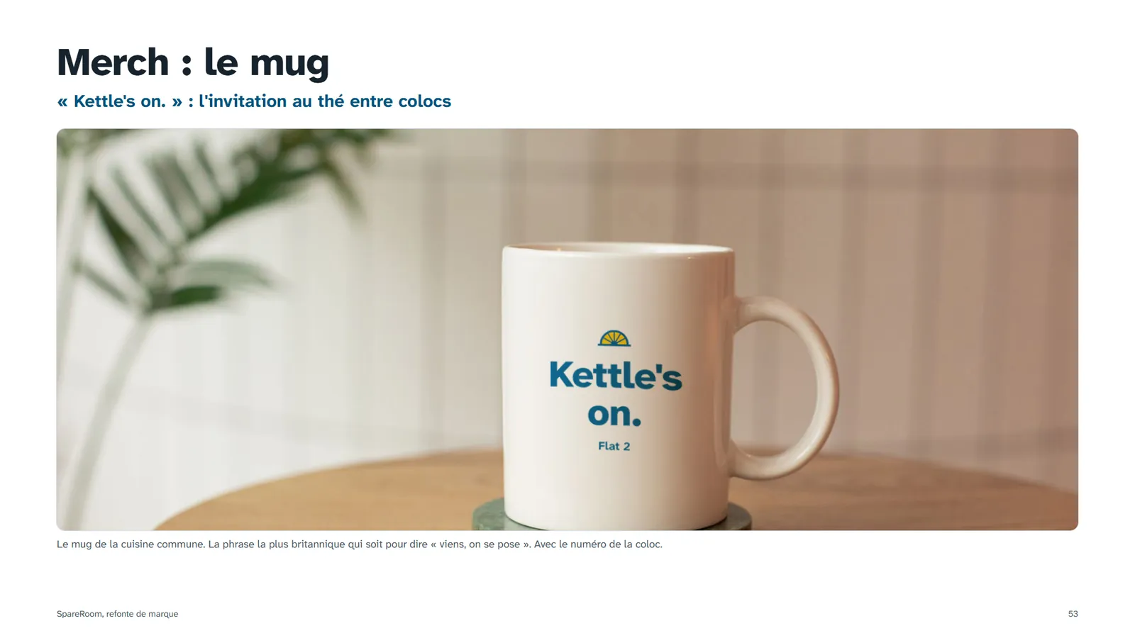
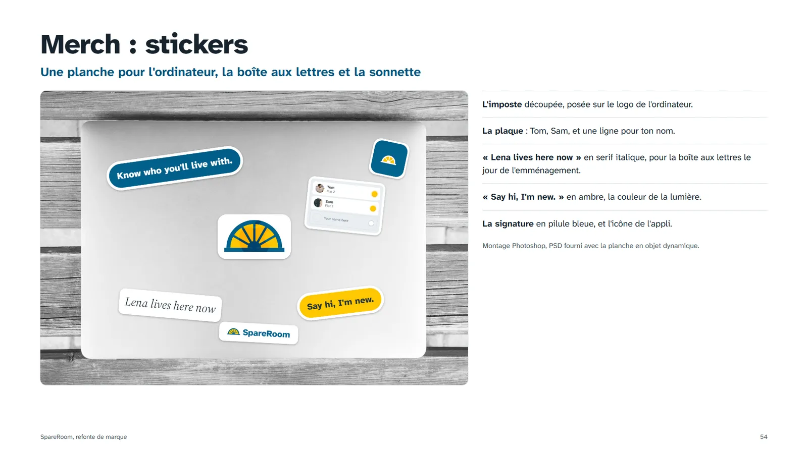
Merch for moving-in day, not for a trade fair: small marks, short phrases from the flatmates' vocabulary, and the window card back in the newsagent's window, where flatsharing started. Mockups built in Photoshop.
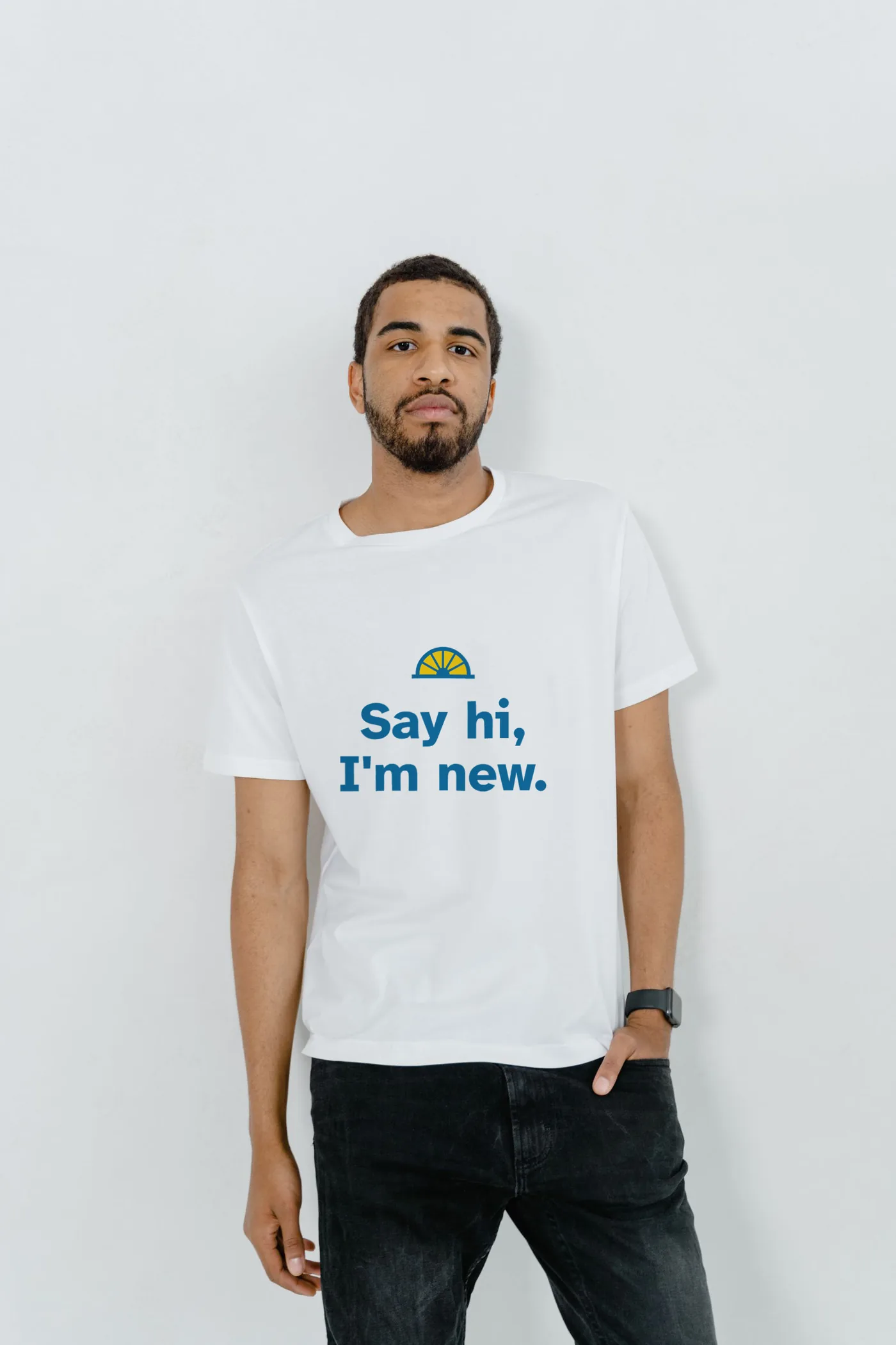


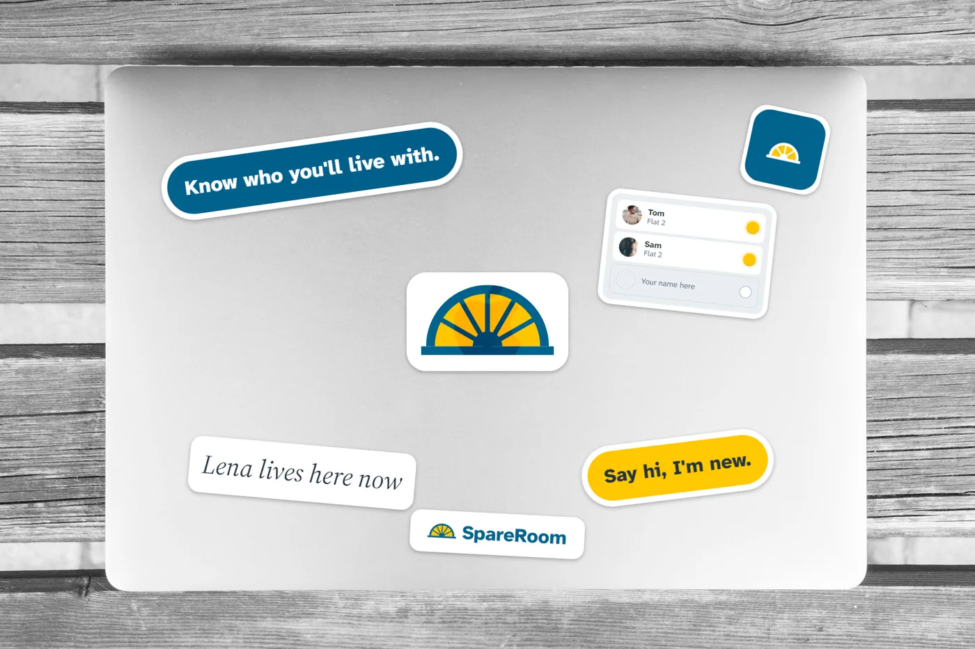
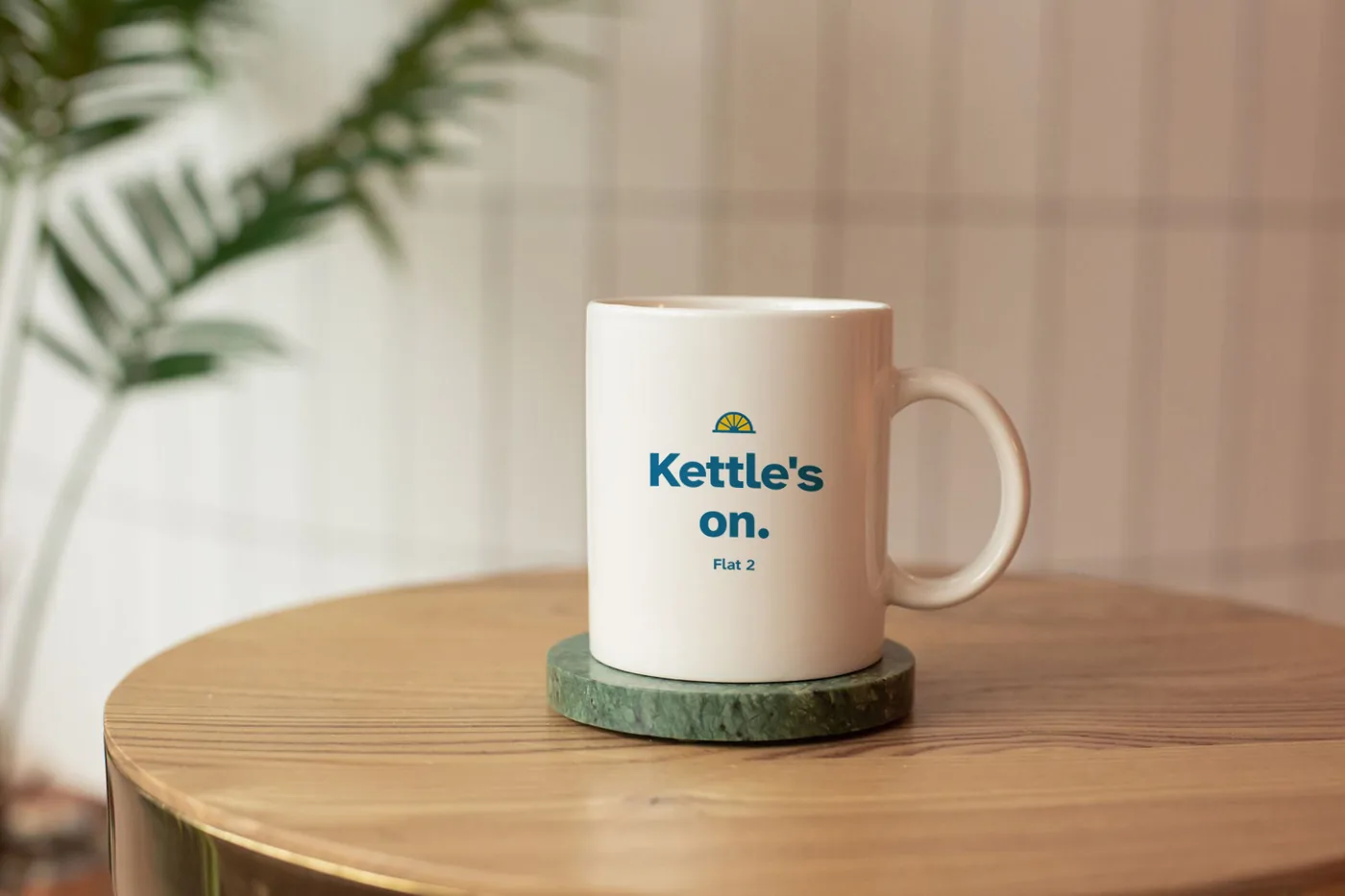
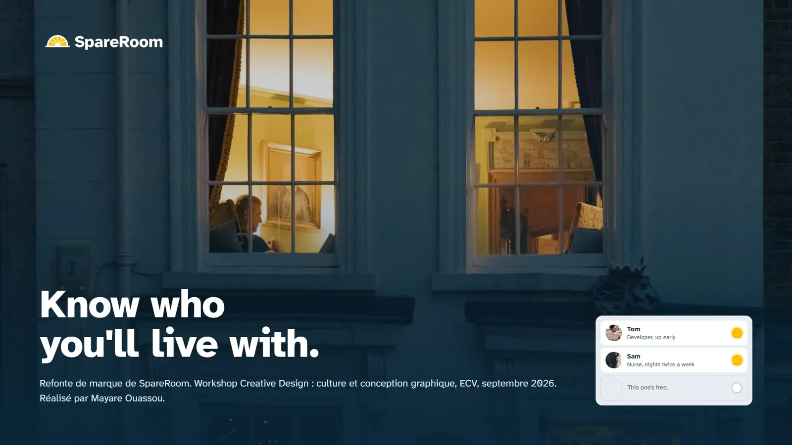
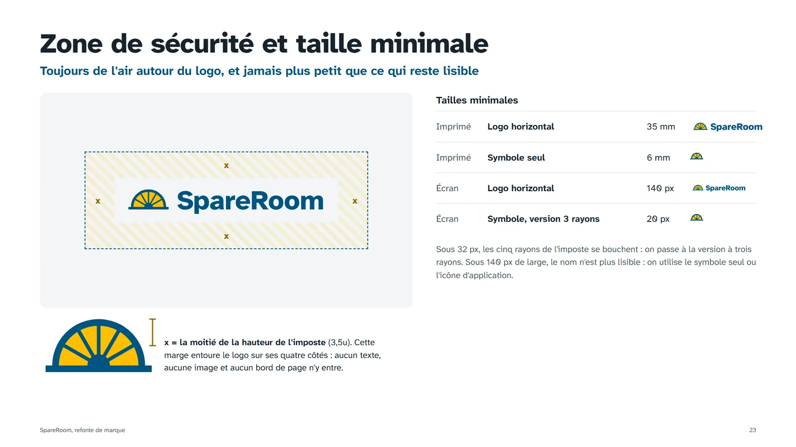
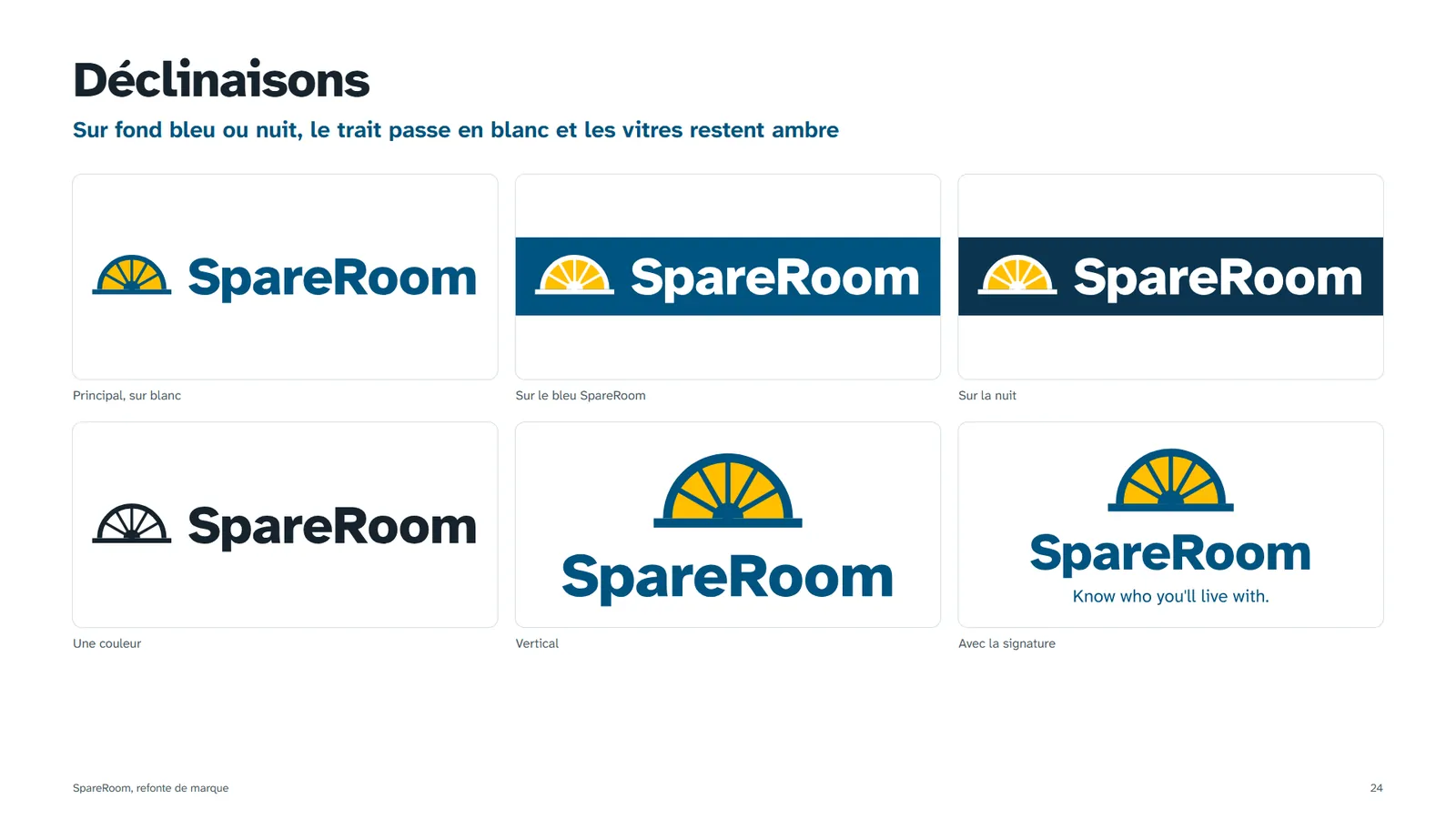
The 56 boards presented at the final pitch, in French. Scroll, or click a board to enlarge it.


Download the deliverables
The research files translated into English. The brand book, the deliverables and the full case file are shown as presented, in French.
46 findings, criteria, criticality, recommendations
↓ DOWNLOADAudit synthesis and site architecture, 24 slides
↓ DOWNLOADLena's six steps, fears and opportunities
↓ DOWNLOAD11 annotated screens, desktop and mobile
↓ DOWNLOADLogo, colour, type, grid, pictograms, design system
↓ DOWNLOADWebsite, mobile, social, window card, merch
↓ DOWNLOADThe complete 56-board presentation
↓ DOWNLOADSVG, PNG, .ai and .eps, plus the palette (CSS, JSON, ASE)
↓ DOWNLOADWhat I'd keep from this project
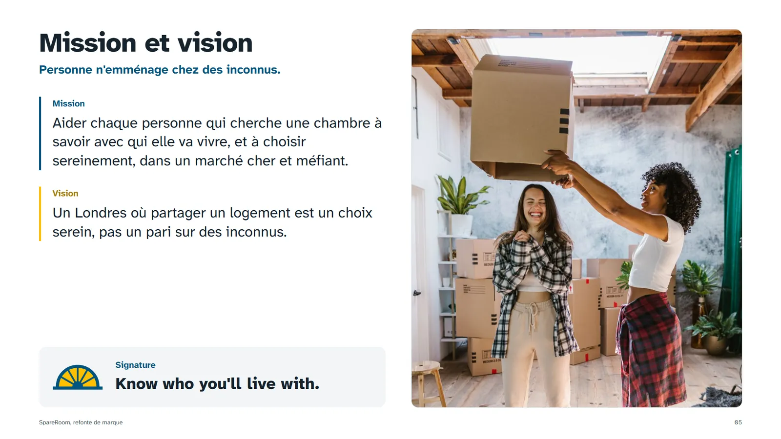
"Know who you'll live with" is an empty slogan unless every listing shows who lives there. The promise had to become a section of the product before it could become a tagline.
The audit showed what users already recognise. Keeping the blue and the orange, and changing what they mean, kept the trust a leader has built over twenty years.
Every recommendation in the grid is a sentence someone can turn into a screen, and every wireframe note points back to a finding number.
What I'd do next
The workshop ended at the pitch. If SpareRoom picked the project up, this is how I'd take it from a rebrand to a product that proves its promise.
Moderated tests with 5 seekers and 5 advertisers on a clickable prototype, on two scenarios: choosing a room with "Who lives here", and sending a first message without an account.
A baseline before launch, then four numbers: share of visitors who send a first message, reply rate within 48 hours, time to a viewing, and scam reports per 1,000 ads.
"Who lives here" and free contact in London only, as an A/B test against today's listing, while watching the advertiser side: does Early Bird revenue move to promotion tools?
Audit the logged-in area left out of scope, run a full WCAG 2.2 review, and turn the screens into a shared design system in Figma for the product teams.
EMERGENCY VET CARE
Ergonomic audit of an emergency vet network, Bastien & Scapin, co-presented to the client